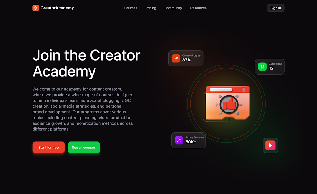
The network for creativity
Join 1.25M professional creatives like you
Connect with clients, get discovered, and run your business 100% commission-free
Creatives on Contra have earned over $150M and we are just getting started
Back to feedPost
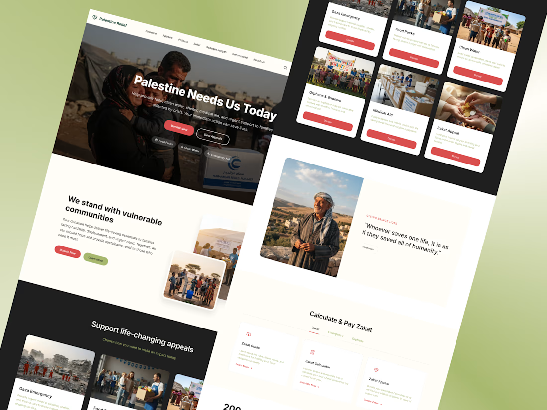
esigning for impact is different from designing for looks.
This charity donation website was created with one goal in mind —
make it easier for people to take action.
Most NGO websites struggle with clarity.
Too much information, weak hierarchy, and confusing donation flows.
This design focuses on solving that.
A clear hero section builds emotional connection instantly.
Strong call-to-actions guide users without hesitation.
Each appeal is structured in a simple, scannable way so users can quickly decide where to contribute.
The entire experience is designed to reduce friction —
less thinking, faster action.
Because when it comes to donations,
every second and every click matters.
Great job on this project! The structure and spacing make it very easy to navigate. Clean and professional.
This shows a high level of skill and attention to detail. It’s not something most people can pull off this way. What key principle or technique do you think made the biggest impact here?
The network for creativity
Join 1.25M professional creatives like you
Connect with clients, get discovered, and run your business 100% commission-free
Creatives on Contra have earned over $150M and we are just getting started
Related posts
Not every visual needs to be loud to be powerful.👀
This one is all about mood, motion, and emotion, using light, colour, and texture to create a feeling before anything else.
What's your take on it?
That is so true! Loud doesn't always mean impact!
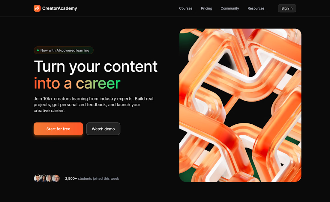
Most Kajabi sites lose visitors in the first 3 seconds.
Not because the design is bad.
Not because the offer is weak.
But because the first screen tries to say everything at once – and ends up saying nothing.
Sound familiar?
A headline that “explains” but doesn’t hook.
A subheadline that tells the entire story.
And 2–4 buttons competing for attention.
The visitor doesn’t know where to look – so they leave.
Your hero section has one job: make people feel “I’m in the right place” and show them what to do next.
Not to overwhelm. Not to impress.
But to guide.
A short, clear headline.
Simple context.
One primary button (a secondary one is fine – just not competing).
When you rebuild your hero around this – the page stops feeling noisy and starts feeling like a confident brand.
Below – a real before & after. Which version feels cleaner to you?
Rightly said
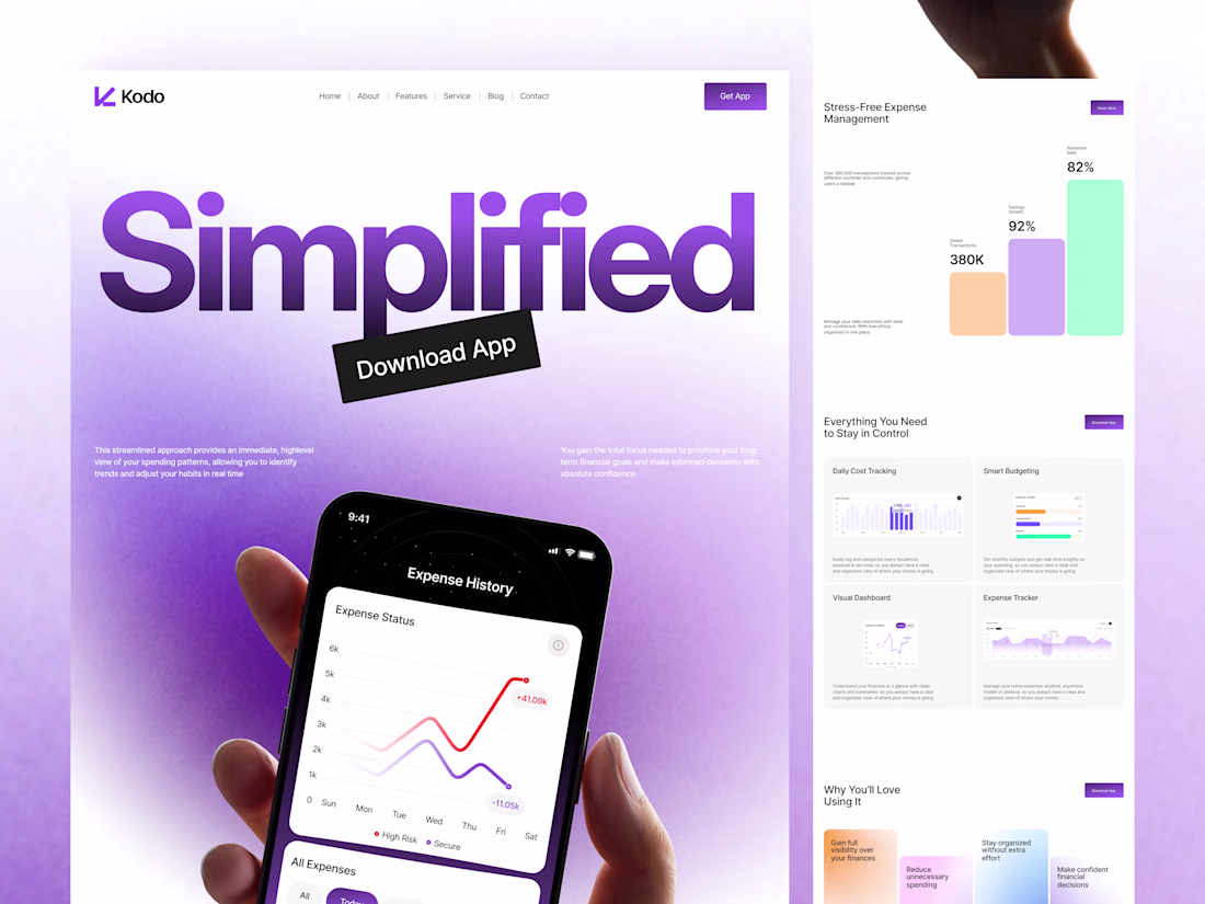
Most web dashboards are built to show data.
Not to help people understand it.
Kodo Web is different. It focuses on:
• Simple layout
• Clear structure
• Easy-to-read charts
• Less confusion, more clarity
Because in web products,
clarity = better decisions.
We design dashboards that:
• Reduce user frustration
• Improve usability
• Help users act faster
👉 Have a confusing web or dashboard?
Send “FINANCE” - we’ll show you exactly what to fix.
looks fantastic 👌
Trending
Runway
AI video generation is exploding. What are you dreaming up in Runway?
Contra University
Learn from expert creatives how to earn more using next-gen AI tools.
creativeaiflow
Creative AI workflows are evolving. What tools do you use, and what are their strengths and weaknesses?
portfolioreview
The best portfolios tell a story, not just show a grid. Share yours for feedback.
freelancerlife
Freelancer life is wins, pivots, and everything in between. What’s yours right now?