The network for creativity
Join 1.25M professional creatives like you
Connect with clients, get discovered, and run your business 100% commission-free
Creatives on Contra have earned over $150M and we are just getting started
Back to feedPost

A website built to make performance marketing feel as powerful as the results.
Proud to share one of my recent website projects: DirectAgents.com.
The goal wasn’t simply to redesign a website it was to create a digital experience that communicates the scale, expertise, and performance-driven mindset behind the Direct Agents brand.
I worked across the UI/UX, visual design, responsive layouts, page structure, and web development, turning a complex range of services and capabilities into a clearer, more engaging experience.
A few things I focused on throughout the project:
→ Creating a strong visual hierarchy that makes a large amount of information easy to navigate
→ Designing a modern, conversion-focused experience without losing the brand’s personality
→ Building responsive layouts that work smoothly across desktop, tablet, and mobile
→ Translating complex marketing capabilities into clear visual stories
→ Paying close attention to typography, spacing, interactions, and the small details that make a website feel polished
The final result is a website that feels more aligned with the level of work Direct Agents delivers for its clients.
Design is at its best when it doesn’t just look good it makes the story easier to understand and the brand easier to trust.
Proud to have played a part in bringing this experience to life.
#WebDesign #WebDevelopment #UIDesign #UXDesign #Framer #DigitalDesign #DirectAgents #ContraDesigner




Communicating scale and expertise without the site feeling corporate and stiff is a hard balance. What ended up doing the most work for that, the copy, the layout, or the motion?
The layout did most of the heavy lifting, with the copy and motion supporting it.
The key was giving the content enough breathing room and creating a strong visual hierarchy so the site felt confident and established without becoming too corporate. The copy then helped reinforce...
Putting layout ahead of the copy is the opposite of what most people would guess for a site this data heavy. Is there one specific spacing or hierarchy decision you'd point to as the one that made the biggest difference?
I would point to the vertical spacing between sections and the hierarchy of headings vs. supporting data. Giving each block enough breathing room made the content feel more like a series of clear decisions rather than one large wall of information.
The biggest change was...
The network for creativity
Join 1.25M professional creatives like you
Connect with clients, get discovered, and run your business 100% commission-free
Creatives on Contra have earned over $150M and we are just getting started
Trending
retrofuturism
Share your favorite designs from the past exploring the distant future. Or your own take on the aesthetic 🚀
halftone
Dots. Texture. Grain. Let's see your designs using the halftone technique.

Midjourney
Creatives are showing off what they're making with Midjourney.
colorgrade
Video editors sound off: How do you enhance the mood of your video in color grading?





Related posts

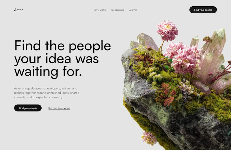
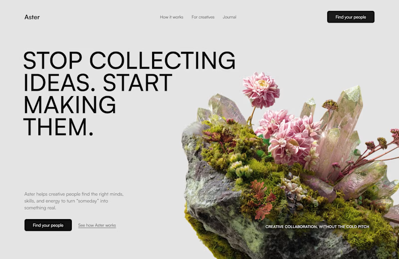
Aster - service that helps creatives find the right people to bring unfinished ideas to life.
I’m testing two hero directions:
A - calm, approachable, and conversational
B - bold, editorial, and a little more dramatic
Which one would you choose? Which one makes you want to keep scrolling?

28 voted
53%
25 voted
47%
53 votes
Closed

Bold is gold and you nailed it. what was the main inspiration behind the visual direction?


RightLife came in looking like an early prototype. It left looking like a company you'd trust with your health data.
Three weeks, five product pages, one scroll section I'm genuinely proud of ("Spend a Day with RightLife"). Same brand DNA, same playfulness, just grown up.
This is what it looks like when maturity doesn't mean losing your personality:)

This is beautiful, Ansh!

A little preview of what I’ve been designing lately 👀
This Jolta Electric Moped (eBike) project is just one piece of what’s coming.
There’s a lot happening behind the scenes, and I’ve got several exciting case studies in the works.
More soon. Stay tuned. ⚡🚀
For your project and contact us.
#InteractionDesign #BrandDesign #modernui #modernuidesign #motiondesing


Very Intuitive!


