The network for creativity
Join 1.25M professional creatives like you
Connect with clients, get discovered, and run your business 100% commission-free
Creatives on Contra have earned over $150M and we are just getting started
Back to feedPost

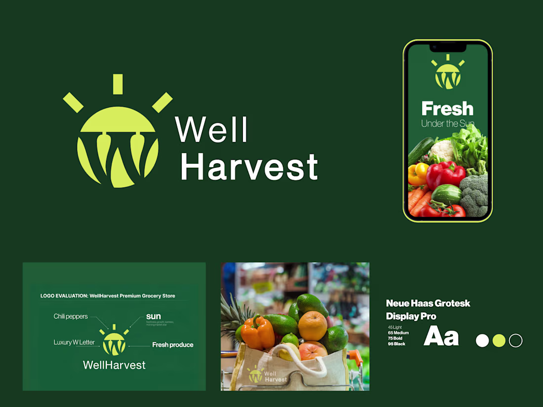
WellHarvest — Premium Grocery Store Logo & Branding
Sun-ripened freshness meets modern simplicity. Designed for a premium natural grocery store, WellHarvest captures the essence of "fresh under the sun" with a clean, vibrant identity. The mark cleverly combines a rising sun (symbolizing growth and daily freshness) with stylized hanging produce, forming a subtle "W" monogram. Paired with crisp typography and the tagline "Fresh Under the Sun," the brand feels wholesome, trustworthy, and appetizing.The deep forest green + bright golden yellow palette evokes nature, health, and vitality — perfect for organic, farm-to-table, or everyday premium groceries.
Fully vector, scalable, and versatile across packaging, signage, app icons, shopping bags, and digital platforms.This branding aims to stand out in a crowded market while building instant trust and emotional connection with health-conscious customers.
Open for custom grocery, supermarket, organic food, or farm market branding projects.
Let's create something fresh together!


The network for creativity
Join 1.25M professional creatives like you
Connect with clients, get discovered, and run your business 100% commission-free
Creatives on Contra have earned over $150M and we are just getting started
Related posts

Shipped another Framer + brand / logo re-design in 1 month time.
Want to build your own Framer websites as designer? Start here


Amazing job!

March Brand Designer Recap:
💜 3x Brand collabs posted
💜 1x Collab passion project
💜 2x Passion projects posted
💜 545 followers gained
💜 3x Client projects completed
💜 10x New enquiries
💜 10x Discovery calls
💜 4x Clients booked
💜 Hit 10K on Instagram
April and May is fully booked🥳
Booking for June and beyond!

Soo exciting Chavi!!

New to posting in Contra! Breaking the ice with a Brand Identity Battle ⚔️
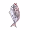
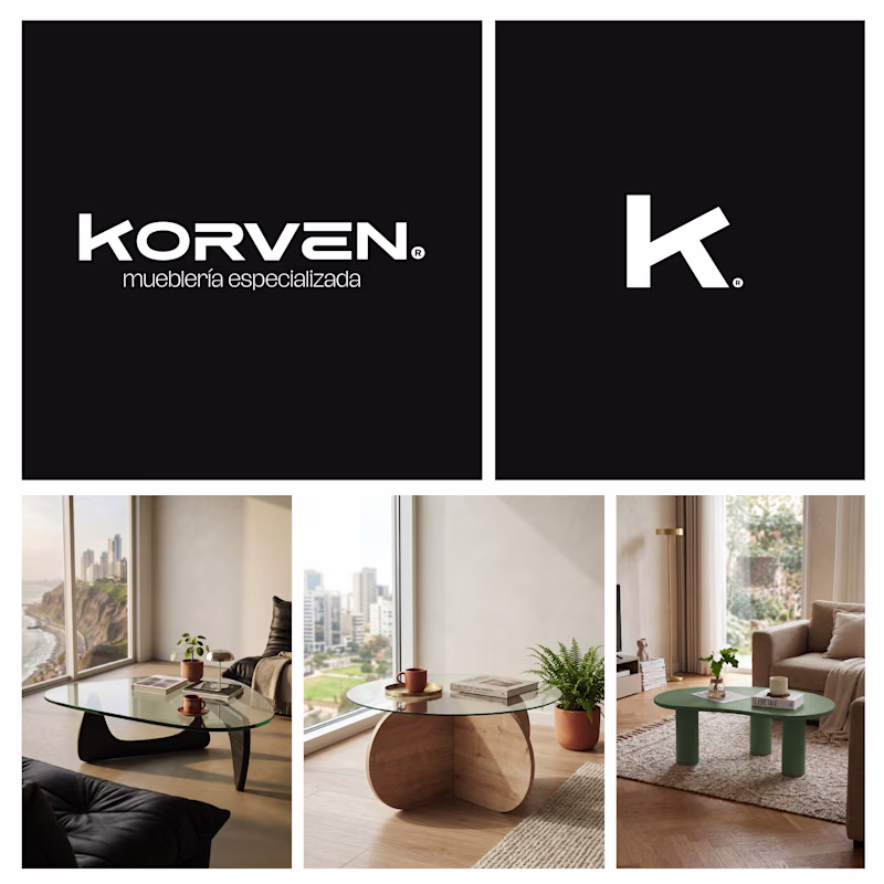
A furniture startup, Korven, recently hired us to build their visual world. Their mission? High-end, sculptural wooden furniture (starting with these Noguchi-esque coffee tables) at an attainable price point ($180–$200 USD). They’re launching with coffee tables but have a roadmap to expand into side tables and full architectural wood elements.
The Dilemma:
We’re split on the visual strategy. Bold, geometric and authoritative vs rounded, modern and tactile.
The Question:
When a product looks like a $2,000 sculpture but costs $200, which identity builds more trust?
👇 Vote A or B. If the answer is "Neither," tell us why. Be brutal!
24 voted
51%
23 voted
49%
47 votes
Closed

Great work, and welcome to the community.


Trending


FLORA
Reusable workflows are replacing one-off prompts in creative AI. Share what you're building in FLORA.
Contra University
Learn from expert creatives how to earn more using next-gen AI tools.
portfolioreview
The best portfolios tell a story, not just show a grid. Share yours for feedback.
freelancerlife
Freelancer life is wins, pivots, and everything in between. What’s yours right now?
aivideo
AI video tools are moving at warp speed. Which ones are you experimenting with?