The network for creativity
Join 1.25M professional creatives like you
Connect with clients, get discovered, and run your business 100% commission-free
Creatives on Contra have earned over $150M and we are just getting started
Back to feedPost

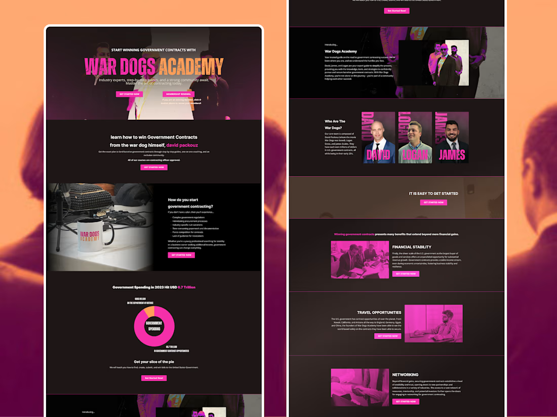
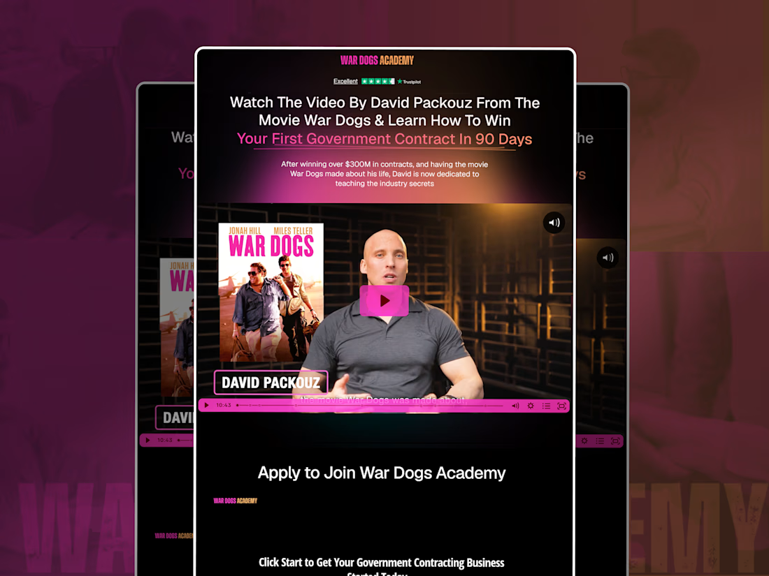
Recently had the chance to rethink two different parts of the War Dogs Academy web experience.
Both pages belong to the same brand, but they are solving very different problems.
wardogsacademy.com is much more conversion-focused. It is built around David Packouz, the video, the core promise, social proof, and one clear next step: apply to join the Academy.
So the structure stays tight. Strong headline, immediate credibility, video first, then the application flow. Everything on the page is there to move someone from interest to action without distracting them.
wardogsacademy.co has a different job.
This one needed to explain the wider War Dogs Academy world. What government contracting is, how the Academy helps, who is behind it, why the opportunity matters, and what someone can expect once they are inside.
That meant a longer editorial structure with more room for education, brand storytelling, team credibility, benefits, and repeated CTAs throughout the journey.
Same visual language. Same brand energy.
Different intent, different hierarchy, different experience.
That was probably the most interesting part of this redesign for me. Not just making two pages look consistent, but making sure each one was structured around the job it actually needed to do.
The network for creativity
Join 1.25M professional creatives like you
Connect with clients, get discovered, and run your business 100% commission-free
Creatives on Contra have earned over $150M and we are just getting started





Related posts

Built the site for Linea — a boutique rail brand where the whole UI is made of the same rule as the print system.
Every route card's red line isn't decoration, it's that route's actual elevation profile. Fare tiers aren't styled, they're the same data at different density.
The logo's sparkle mark even resolves from the exact same contour-drawing logic, live on the page.
One idea, all the way down → Here

such a nice feeling to see my design trending on @splinetool
Comment 'keyboard' for the remix link👇


Amazing idea

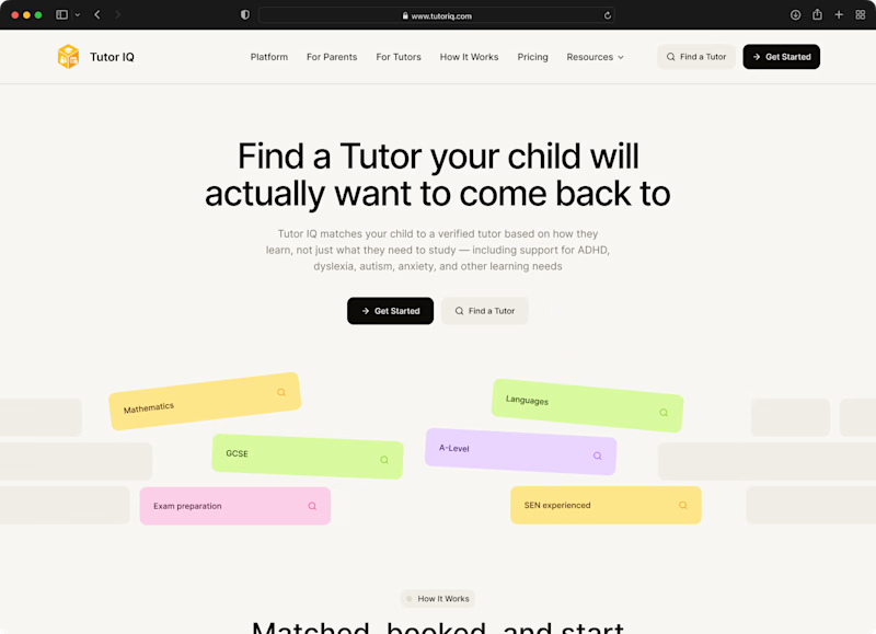
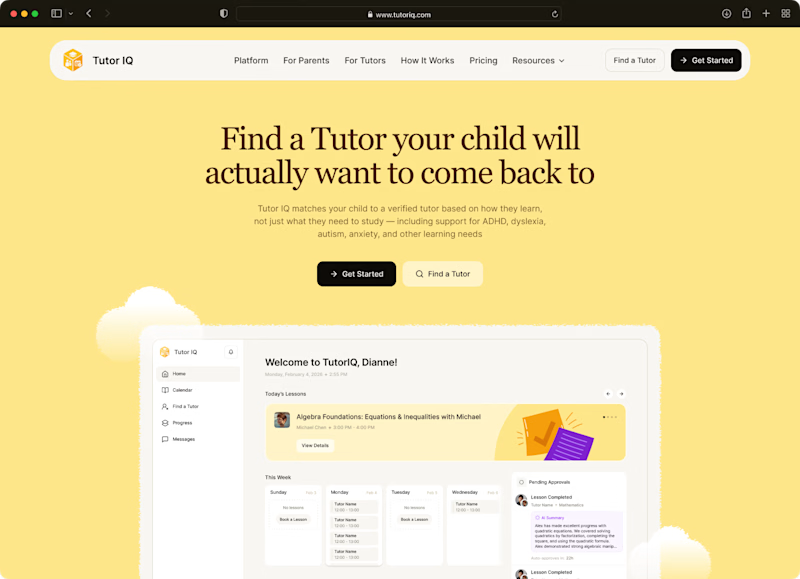
Two moods for one tutoring website🤩 Which would you click?
These were two early website concepts we put together for TutorIQ before choosing the main design.
Tell us in the comments what caught your eye:
🧩 1 — Light and playful
☀️ 2 — Softer and calmer
Mini case study with the final website design is coming here very soon!
11 voted
55%
9 voted
45%
20 votes
Closed

I'm going with Light and playful 🧩