The network for creativity
Join 1.25M professional creatives like you
Connect with clients, get discovered, and run your business 100% commission-free
Creatives on Contra have earned over $150M and we are just getting started
Back to feedPost

Behind the design: Parangtritis Restaurant.
Rather than starting with decoration, I started by defining the feeling the brand needed to communicate.
Warm. Calm. Refined. Memorable.
From there, I explored different visual directions, refined the identity, and tested how the elements could work together across different applications.
The challenge was keeping the design simple without making it feel generic.
So the process became less about adding more — and more about making every element earn its place.
This is a glimpse of that journey, from early exploration to the final visual direction.

The network for creativity
Join 1.25M professional creatives like you
Connect with clients, get discovered, and run your business 100% commission-free
Creatives on Contra have earned over $150M and we are just getting started





Related posts

Brand identity work for WesoftAI



Very well looking composition, good sinergy

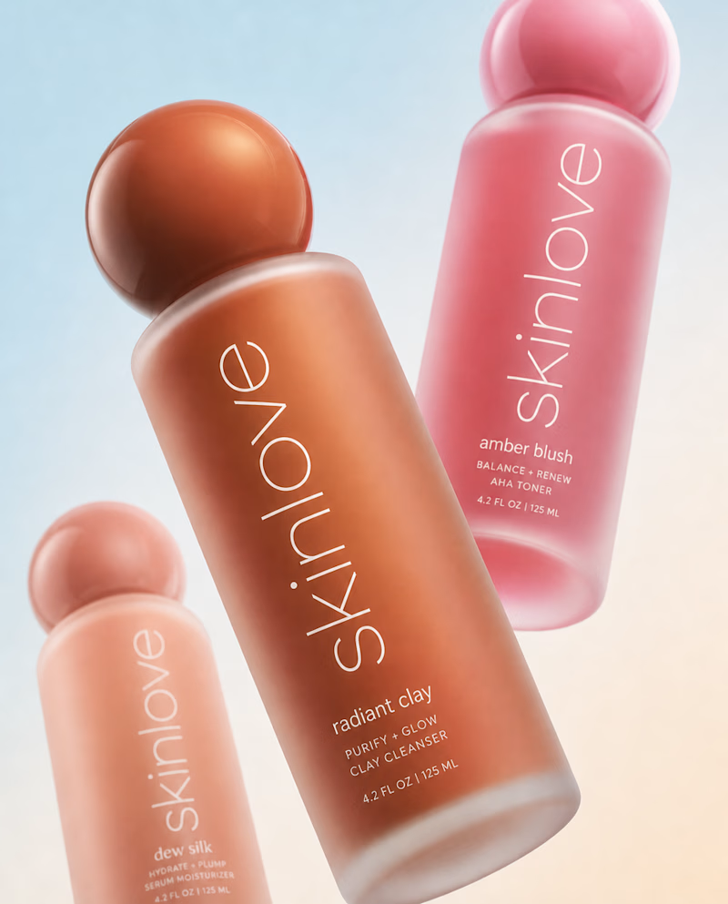
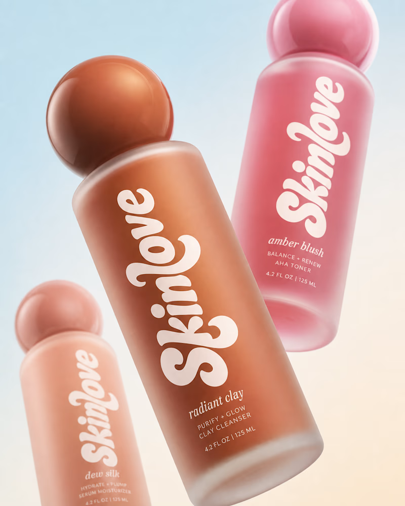
Safe or bold, which one actually makes you stop scrolling? 🤔
Sans: the serif, tight tracking, one accent color playbook every skincare brand is running right now.
Bold: the same idea, redesigned with attitude. 💅
25 voted
32%
53 voted
68%
78 votes
Closed

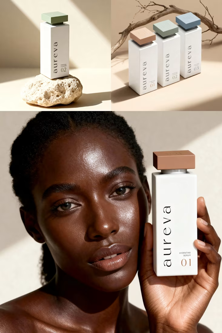
A closer look at Aureva, a Paris-based skincare brand I worked on.
The brief was to create a brand identity and packaging that felt premium yet approachable. I paired distinctive typography with soft earth tones, using color to give each product its own place within the range.
The full case study is now on my profile.

Premium branding