The network for creativity
Join 1.25M professional creatives like you
Connect with clients, get discovered, and run your business 100% commission-free
Creatives on Contra have earned over $150M and we are just getting started
Back to feedPost

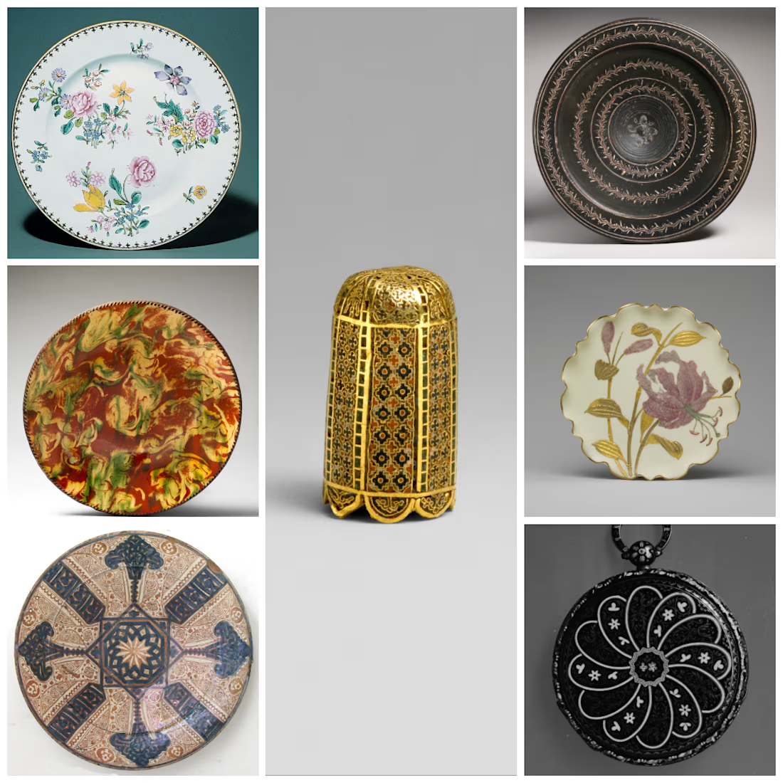
Beautifully merged the art

This is my 3rd and last submission, I have many Ideas so I combined them into one,
Inspired by:
1. Tip of a Pointer, Bayzantine 1080–1150 As cylindrical bullet seats
Link to Art: https://www.metmuseum.org/art/collection/search/466296
2. Watch pobably swiss, ca. 1815-20 As...
The network for creativity
Join 1.25M professional creatives like you
Connect with clients, get discovered, and run your business 100% commission-free
Creatives on Contra have earned over $150M and we are just getting started


Related posts

The second banner arrangement reads cleaner but the first one is more aesthetic-y

Same 18 seconds, two middles. One pulls you through a tunnel of banners, one lays them out. 1 or 2.
39 votes
Ends in 4h

Omoro: a visual research system for creative people
Taste has an anatomy. I built Omoro to take it apart.
Omoro (oh-moh-roh) breaks aesthetics down to their palette, typography, materials and lineage, so a look can be named, compared and directed.
What you're looking at:
· UI Lab. 49 interface screens, each in its own visual language. Turn the dial, open one and make it yours.
· The style library. 292 design styles, each with its palette, typefaces, history and real examples. Read the visual logic, not just the surface.
· The Rig. Sixteen camera angles, each with a 3D rig. Drag the strength and the camera moves; change the lens and the field of view changes. It then writes the shot direction for your subject.
· Light the set. A 3D lighting stage on every photography style. Drag a lamp and watch the frame change from the front, side and rear.
· Fonts. A live type lab. Every aesthetic resolves to a real typeface pairing, with 39 classic faces to start from.
The library is free and stays free. No account needed.
What do you make?
omoro.io →

Breaking down aesthetics is a cool idea.

Some ideas look perfect on a moodboard and fall apart the second they hit a real website.
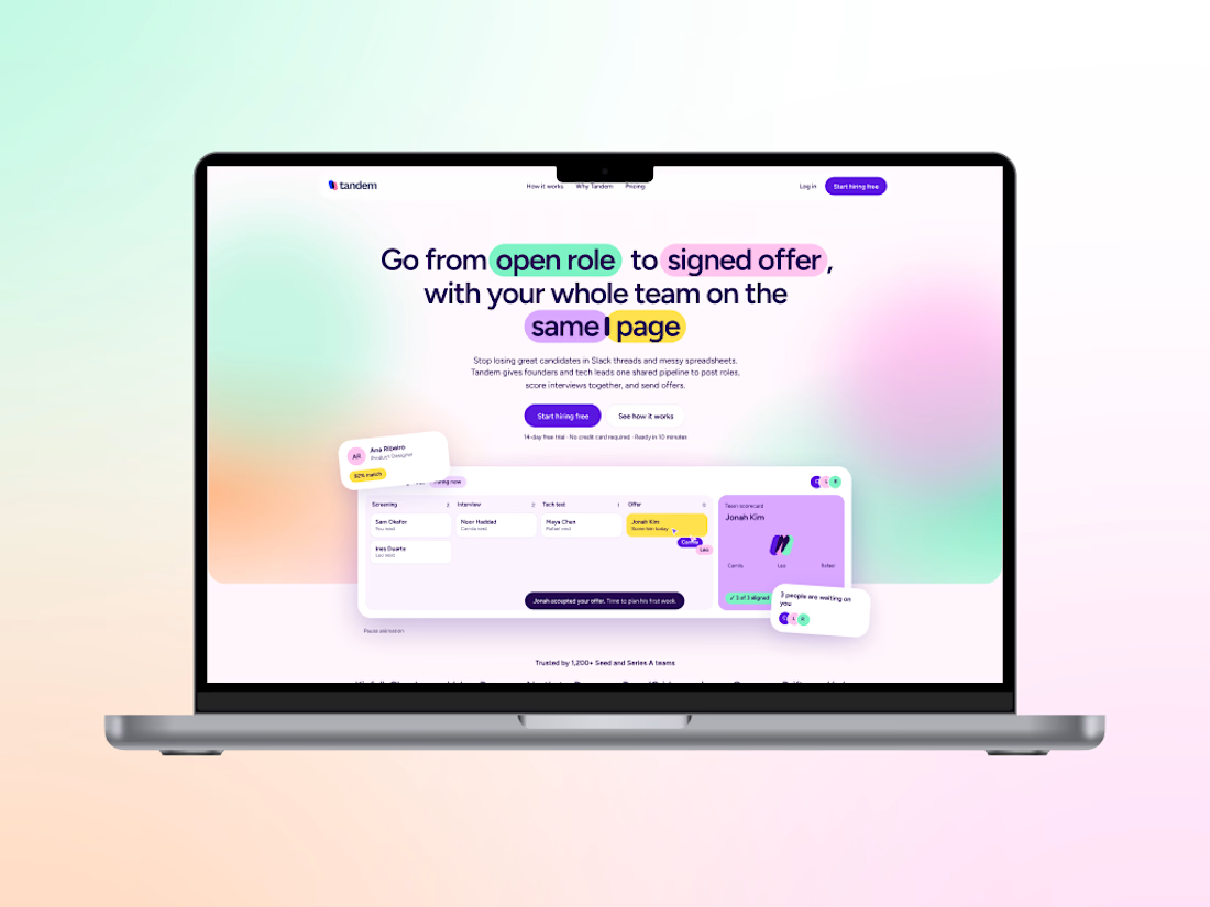
That happened to me on Tandem, a concept brand I made for a hiring app for small startups.
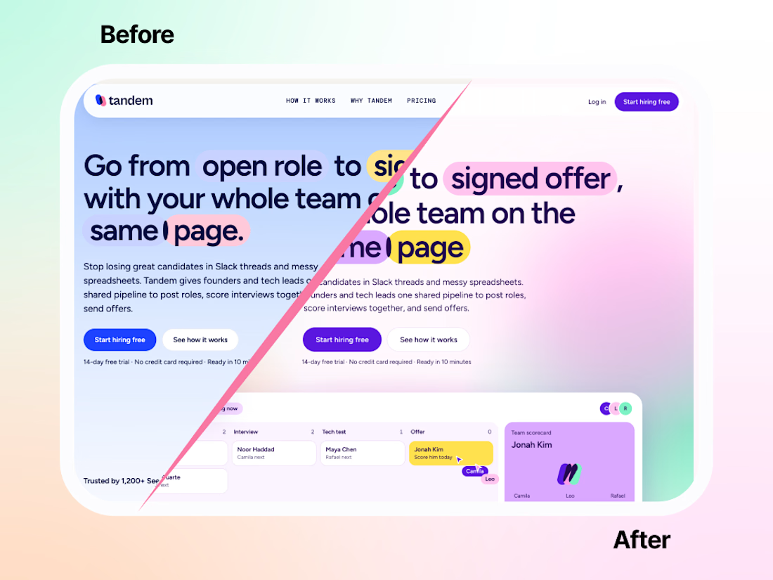
I had a direction I loved. In my head it made total sense. On the actual site? Flat. No energy. It looked like a brand that needed a nap. 😴
I tried fixing it. A little brighter here, a new shade there. It didn’t help. So I did the painful thing and started over.
Funny thing is, most of the ideas stayed. The pills still highlight the headlines (my favorite: in “same page,” one sits right between the two words). What changed was the palette. Soft colors melting into gradients, a dark violet holding everything together, and suddenly the characters and product screens had something to pop against.
Same bones, totally different energy.:
Honestly, starting over hurt for about an hour. Then it was the best decision on the project.
Fix it or start over: how do you decide?