The network for creativity
Join 1.25M professional creatives like you
Connect with clients, get discovered, and run your business 100% commission-free
Creatives on Contra have earned over $150M and we are just getting started
Back to feedPost

The second banner arrangement reads cleaner but the first one is more aesthetic-y

Same 18 seconds, two middles. One pulls you through a tunnel of banners, one lays them out. 1 or 2.
39 votes
Ends in 4h
The network for creativity
Join 1.25M professional creatives like you
Connect with clients, get discovered, and run your business 100% commission-free
Creatives on Contra have earned over $150M and we are just getting started


Related posts

Same Nexus layout, two color moods. 🎨
A: Forest Green 🌿 feels fresh, natural, and calm.
B: Ocean Teal 🌊 feels cool, deep, and techy.
Which one are you picking? Drop A or B below! 👇
#ColorExploration #UIDesign #BrandColor #DesignPoll
0 voted
0%
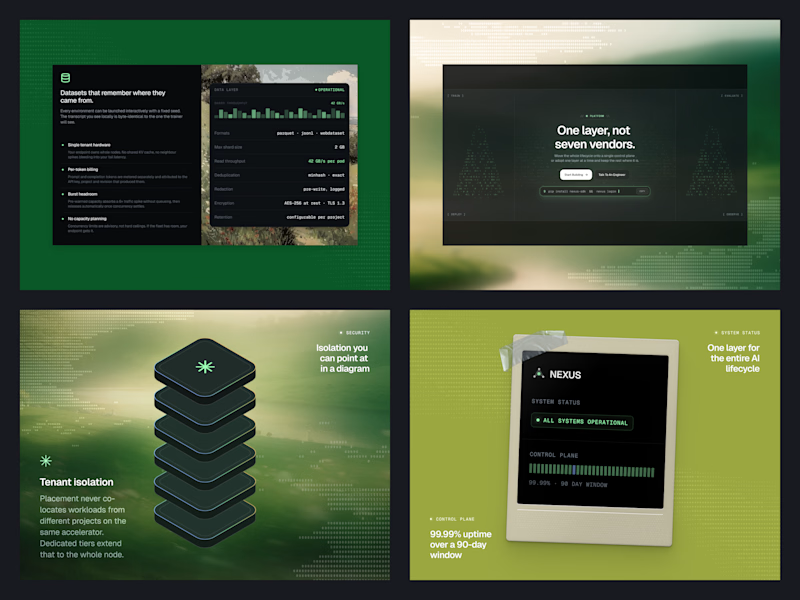
2 voted
100%
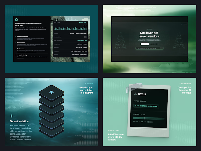
2 votes
Closed

B, Ocean Teal. It sits more calmly against the dark panels, the green gets a bit loud.

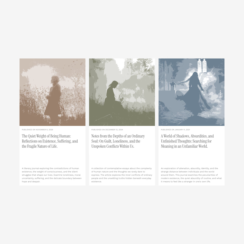
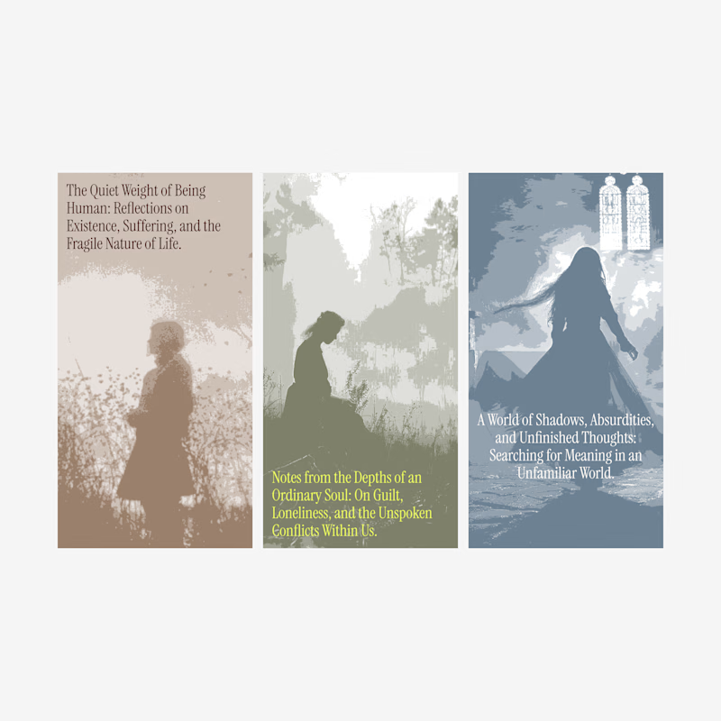
Blog card design.
Which one of these looks better?
1 voted
7%
13 voted
93%
14 votes
Closed

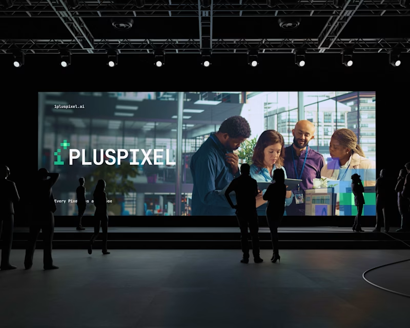
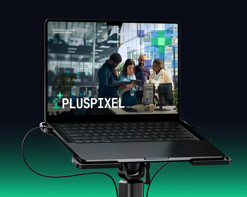
Same content, two different settings.
One designed to be seen on a big conference screen, the other experienced through a compact device. It's interesting how the same visuals can feel different depending on where they show up.
Which setting do you think brings the content to life better?
4 voted
57%
3 voted
43%
7 votes
Closed

Big screen 🔥