The network for creativity
Join 1.25M professional creatives like you
Connect with clients, get discovered, and run your business 100% commission-free
Creatives on Contra have earned over $150M and we are just getting started
Back to feedPost
DPISHOWCASE — Brand Identity
A bold visual identity designed to make ideas impossible to overlook.
DPI Showcase is a conceptual creative brand built around one simple idea: showcasing creative work in a way that feels energetic, modern and memorable.
For this identity, I wanted to move away from the typical clean-and-minimal creative industry aesthetic and create something with more personality. The visual language is based on a strong combination of red and yellow, geometric shapes and a distinctive symbol that can work independently from the wordmark.
The result is a flexible identity that feels playful and contemporary while remaining professional enough to work across digital and physical applications.
Visual Direction
Rather than relying on a neutral black-and-white identity, I built the visual direction around high-contrast red and yellow.
The combination creates an energetic and optimistic personality while giving the brand an instantly recognizable visual signature.
The red communicates energy, confidence and movement, while the yellow introduces warmth, creativity and a more playful character.
Together, they create a visual language that feels bold without becoming overly complicated.
The supporting neutral tones provide enough breathing room for the stronger colors and allow the identity to adapt to different compositions.
Graphic Language
To make the identity feel more distinctive, I developed a graphic system based on the logo symbol.
The rounded forms can be:
enlarged and cropped,
repeated into patterns,
layered,
rotated,
combined with photography,
used as framing elements,
or applied as subtle decorative details.
This creates a visual system that can continue to evolve beyond the original logo.
The goal was to make the brand recognizable even when the logo isn’t immediately visible.


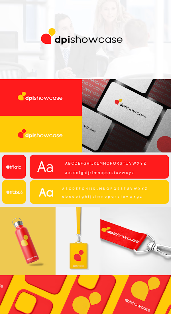

Making the symbol work independently of the wordmark is what usually decides whether a system like this survives small formats, and the lanyard and bottle shots suggest it does. Did you land on a rule for how much of a layout the red can take before the neutrals have to come in, or is that judged case by case?

Thank you for your comment! I didn’t define a specific rule for this; I just judged it case by case. :)
The network for creativity
Join 1.25M professional creatives like you
Connect with clients, get discovered, and run your business 100% commission-free
Creatives on Contra have earned over $150M and we are just getting started




Related posts

Brand Identity delivered by paper.


Love it🙌

I joined Contra just a week ago and have mostly shared the client branding work I do through Mariya Design.
But I haven't properly introduced the other branch of my practice yet:
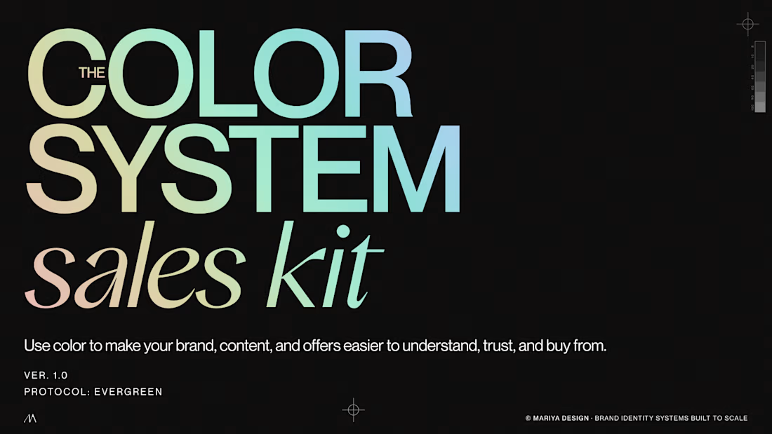
Color Systems by Mariya.
It started from something I kept running into in brand and packaging work: a color palette can look beautiful and still be surprisingly difficult to use.
So I began building systems around color instead of collecting combinations.
Today that includes:
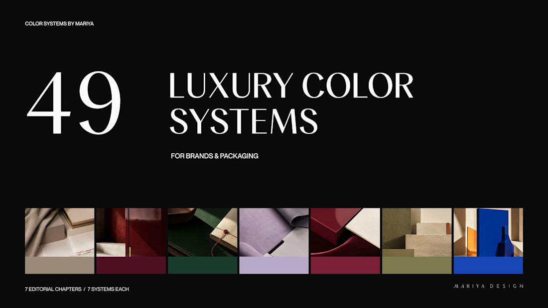
/49 Luxury Color Systems
Role-led color systems for branding and packaging.
/365 Cultural Color Palettes
A growing archive of color directions inspired by places, objects, materials and visual culture around the world.
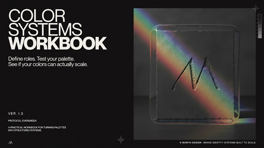
/Color Systems Workbook
A free tool for turning color inspiration into a usable system.
/Color System Sales Kit
A practical tool for designers presenting and selling color direction to clients.
I'll share some of the systems, visual references and thinking behind them here over the next few weeks.
If you're a designer, brand strategist or just slightly obsessed with color, this side of my work is probably for you.
Color Systems by Mariya
mariya.design/color-systems


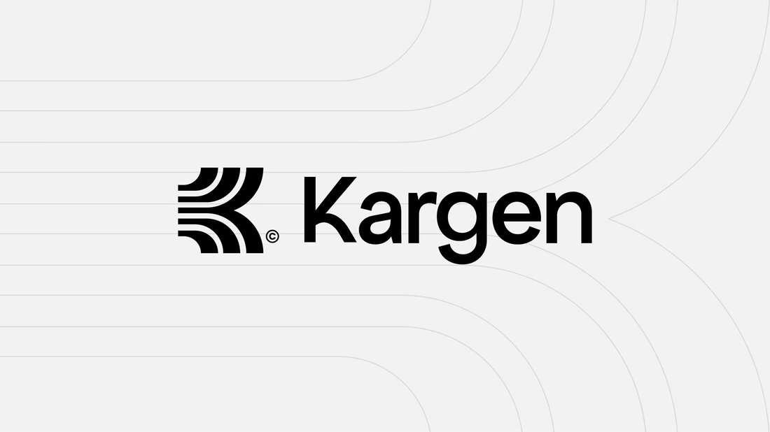
One of the directions I explored for Kargen. It didn't make the final cut, but I think it holds up. We decided to go totally different route.
Kargen is an AI that books freight on its own. It reads the email, quotes the load, and books the truck, day or night. The brand had to feel as fast as the product, but calm with the pace.

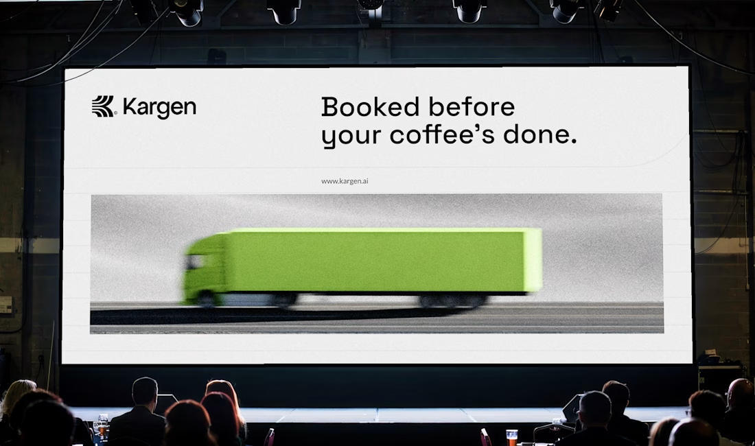
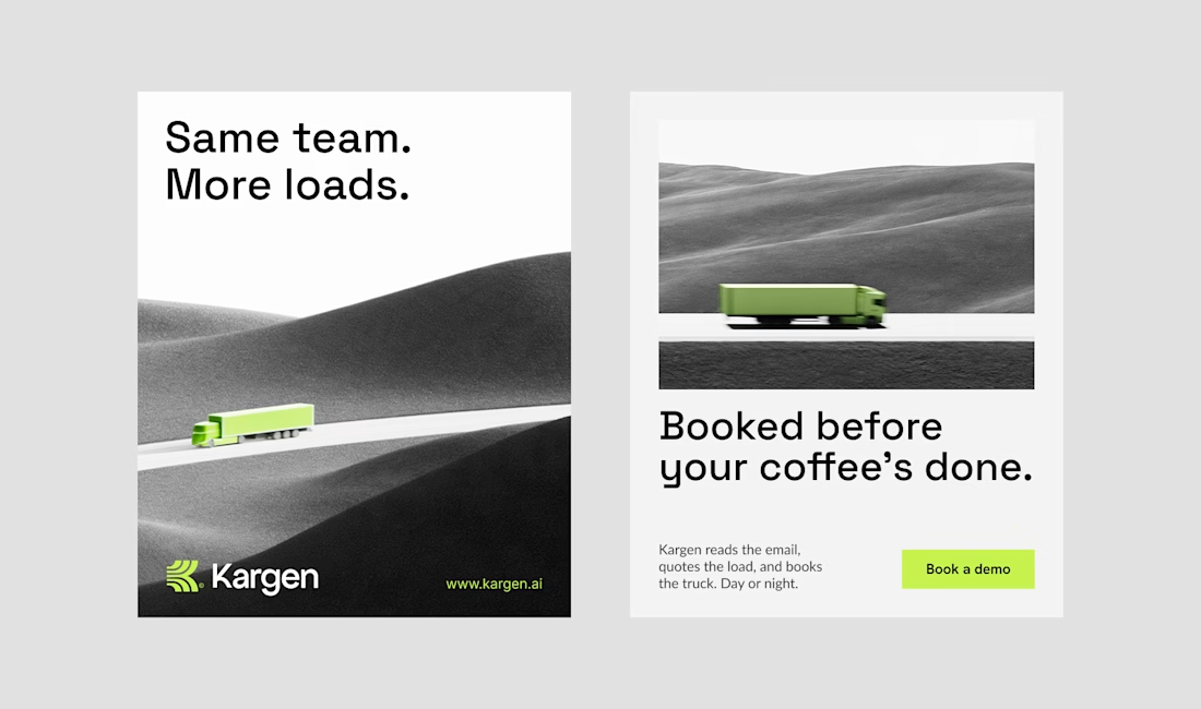

Sick 🔥