The network for creativity
Join 1.25M professional creatives like you
Connect with clients, get discovered, and run your business 100% commission-free
Creatives on Contra have earned over $150M and we are just getting started
Back to feedPost

🎨 Talent Marketplace Platform — UI Design Exploration
Hi everyone! 👋
Sharing some insights from a recent marketplace design exploration — a talent marketplace platform built to connect businesses, startups, and individuals with skilled UI/UX designers. 🚀
🎯 The Concept
The idea was to make finding the right design talent feel effortless. Whether you're a startup hunting for your first designer or a business scaling your team, the platform bridges that gap with a smooth, intuitive experience. 🤝
🎨 The Design Direction
✨ Clean, modern style — clarity and focus in every screen
🌈 Bright accent colors — fresh, energetic, and inviting
📐 Strong visual hierarchy — easy browsing from search to hire
💼 Purpose-built layouts — designed around real user needs
The result is a fresh, welcoming marketplace experience that feels professional yet approachable. 🔥
What do you think? Let me know in the comments! 💬
Feel free to leave feedback, press (L) if you like it ❤️, and don't forget to follow our Contra account for more!
UI Designer: Mudassir 🎨


The network for creativity
Join 1.25M professional creatives like you
Connect with clients, get discovered, and run your business 100% commission-free
Creatives on Contra have earned over $150M and we are just getting started



Related posts


A bold, modern landing page for a creative agency, built around immersive visuals and strong typography. We’d love to hear your thoughts!


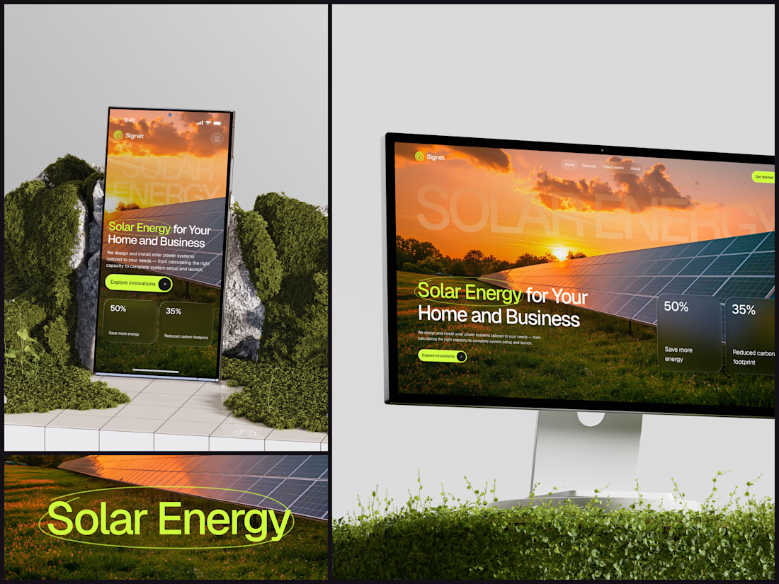
Solar Energy Website
A thin lime circle tells you which two words this page is about.
The headline sits over a sunset photo of a panel field. The "Get started" and "Explore innovations" buttons share the circle's lime, so the eye moves from the circled words straight to the next step.
Large faded capitals repeat those two words across the sky, faint enough to stay inside the photo. On mobile they break onto two lines, and the headline and button stack above two frosted cards.
Only two words of "Solar Energy for Your Home and Business" are lime, and the whole page follows them.
Designed by the Hue & Machine team.
#SolarEnergy #RenewableEnergy #CleanTech #WebDesign #LandingPage #HeroSection #UIDesign #ResponsiveDesign #MobileDesign #FigmaDesign



This is really cool, Nice job Dmytro


Really impressive work! Your creative approach and attention to detail are worth appreciating.


