The network for creativity
Join 1.25M professional creatives like you
Connect with clients, get discovered, and run your business 100% commission-free
Creatives on Contra have earned over $150M and we are just getting started
Back to feedPost
Taste Test

The network for creativity
Join 1.25M professional creatives like you
Connect with clients, get discovered, and run your business 100% commission-free
Creatives on Contra have earned over $150M and we are just getting started





Related posts


A calm, editorial landing page for an architecture studio, built around daylight and materials. We'd love to hear your thoughts! 🏛️


The warm timber slats against the pale page feel calm. Did you build the motion in Jitter?


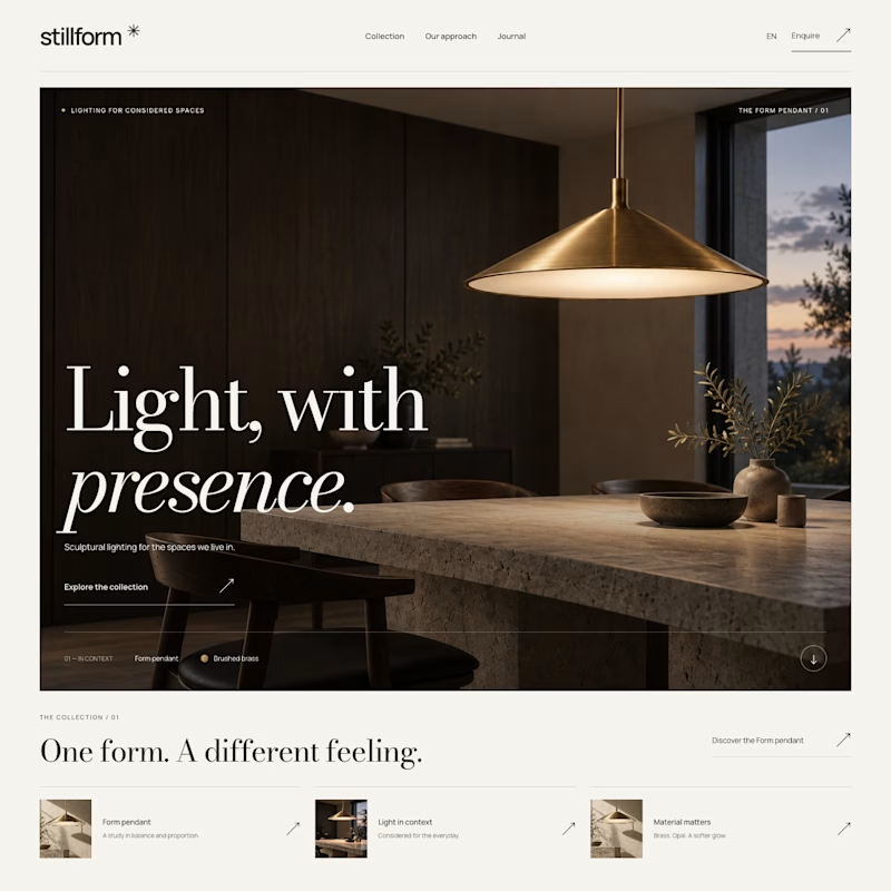
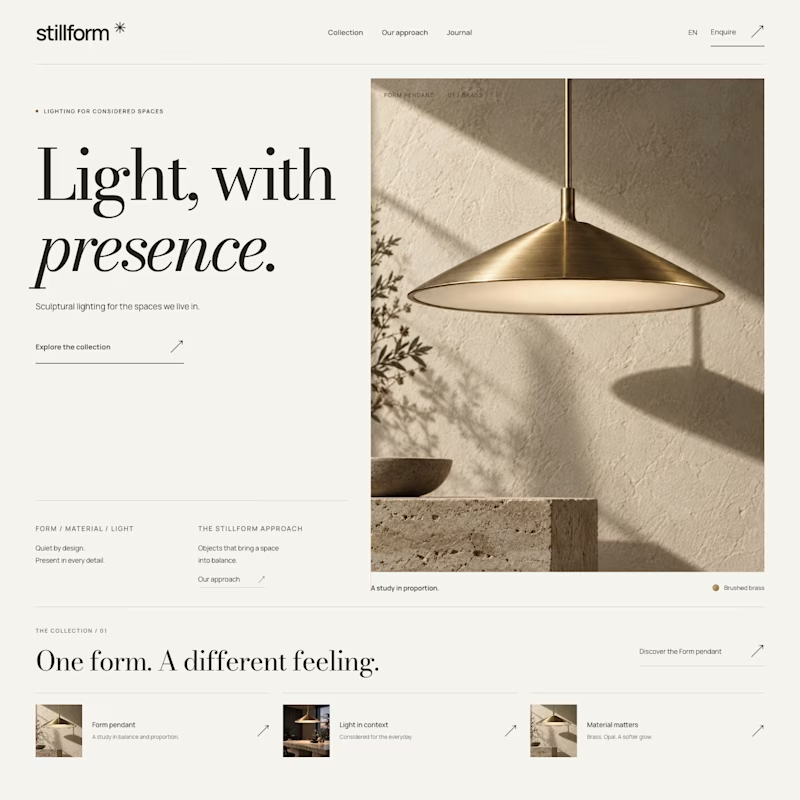

Atmospheric, and it was the photography that decided it. A lamp is a product you buy for what it does to a room, so seeing the warm glow pooling across a dark surface sells the feeling before the layout even registers. Sculptural is gorgeous but shows the object, Atmospheric shows the outcome.


Another successful launch 🚀
For MindAbility, we went from Figma design to a fully built Kajabi experience – website pages, course design, offers, forms, and automations.
The result is a clean, connected platform that’s easy to manage and ready to grow into new regions.


The interaction between the typography, imagery, and spacing works really well.


