The network for creativity
Join 1.25M professional creatives like you
Connect with clients, get discovered, and run your business 100% commission-free
Creatives on Contra have earned over $150M and we are just getting started
Back to feedPost
Taste Test

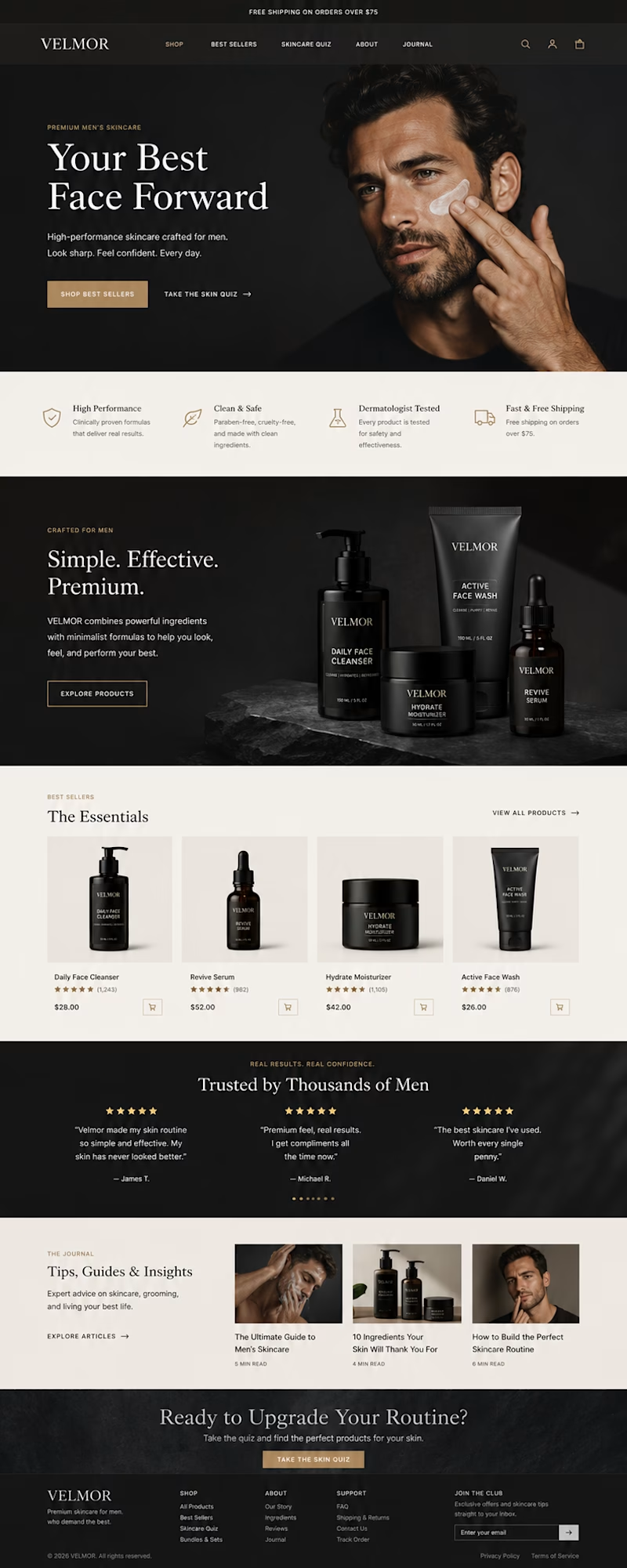
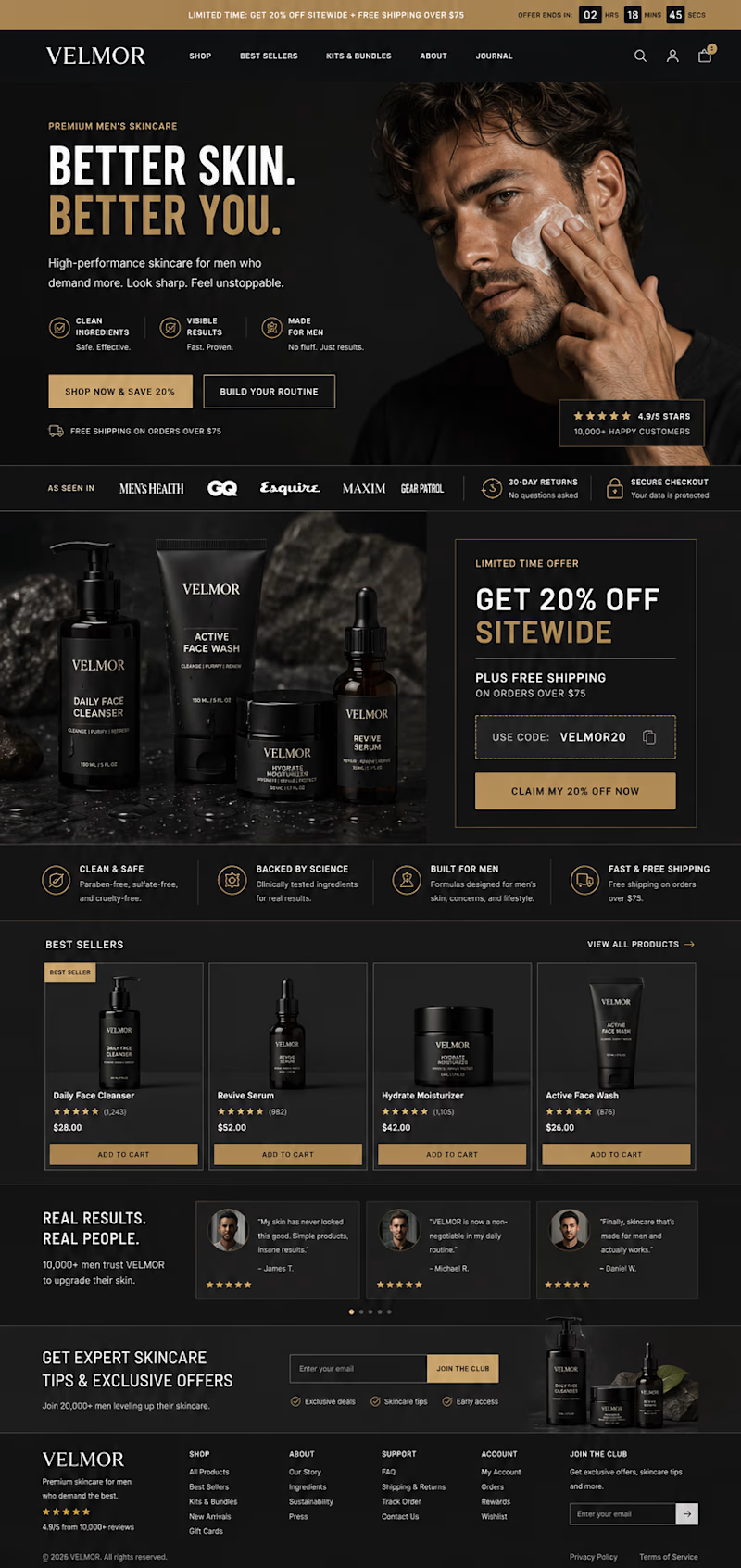
For an eCommerce brand, design should not only look good — it should build trust, explain the product clearly, and make buying feel easy.
Which version would you choose
A or B? 👀

9 voted
100%
0 voted
0%
9 votes
Closed

I will take A

A looks more inviting!

Nice work!
The network for creativity
Join 1.25M professional creatives like you
Connect with clients, get discovered, and run your business 100% commission-free
Creatives on Contra have earned over $150M and we are just getting started





Related posts

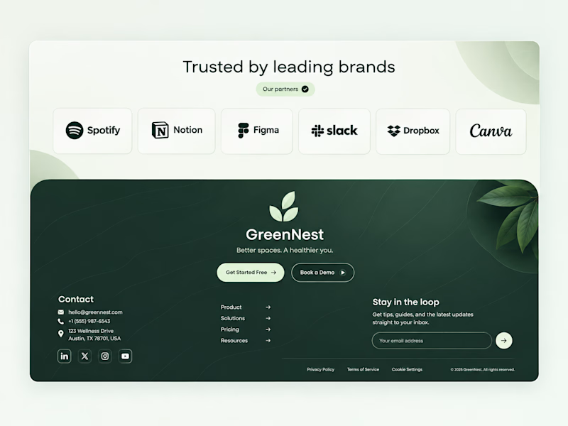
Both on-brand. Just two different sides of the same story.
Which color would make you trust "better spaces, a healthier you" more? 👇

44 voted
100%
0 voted
0%
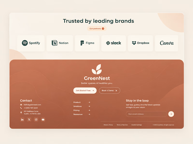
44 votes
Closed


Which Kajabi sales page design would you choose for this course? Vote for A or B and tell me what made the difference.

23 voted
50%
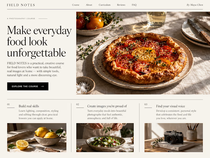
23 voted
50%
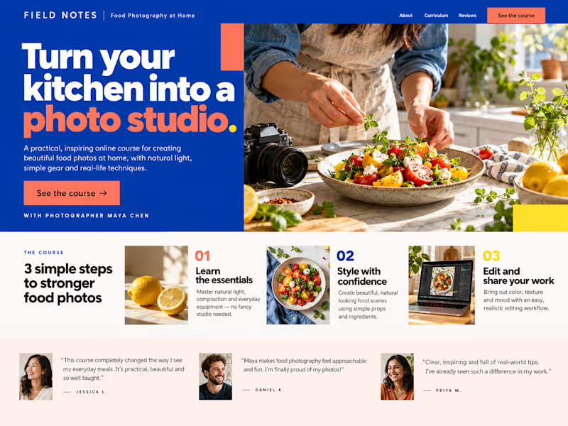
46 votes
Closed

B still could be polished though...maybe try giving the text section little bit more real estate..I don't know

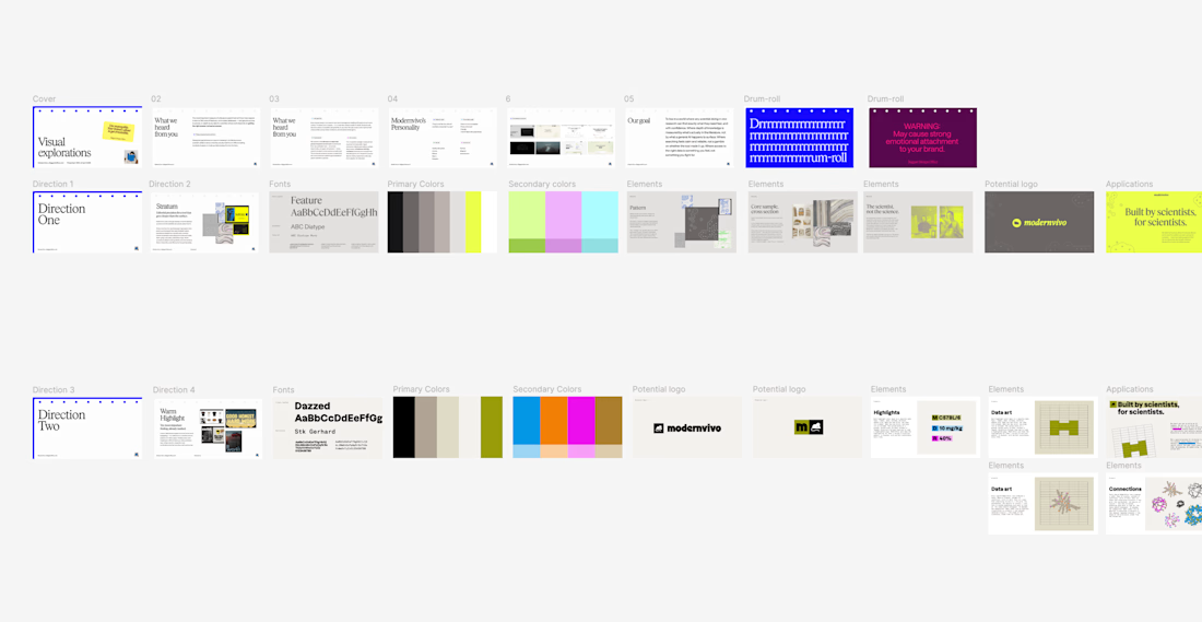
after presenting more brand directions than I can count, one thing I’ve learned: I never jump straight into showing the visuals.
first I want to establish what we're actually trying to solve.
what we heard from the client. what they want to be known for. where they sit in the market. what needs to feel different.
then the big idea, and how it translates into type, colour, imagery and graphic elements.
only then the designs.
context changes how you judge the work.