The network for creativity
Join 1.25M professional creatives like you
Connect with clients, get discovered, and run your business 100% commission-free
Creatives on Contra have earned over $150M and we are just getting started
Back to feedPost

Most design-resource platforms play it safe — clean grids, muted colors, restrained type.
This one does the opposite: oversized type filling the whole screen, saturated navy + orange, zero apology.
Sometimes "loud" is the right brand decision. 🔶


Okay but you do have a literal grid in the background though 😉

Bold move breaking away from muted layout norms! How did you balance the massive kinetic type with maintaining clean functional UX?
The network for creativity
Join 1.25M professional creatives like you
Connect with clients, get discovered, and run your business 100% commission-free
Creatives on Contra have earned over $150M and we are just getting started
Trending
retrofuturism
Share your favorite designs from the past exploring the distant future. Or your own take on the aesthetic 🚀
halftone
Dots. Texture. Grain. Let's see your designs using the halftone technique.

Midjourney
Creatives are showing off what they're making with Midjourney.
colorgrade
Video editors sound off: How do you enhance the mood of your video in color grading?


Related posts

Finally got to put the full ASTRAL case study together.
What started as a Framer template slowly turned into its own little world, identity, art direction, a fictional audio product, packaging, and the digital experience around it.
Had way too much fun obsessing over the tiny details on this one.


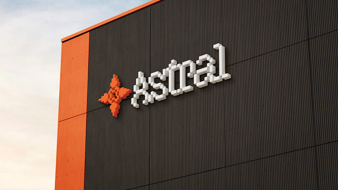
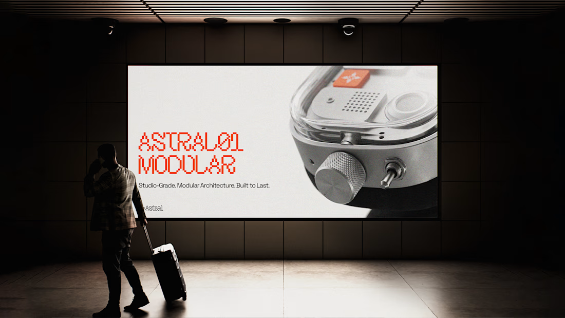
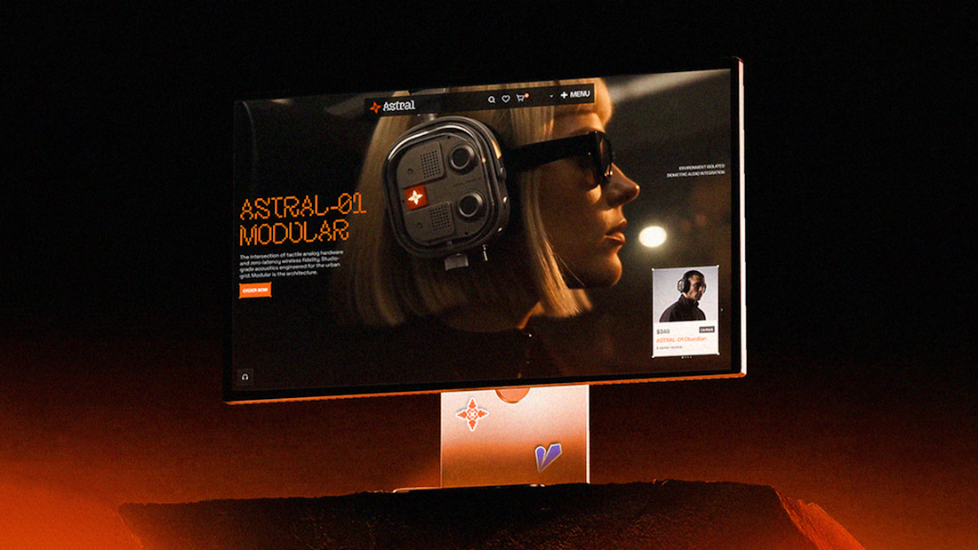

This is such a strong visual direction. Love how ASTRAL feels like a real brand and product, not just a concept piece. The whole world around it is insanely well thought out 👏

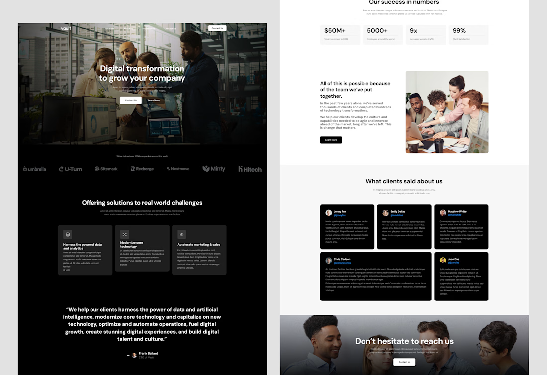
Digital Transformation Company Website Landing Page. 👇
A modern and professional digital transformation website designed to present the company’s expertise, solutions, and business impact. The landing page combines a bold hero section with clear service offerings, trusted client logos, success metrics, testimonials, team-focused visuals, and strong call-to-action sections to build credibility and encourage potential clients to connect. 🚀

Brand Manual & Photoshoot Guidelines for Tre Sorelle
Check it out


