The network for creativity
Join 1.25M professional creatives like you
Connect with clients, get discovered, and run your business 100% commission-free
Creatives on Contra have earned over $150M and we are just getting started
Back to feedPost


Beautiful!

thank you!
The network for creativity
Join 1.25M professional creatives like you
Connect with clients, get discovered, and run your business 100% commission-free
Creatives on Contra have earned over $150M and we are just getting started



Related posts

Photographer Portfolio Website
"Capturing light, emotion, and the moments you never want to forget." That line set the tone, and the layout follows it.
The hero is one motion-blurred portrait washed in red. The photographer's name runs across the bottom in a condensed white face, so large the screen cuts it off. The photo keeps its soft focus, and the name still reads first.
Thin grid lines split the page into narrow columns, and the small copy sits justified inside them. The loose photo gets a strict structure to lean on.
A single round red button with an arrow sits right on the letters and marks where to go next.
Designed by the Hue & Machine team.
#WebDesign #Photography #PortfolioWebsite #EditorialDesign #Typography #UIDesign #ProductDesign #CreativeDirection #ResponsiveDesign #FigmaDesign


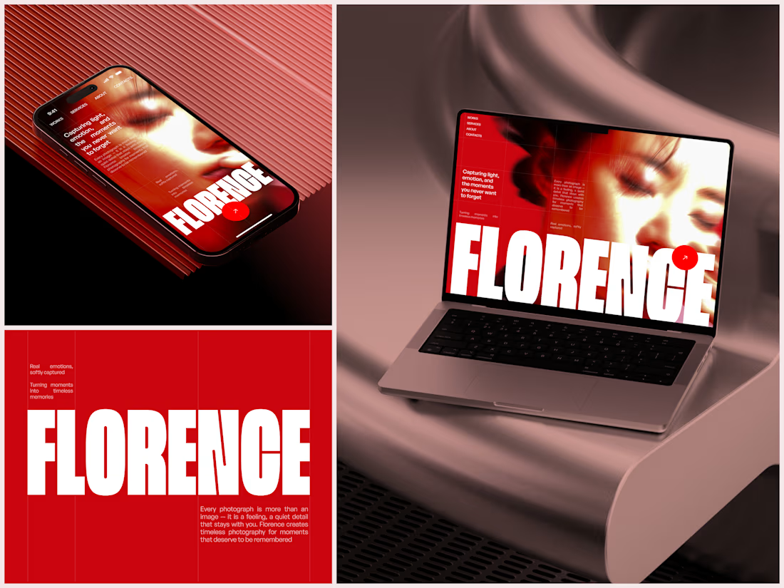

The heavy condensed white FLORENCE over the red portrait is bold, and keeping the same red across phone, laptop and type tile makes the case study read as one system. Did the red come from the photographer's own work, or was it your call?

Transforming Product Photography into a High-Impact Instagram Post
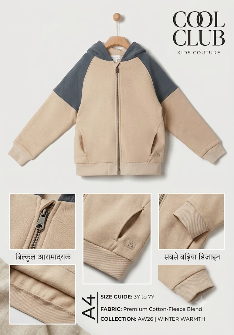
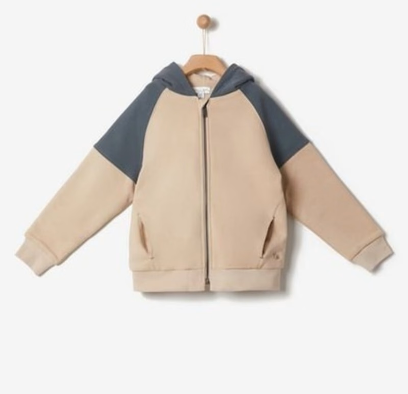
When we received the simple product image of this kids' hoodie, our primary goal was to elevate it from a basic catalog shot into an engaging, eye-catching social media post.
Strategic Layout & Composition: We chose a vertical A4 format, which is a perfect fit for Instagram reels, carousels, and promotional posts. At the top, the product is cleanly positioned against a neutral background to maintain the brand's aesthetic



🛥️ LUXURY CRUISE POSTER - Premium $5000+ Ticket Design!
Designed this premium Ocean Luxury Cruise poster - golden hour sunset + luxury yacht - sells high-ticket $5000+ voyages!
Why this luxury design sells:
✅ Golden hour sunset + luxury yacht = $5000+ feeling instantly
✅ Gold UP TO 40% OFF - elegant gold, premium not cheap
✅ Top line - EXPLORE THE MEDITERRANEAN • CARIBBEAN • BEYOND - dream destinations
✅ Luxury badges - ALL-INCLUSIVE 7-14 DAY VOYAGES • PRIVATE SUITES & SPA • GOURMET DINING
✅ Gold border + navy blue - luxury cruise brand colors
✅ Two CTAs - BOOK NOW • LIMITED CABINS + RESERVE YOUR VOYAGE - urgency
Previous version: 146 views, 3 likes - luxury niche performs best for high-ticket!
Perfect for luxury travel brands, yacht charters, cruise agencies.
Tools: Photoshop, Lightroom, Illustrator - 8K Ultra HD


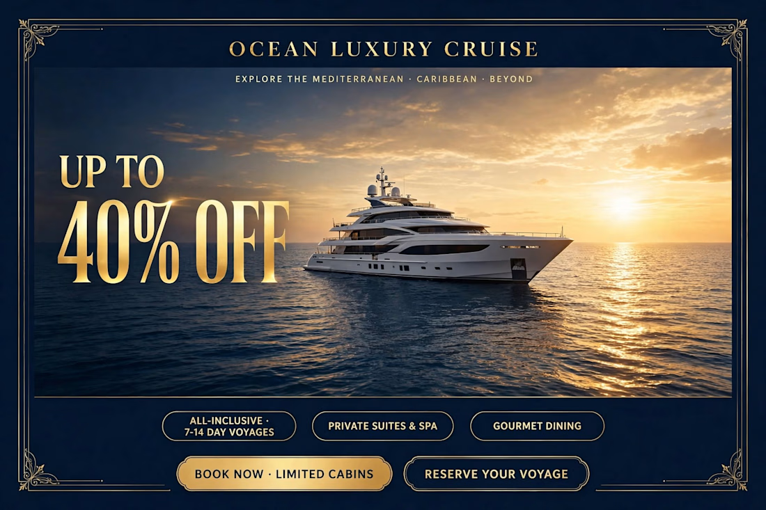
Gold type on deep navy with the sunset glow makes "40% OFF" the first thing I read. The two CTAs at the bottom compete a bit, would you test a single Book Now?