The network for creativity
Join 1.25M professional creatives like you
Connect with clients, get discovered, and run your business 100% commission-free
Creatives on Contra have earned over $150M and we are just getting started
Back to feedPost

Project: Healthcare Companion App — Patient Dashboard & Onboarding
Overview
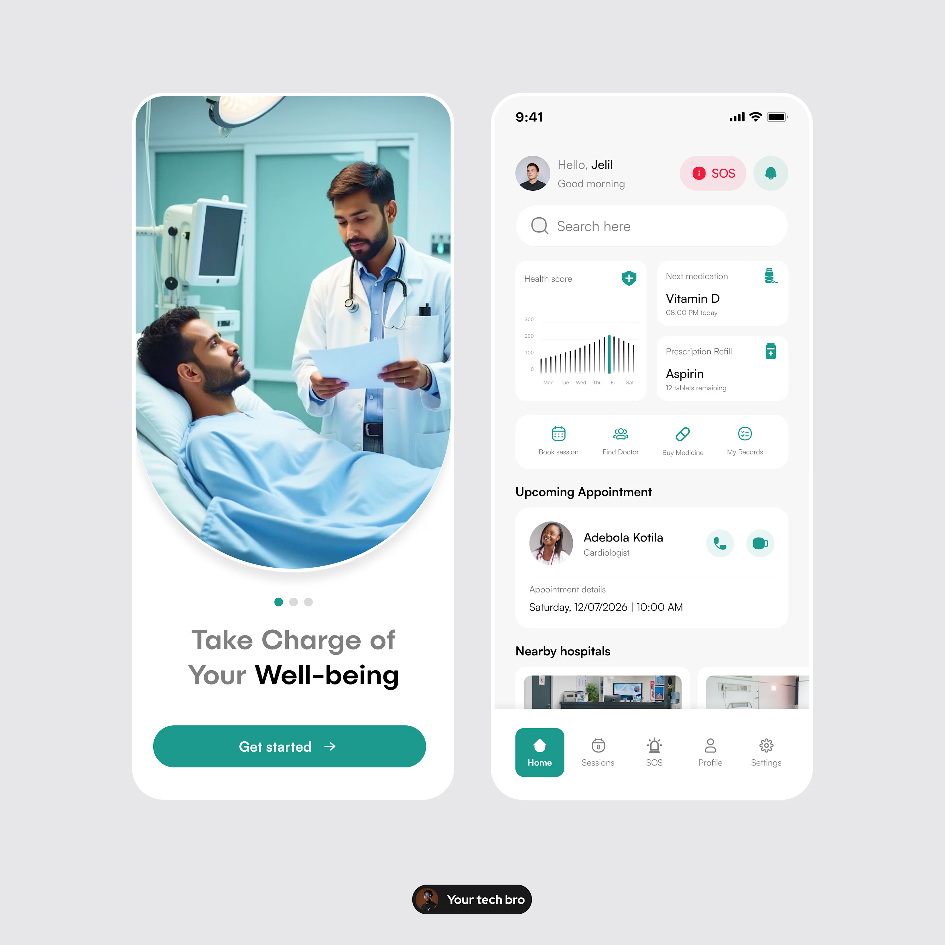
Designed a mobile health app that helps patients manage medications, appointments, and emergencies from one central dashboard. The goal: reduce friction for users who are often stressed, unwell, or short on time.
Problem
Health apps tend to either overwhelm users with data or bury critical actions (like emergency access) too deep in the navigation. Patients needed a system that felt calm, clear, and fast to act on.
Solution
Onboarding built around human trust: a doctor-patient visual before any feature explanation, setting an emotional tone before a functional one.
Home dashboard surfaces the essentials immediately: health score trend, next medication, prescription refill status, all above the fold.
One-tap SOS access, persistent in the header, not hidden in settings or menus.
Appointment cards include the doctor's photo and specialty, reducing the disconnect between an app and real care.
Quick-action shortcuts (Book session, Find Doctor, Buy Medicine, My Records) reduce navigation depth for common tasks.
Outcome
A clean, trustworthy interface that treats health management as something the user can act on quickly, not a dashboard they have to interpret.
Tools: Figma
Role: Product Designer (UI, UX, prototyping)
If you're building a healthcare, wellness, or patient-facing product and want an interface people actually trust, let's talk.

The network for creativity
Join 1.25M professional creatives like you
Connect with clients, get discovered, and run your business 100% commission-free
Creatives on Contra have earned over $150M and we are just getting started

Related posts


Professional work

A few things we’ve been working on this month.
Different industries, different problems, but the same goal: making complex products feel simple, clear, and trustworthy.
Fintech → Investment Banking → Geospatial AI
More projects are still in progress.
Full case studies coming soon.






This is the kind of work I enjoy seeing — simple, focused, and actually thought through.


Does an AI brand still need to look like an AI brand?
Lupr helps small and growing businesses adopt AI without the complexity, so the identity needed to do the same.
We built a clean, approachable system around movement, connection and continuous improvement, without leaning on the usual futuristic tech clichés.
The idea was simple: make AI feel like useful business infrastructure, not something you need to be an expert to understand.
As AI becomes part of everyday business, do you think brands still need to visibly signal “AI”?
Full case study below 👇


Great design it feels alive 🎉🎉❤️❤️





