The network for creativity
Join 1.25M professional creatives like you
Connect with clients, get discovered, and run your business 100% commission-free
Creatives on Contra have earned over $150M and we are just getting started
Back to feedPost

SOMA is a foundation of structural clarity and digital precision, representing a unified body where complex utility meets minimalist form. This minimalist logo identity is defined by geometric reduction and functional weight, stripping away the non-essential to focus on a singular, monolithic presence.
The logo design utilizes high-contrast iconic mass and a strict monochrome palette (#191919 / #FFFFFF) to eliminate visual noise. Built on a grid-first structure with Helvetica Now Display typography, the 1:1 modern vector system ensures total integrity across all technical and abstract app icon applications.
© 2026 Anh Do — Anhdodes


The Story Is Excellent 👌 Minimalist S and O
The network for creativity
Join 1.25M professional creatives like you
Connect with clients, get discovered, and run your business 100% commission-free
Creatives on Contra have earned over $150M and we are just getting started






Related posts

My latest branding project for the Atlanta Museum of Paleontology.
Check out the full project at maximjungle.com

A T-rex drawn in one thin outline is such a good mark 🦖 I'd happily visit that museum.


How far can you take a logo beyond the first draft?
I started with Recraft's Logo Maker and a fictional idea: Bibu's Paws, a cosy little dog rescue and adoption shelter.
I wanted the identity to feel warm, homely and full of character, so I explored a few logo directions before settling on the little dog tucked inside a house.
From there, I took the idea further, building out the visual identity with an earthy colour palette, typography, illustrations and a few real-world applications: the shelter space, dog merchandise and an adoption welcome kit.
I enjoyed seeing how a small starting point could grow into a brand with its own personality and world.
Now I'm curious: if you were building a brand around this logo, what would you create next?






It turned out so cozy, you did great

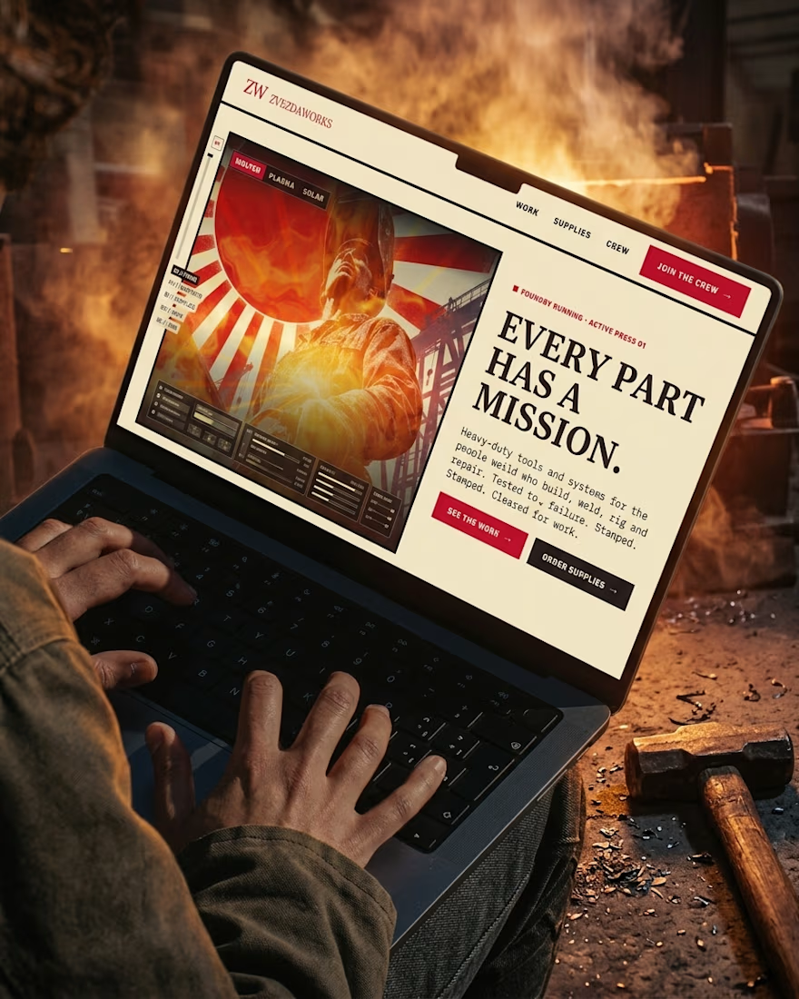
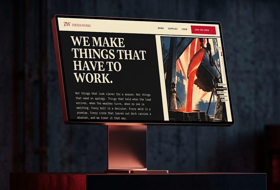
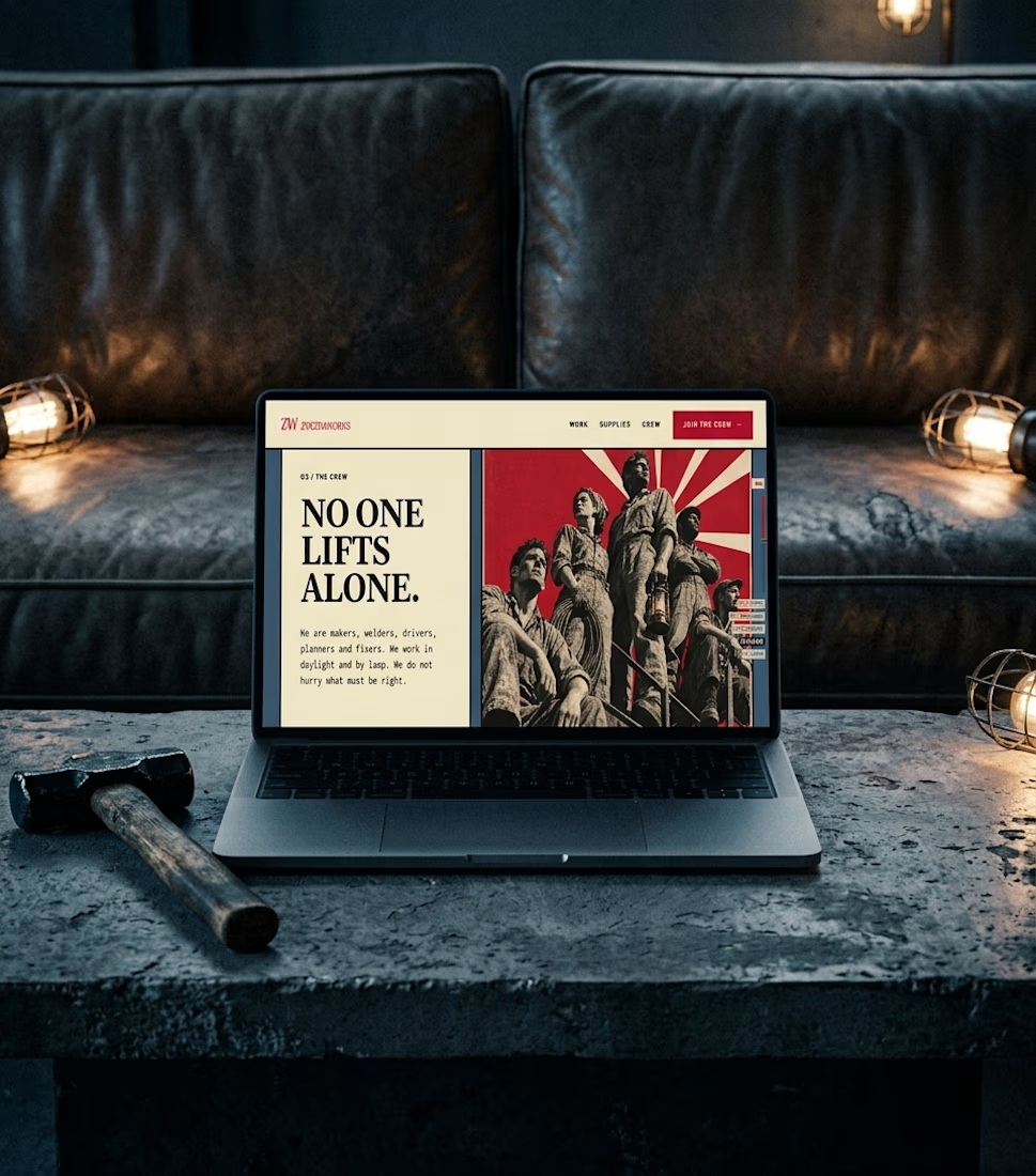
Ever wondered what a space-race poster would sell if it sold hammers?
The Zvezda Works case study answers that, and it’s nearly here.
Watch this space.