The network for creativity
Join 1.25M professional creatives like you
Connect with clients, get discovered, and run your business 100% commission-free
Creatives on Contra have earned over $150M and we are just getting started
Back to feedPost

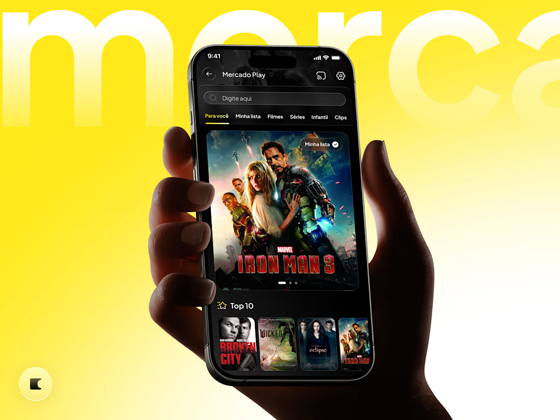
Mercado Play, reimagined in dark mode. 🎬🌙
This concept started with a feature I missed in the app: a dark theme built around the streaming experience.
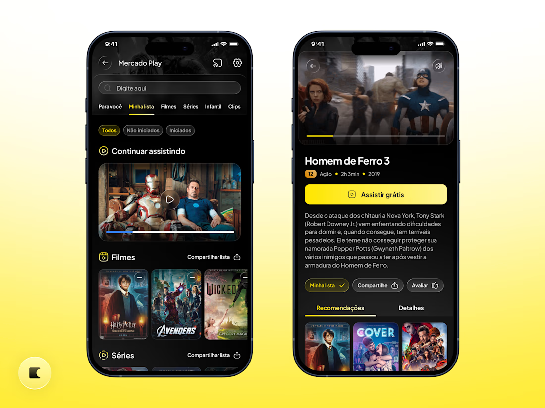
I chose darker surfaces to give movie artwork more presence, reduce visual distractions, and create a more cinematic atmosphere. The signature yellow remains an accent, highlighting key actions and keeping the brand recognizable.
Beyond the palette, I refined components with a purpose:
✦ Larger featured artwork for stronger visual impact.
✦ Clearer navigation and selected states to guide browsing.
✦ Watchlist filters and visible playback progress to support returning viewers.
✦ A prominent “Watch for free” button to communicate the offer immediately.
The goal: make the experience feel more polished and immersive, strengthening its perceived value while keeping the content at the center.
An independent redesign concept exploring visual direction and interaction ideas.
Would you use Mercado Play in dark mode? 👇


Super clean mobile layout!

Dark mode here works because the artwork carries the screen. Bigger featured posters and visible playback progress are the two picks I would actually notice day to day.
The network for creativity
Join 1.25M professional creatives like you
Connect with clients, get discovered, and run your business 100% commission-free
Creatives on Contra have earned over $150M and we are just getting started





Related posts


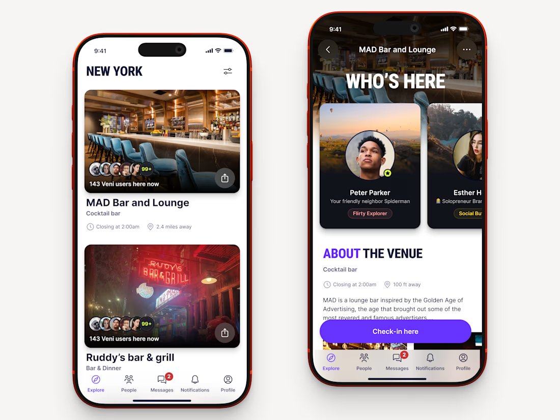
Recently worked on a mobile app for local networking.
Find venues (bars, clubs, conference halls, etc..) nearby, see who's there and connect.


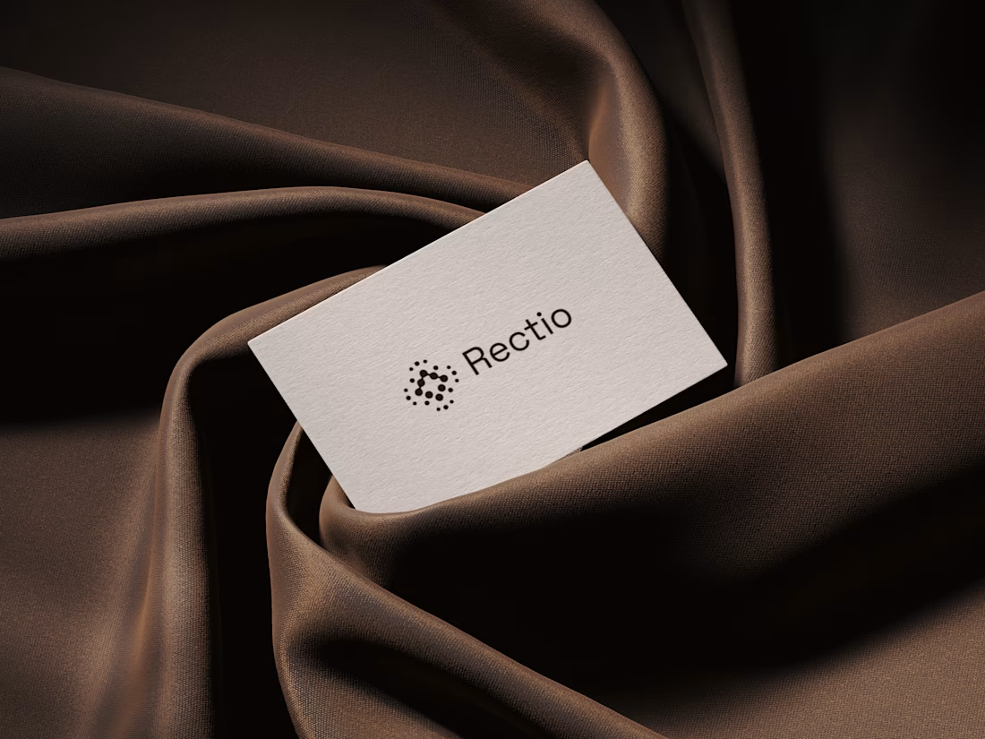
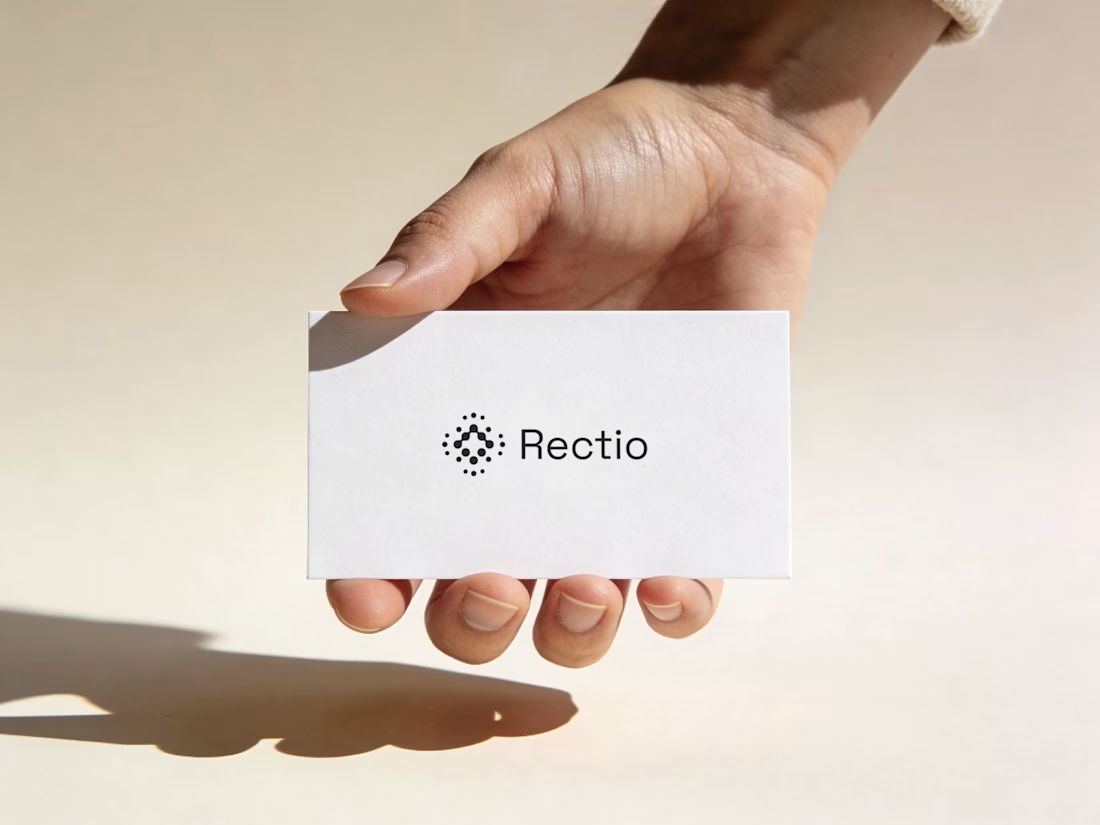
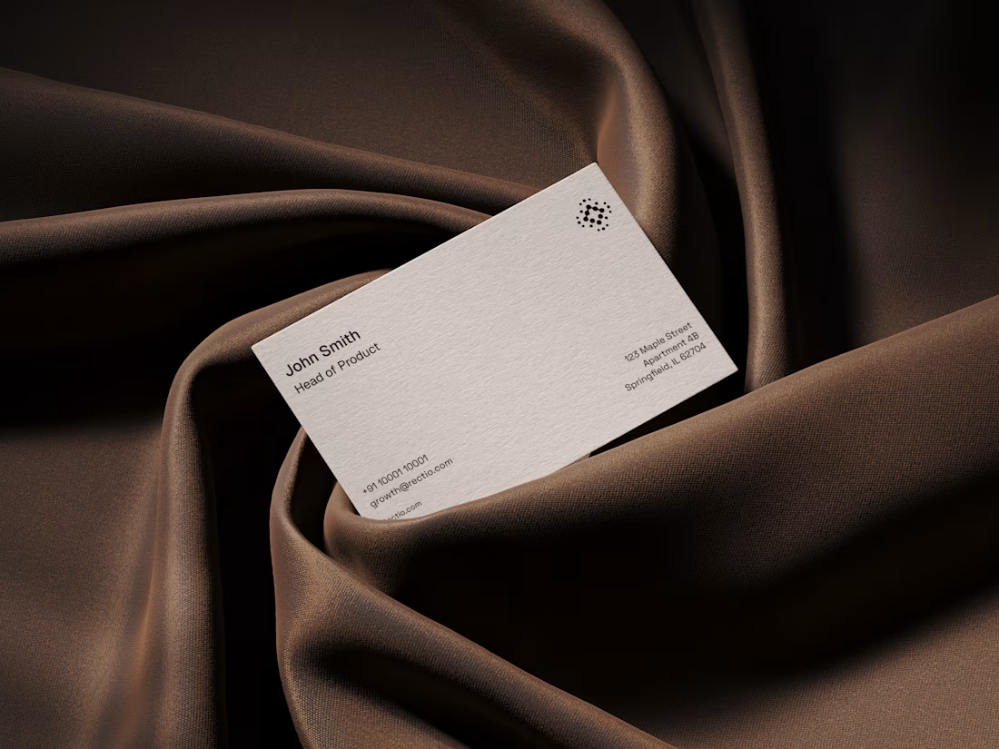
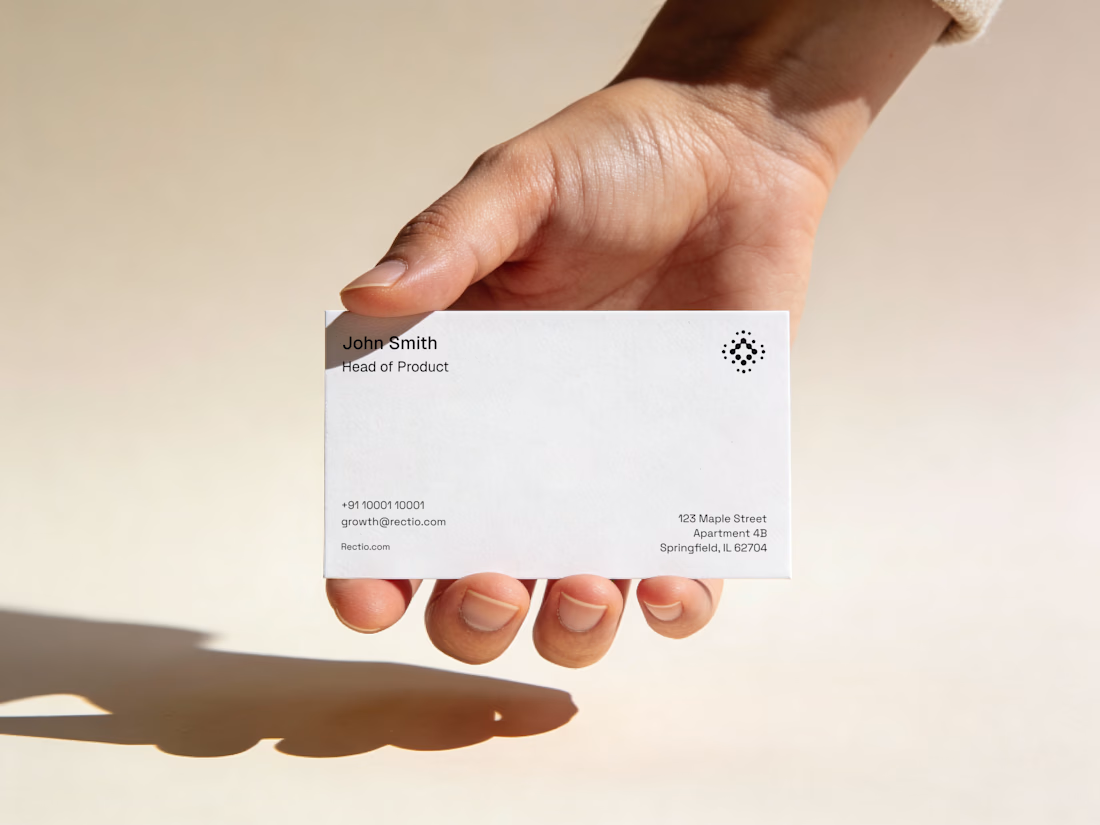
Rectio — Brand Identity
Brand Identity • Visual Direction • Business Cards • Mockups
A modern and minimal branding direction for Rectio, from visual identity to business card applications.
Created by Artonest Design Studio — artonest.design



Bring back mascot logo's 🙌
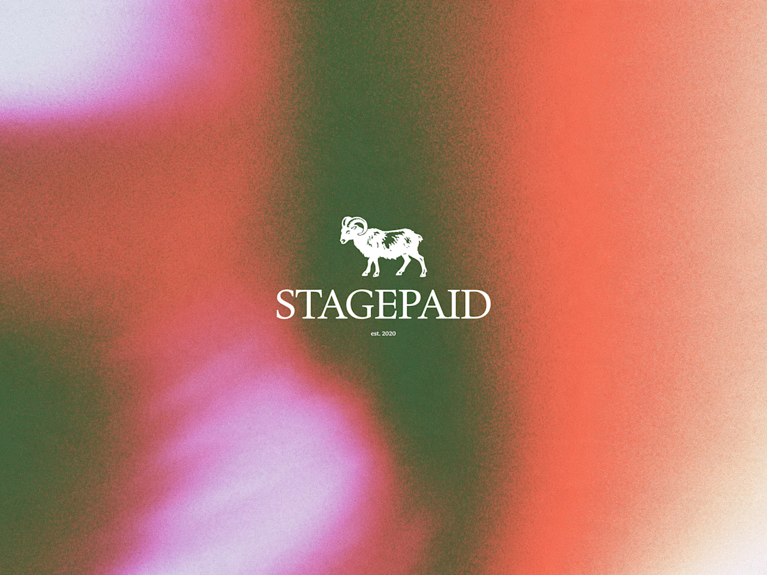
Ram logo 'Stagepaid'.




cool work! love mascot logos :D