The network for creativity
Join 1.25M professional creatives like you
Connect with clients, get discovered, and run your business 100% commission-free
Creatives on Contra have earned over $150M and we are just getting started
Back to feedPost

Another site, another story brought to life. 🌆
This one's called Old Town Park, built with smooth animations, a bold portfolio section, and a clean team/testimonial layout that makes visitors trust the brand instantly.
Website design isn't just about looking good, it's about guiding visitors toward taking action.
Want a site like this for your business?
DM me now or message me via whatsapp +234 812 303 2043
#WebsiteDesign #WebDev #PortfolioSite #FunnelTech #UIUX #SmallBusinessWebsite
The network for creativity
Join 1.25M professional creatives like you
Connect with clients, get discovered, and run your business 100% commission-free
Creatives on Contra have earned over $150M and we are just getting started

Challenges
View all


Related posts


Engaging website for a New York–based architecture and construction studio, balancing bold typography, immersive imagery and a minimal editorial layout.


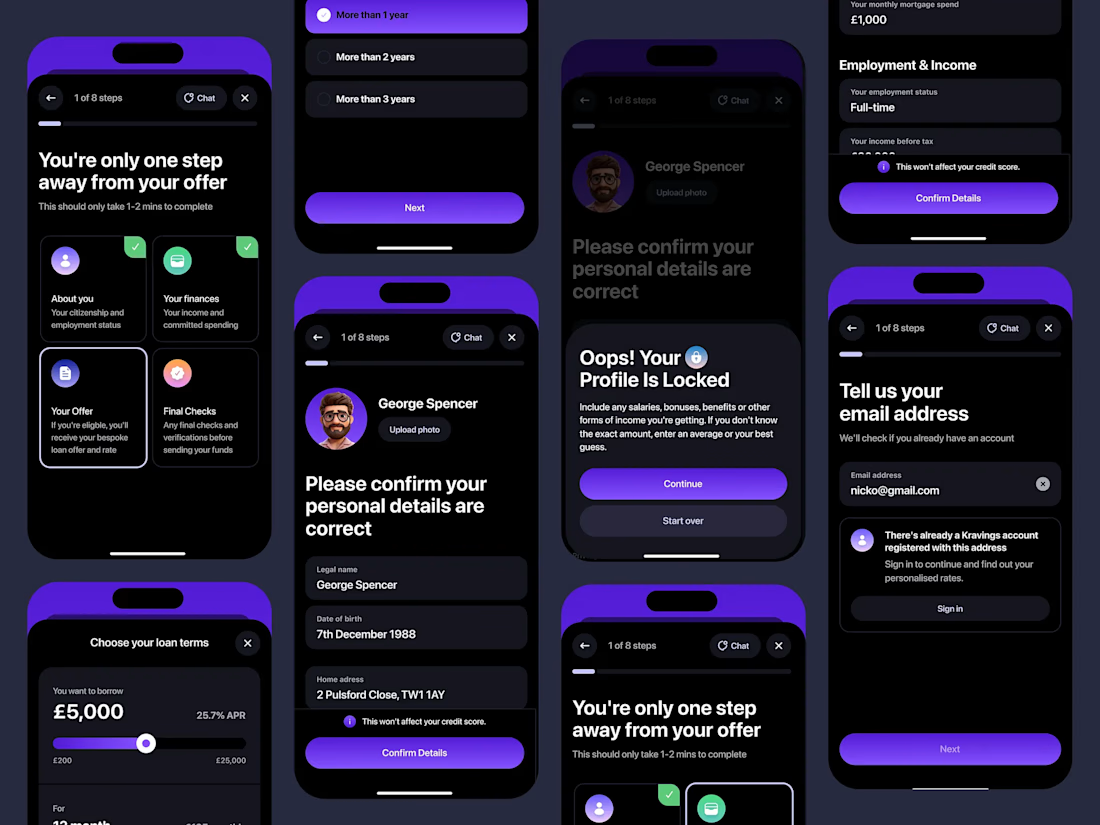


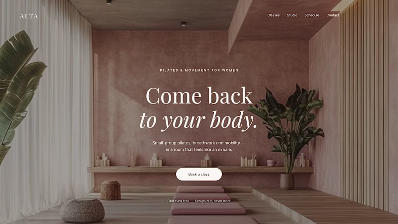
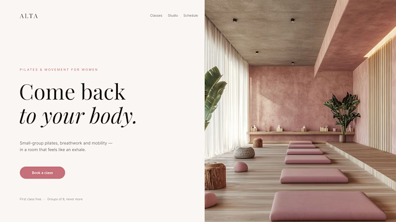
Where should the photo live - behind the words or beside them?
Same pilates studio, same headline.
01 - Photo as the background. Full-bleed atmosphere: the room wraps around the words. Immersive and cinematic, but the text only survives thanks to a darkening overlay laid over the image.
02 - Photo beside the text. A clean split: words on calm ground, the room in its own column. Everything readable at a glance, the trade is a little less drama.
One sells the feeling. The other sells the clarity. Which hero would make you book the class?

80 voted
75%
27 voted
25%
107 votes
Closed

1 nails it


