The network for creativity
Join 1.25M professional creatives like you
Connect with clients, get discovered, and run your business 100% commission-free
Creatives on Contra have earned over $150M and we are just getting started
Back to feedPost

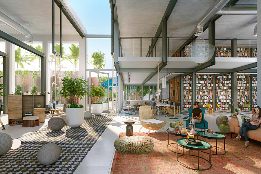
Have you ever noticed how some architectural renders instantly make you imagine yourself living in the space, while others simply feel like a 3D model?
A lot of that difference comes down to lighting.
In architectural visualization, lighting is more than just making a scene brighter. It creates mood, defines depth, reveals material qualities, and helps communicate how a space will actually feel.
The right balance of natural and artificial light can turn an ordinary render into an image that feels warm, inviting, luxurious, or dramatic—depending on the story the design needs to tell.
That’s why I pay close attention to factors such as the direction and intensity of natural light, color temperature, shadows, reflections, and how light interacts with different materials.
When these elements work together, the result goes beyond simply showing a design. It helps clients experience the space before it is built.
This is the level of detail I aim for in every architectural visualization I create: realistic lighting, convincing materials, and images that communicate the design with clarity and emotion.
What do you think makes an architectural render feel truly photorealistic—the lighting, materials, composition, or the combination of all three?


The network for creativity
Join 1.25M professional creatives like you
Connect with clients, get discovered, and run your business 100% commission-free
Creatives on Contra have earned over $150M and we are just getting started





Related posts

Which one brings more clarity to the hero section?
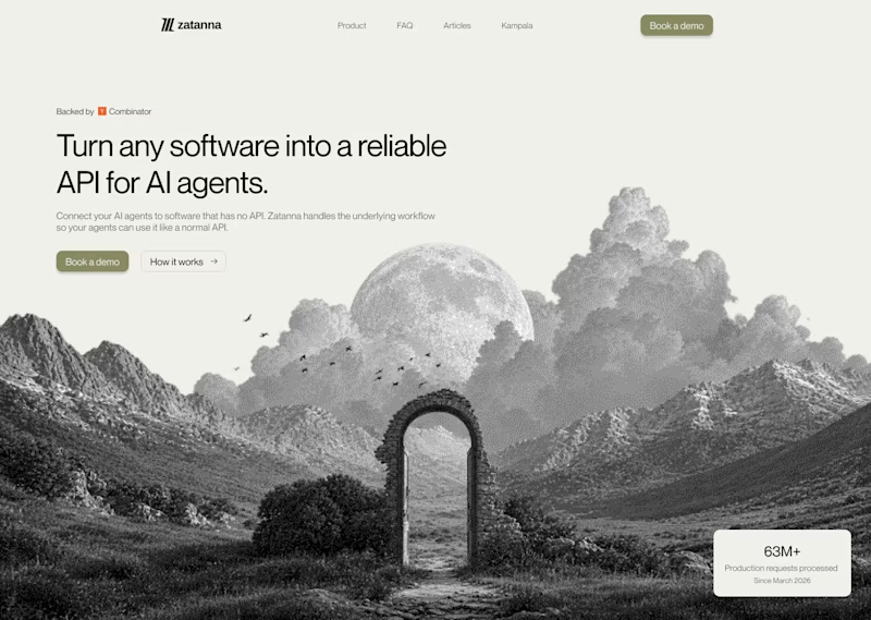
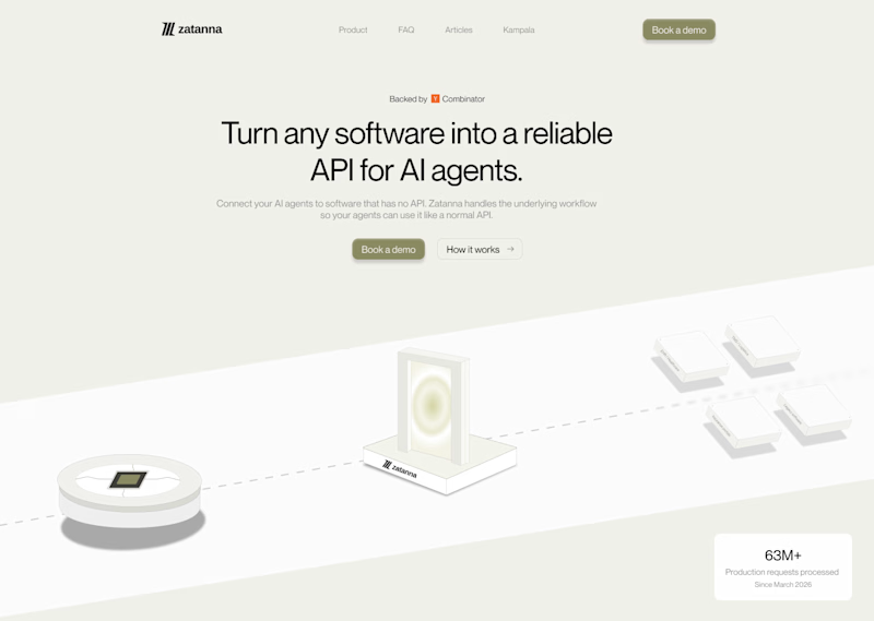
I was exploring a hero section concept for an AI product and tried two different visual directions.
Visual-led — focuses on explaining the idea through the interface/visual.
Isometric — uses a visual system to represent how the product works.
Both look good, but the real question isn't which one looks better.
Which one helps you understand the product faster?
That's something I always try to think about when designing hero sections — the visual should help explain the product, not just make the page look good.
Which one would you choose?
7 voted
58%
5 voted
42%
12 votes
Closed

The visual direction looks great, but I think Isometric does a better job of explaining the product.

Which hero visual feels right for this brand?
While working on the homepage for Halfspace, a website design and SEO agency, I explored two different hero visuals for the same headline and layout. Same message, same structure, just a different visual metaphor and mood.
Option 1 - Rocket Launch. Bold, literal, and energetic, visually reinforcing the "launch your business" message with motion and fire.
Option 2 - Glass Cube. Abstract, sleek, and premium, giving a more refined, tech-forward feel without relying on a literal metaphor.
Would love your honest UX/UI take, which direction feels more impactful, memorable, and aligned with a web design/SEO brand, and why?
11 voted
41%
16 voted
59%
27 votes
Closed

Both design are great; it's hard to choose one

Brand identity work for WesoftAI


