The network for creativity
Join 1.25M professional creatives like you
Connect with clients, get discovered, and run your business 100% commission-free
Creatives on Contra have earned over $150M and we are just getting started
Back to feedPost

The brief: streetwear app for a GenZ audience that doesn't feel like a generic ecommerce clone.
The network for creativity
Join 1.25M professional creatives like you
Connect with clients, get discovered, and run your business 100% commission-free
Creatives on Contra have earned over $150M and we are just getting started

Related posts


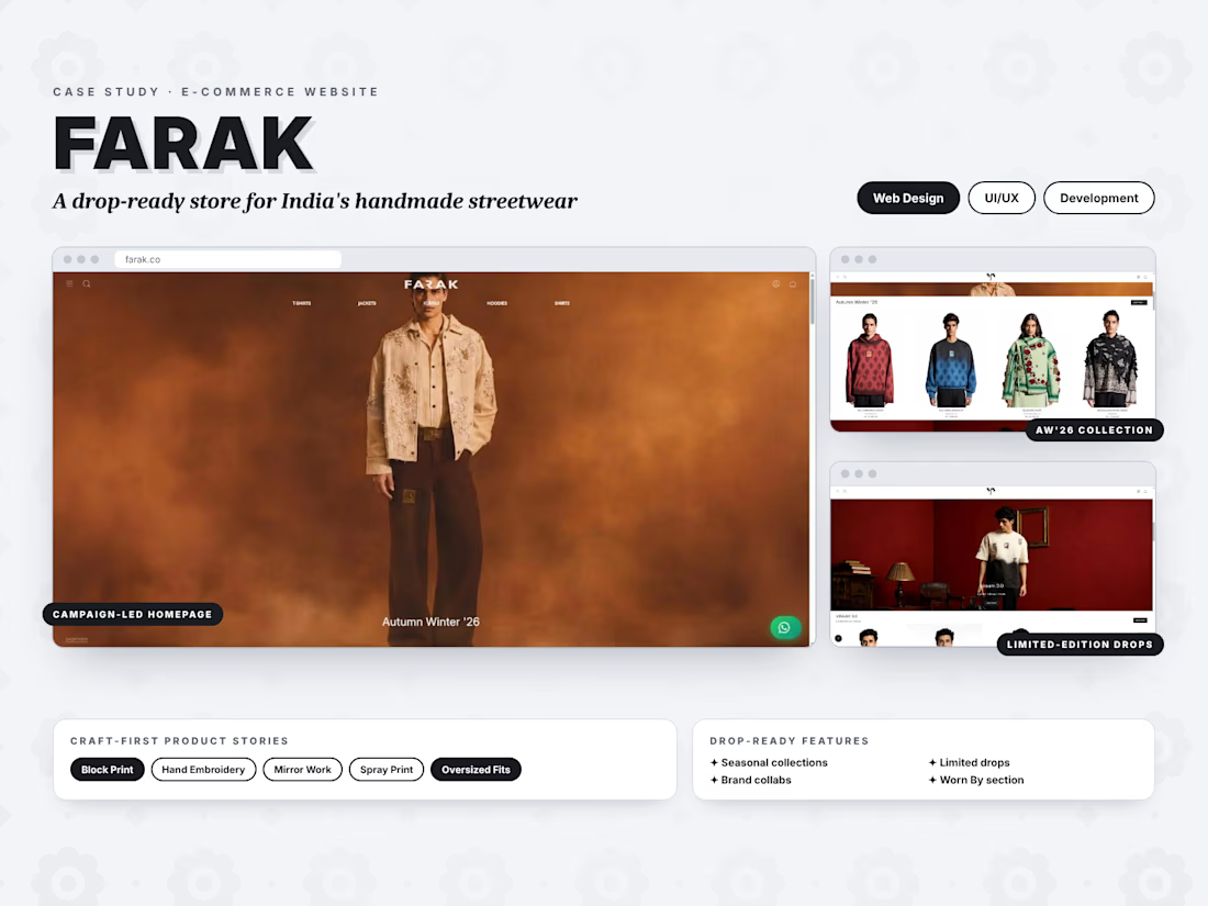
New project live: FARAK 🧵
I designed and developed an e-commerce website for this Indian handmade streetwear brand. It showcases seasonal collections, limited drops and craft-first products, with a smooth shopping experience on every device.

CLOTH, a fashion e-commerce concept.
One orange accent. Big type. Motion with a reason.
Hero with a rotating Look card, hover-to-swap categories, a filterable product carousel and a footer wordmark that builds letter by letter.
Size guide on the cards, or keep them clean?
Check it out


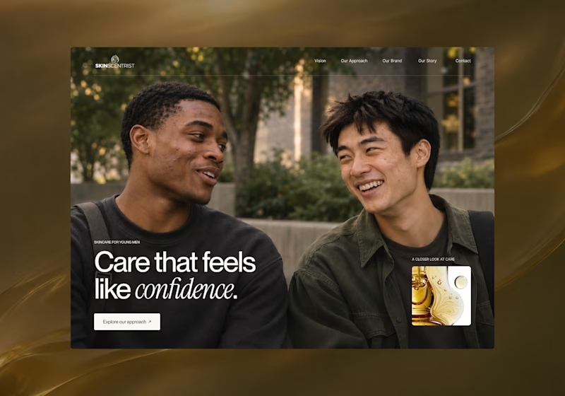
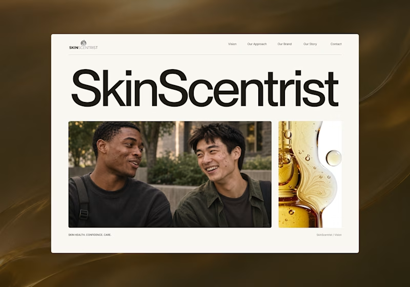
I’m exploring two homepage hero directions for SkinScentrist, a skincare brand focused on helping young men feel more confident in their skin.
Both concepts use the same imagery but take very different approaches to storytelling and visual hierarchy.
Direction 1 feels more emotional, immersive, and lifestyle-driven. The full-screen photography and bold messaging create a stronger connection to confidence and self-care.
Direction 2 feels more minimal, editorial, and brand-focused. The oversized typography, clean layout, and product imagery give it a more refined, contemporary skincare feel.
Direction 1: immersive, personal, emotional
Direction 2: minimal, editorial, premium
Which direction feels stronger for a modern skincare brand?
10 votes
Ends in 1d


