The network for creativity
Join 1.25M professional creatives like you
Connect with clients, get discovered, and run your business 100% commission-free
Creatives on Contra have earned over $150M and we are just getting started
Back to feedPost

What makes a brand feel more memorable?
I think a mascot can be one of many ways to make a brand more recognizable, expressive, and engaging. Am I right?
Yet there are still so many brands without a mascot of their own.
Do you think this mascot feels like a good fit for Chobani?


What makes a brand feel more memorable?
I think a mascot can be one of many ways to make a brand more recognizable, expressive, and engaging.
Yet there are still so many brands that don't have a mascot of their own.
So I decided to imagine what a mascot for Chobani could look like.
...
The network for creativity
Join 1.25M professional creatives like you
Connect with clients, get discovered, and run your business 100% commission-free
Creatives on Contra have earned over $150M and we are just getting started






Related posts

A little character, a lot of personality Such a creative way to make a brand more memorable.


Why don’t more DTC brands have mascots?!
I feel like mascots are such a fun way to give brands more personality and create something people can actually connect with.
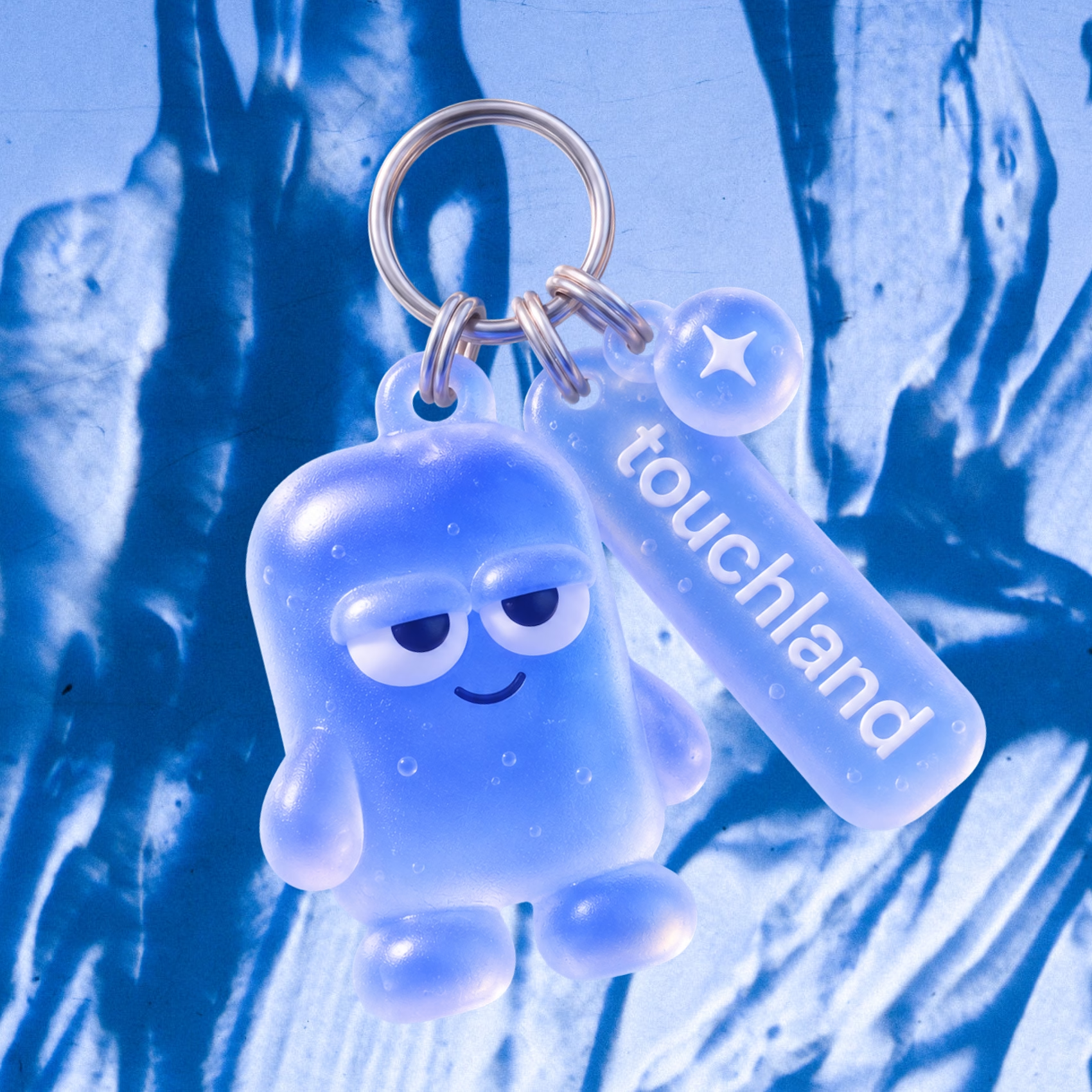
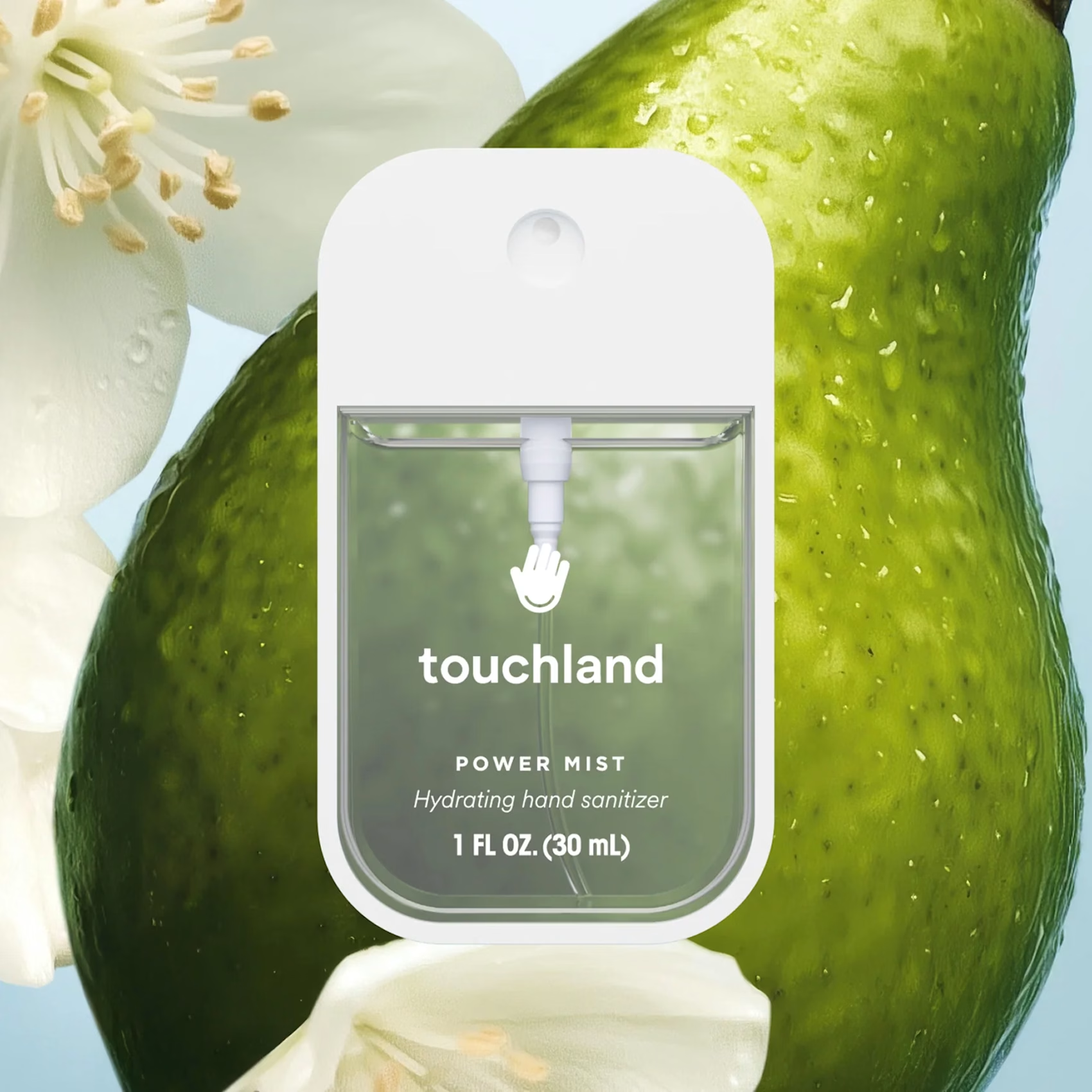
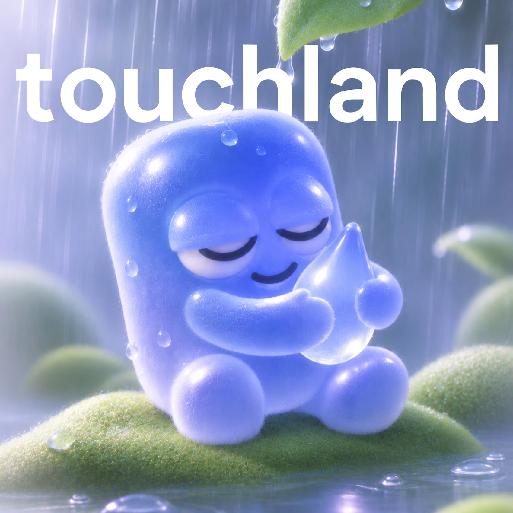
So I decided to give touchland its own little character! A squishy, jelly-like mascot that changes colors,...

Los 3 Salchis: a mascot logo for a neighborhood pizzeria 🍕
This is one of the projects I enjoyed working on the most.
Los 3 Salchis is a family-run neighborhood pizzeria, and the goal was to create a mascot logo that captures what happens around their tables: warmth, closeness, love, celebrations, and those long nights with friends and family.
What I worked on:
Mascot logo design: a friendly little sausage dog who’s always ready for a slice
Warm brand palette inspired by the feeling of an American pizzeria
Visual direction and imagery with a nostalgic, film-like look
I hope you enjoy it as much as I enjoyed making it!!! ❤️ :)
Los 3 Salchis: mascot logo para una pizzería de barrio 🍕
Este es uno de los proyectos que más disfruté trabajar.
Los 3 Salchis es una pizzería familiar y de barrio. El objetivo era crear un mascot logo que reflejara lo que pasa alrededor de sus mesas: la calidez, la cercanía, el amor, los festejos y esas juntadas largas con amigos y familia.
Qué hice:
Diseño del mascot logo: un salchicha simpático, siempre listo para una porción
Paleta de marca cálida, inspirada en el feeling de una pizzería americana
Dirección visual e imágenes con un look nostálgico, estilo film
Espero que les guste tanto como a mí hacerlo!!!! ❤️ :)


The sausage dog mascot suits this pizzeria perfectly.

Final Delivery vs Initial Concept
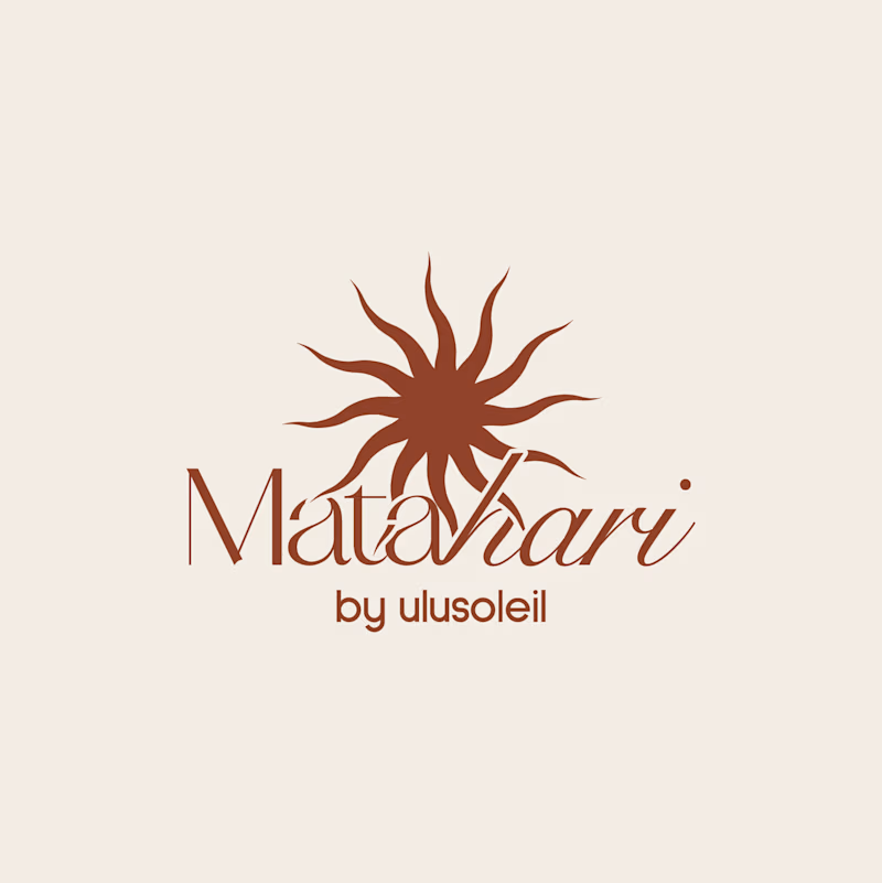
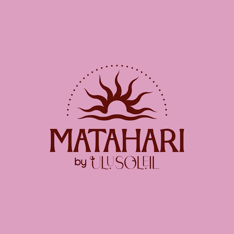
Which Matahari logo would you pick for a brand like this?
Matahari is an everyday skincare brand inspired by the warmth of the tropics, offering feel-good, effective essentials that keep skin soft, hydrated, and naturally radiant through simple, effortless daily care.
Vote and tell me why. Does the final refinement make a difference, or was the first concept already enough?
33 voted
70%
14 voted
30%
47 votes
Closed

Initial Concept. The caps wordmark stays readable when it shrinks to an email header or a jar lid, where the thin script starts to blur. The final has more warmth, but the sun mark already carries that in both.