The network for creativity
Join 1.25M professional creatives like you
Connect with clients, get discovered, and run your business 100% commission-free
Creatives on Contra have earned over $150M and we are just getting started
Back to feedPost
Taste Test

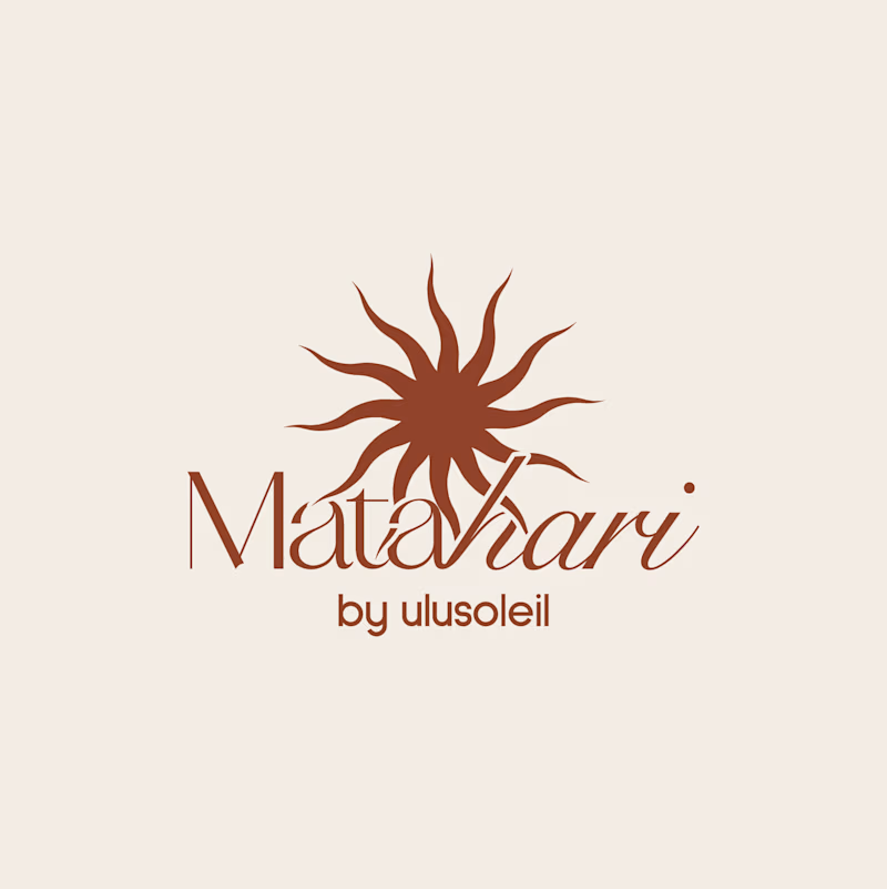
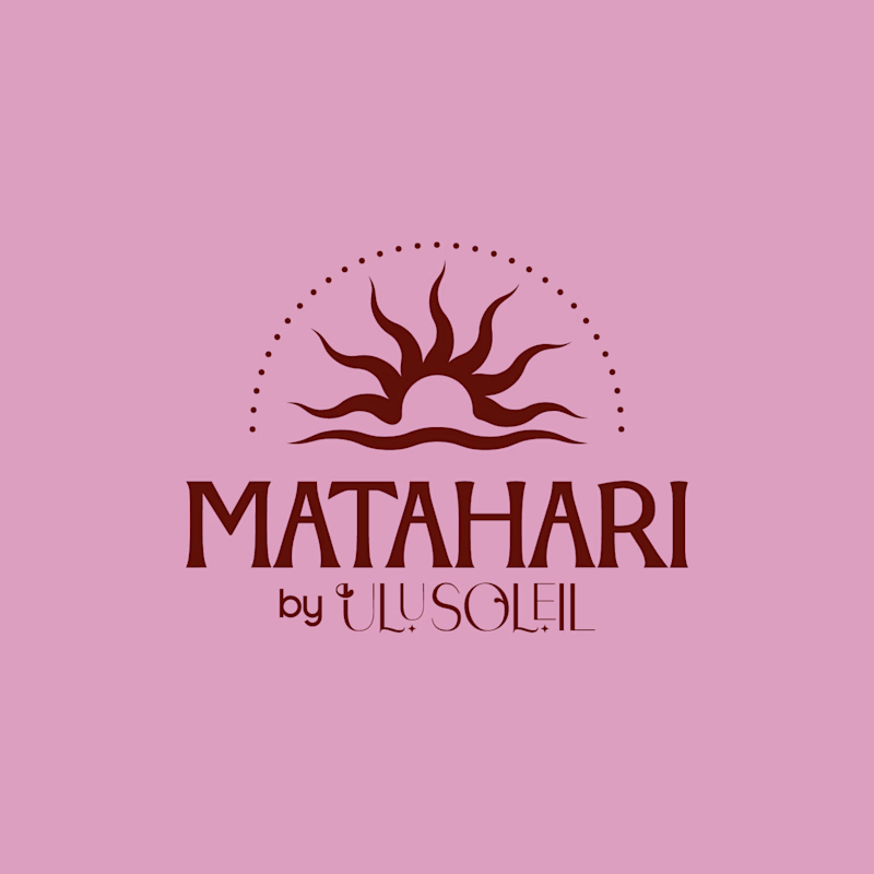
Final Delivery vs Initial Concept
Which Matahari logo would you pick for a brand like this?
Matahari is an everyday skincare brand inspired by the warmth of the tropics, offering feel-good, effective essentials that keep skin soft, hydrated, and naturally radiant through simple, effortless daily care.
Vote and tell me why. Does the final refinement make a difference, or was the first concept already enough?
44 votes
Ends in 8h

Final delivery — the elegant script suits tropical skincare.
Thanks so much!

Nice!

Final Delivery
I agreee!!!

Final delivery stands out and makes the Matahari Skincare brand feel premium. Well done🔥
ohh thanks!!

really like your work and that kind of style! wow!
appreciate it!!

final !

Super clean direction the balance between simplicity and personality makes this instantly memorable. Out of curiosity, did you start with the typography first or build the mark around a core brand concept?
I started with the typography and then built around it

Initial Concept. The caps wordmark stays readable when it shrinks to an email header or a jar lid, where the thin script starts to blur. The final has more warmth, but the sun mark already carries that in both.
That's also true! Thanks for the input!

The final delivery makes reading the wordmark hard to read. I would have chosen the initial concept wordmark and then merged it with the supporting wordmark from the final delivery concept.


On light color it rocks than pink tbh

Final delivery
The network for creativity
Join 1.25M professional creatives like you
Connect with clients, get discovered, and run your business 100% commission-free
Creatives on Contra have earned over $150M and we are just getting started





Related posts

Lime Cream or Peach Fuzz? 🍋🟩🍑
Two animated isometric sets — same system, different mood. Cast your vote 👇
68 voted
78%
19 voted
22%
87 votes
Closed

Lime Cream. The dark linework pops more on it.

two brands, one tiny taste test.
would you rather look through an Oriel or answer a Calling?
winner gets the full brand. reply with your pick.
35 voted
85%
6 voted
15%
41 votes
Closed
The biggest misconception about branding is thinking it's just a logo. What actually saves founders time and money later is a compact system a focused 2–3 color palette and clear sub-brand rules so every new deck, social post, or product launch looks cohesive without starting from scratch.


How far can you take a logo beyond the first draft?
I started with Recraft's Logo Maker and a fictional idea: Bibu's Paws, a cosy little dog rescue and adoption shelter.
I wanted the identity to feel warm, homely and full of character, so I explored a few logo directions before settling on the little dog tucked inside a house.
From there, I took the idea further, building out the visual identity with an earthy colour palette, typography, illustrations and a few real-world applications: the shelter space, dog merchandise and an adoption welcome kit.
I enjoyed seeing how a small starting point could grow into a brand with its own personality and world.
Now I'm curious: if you were building a brand around this logo, what would you create next?






It turned out so cozy, you did great