The network for creativity
Join 1.25M professional creatives like you
Connect with clients, get discovered, and run your business 100% commission-free
Creatives on Contra have earned over $150M and we are just getting started
Back to feedPost
3 CRO mistakes killing your landing page conversions
You're driving traffic. You're spending on ads. People are landing on your page. But they're not converting. And you can't figure out why.
Nine times out of ten, it's one of these three mistakes.
1. Your headline talks about you instead of the visitor.
This is the most common and most expensive mistake on landing pages. The visitor arrives with one question in mind: "Can this solve my problem?" And the first thing they see is something like "We are the leading provider of innovative solutions."
Nobody cares. Not in the first 5 seconds. Not ever.
Your headline has one job. Reflect the visitor's problem or desire back to them immediately. Make them feel like they're in the right place. If your headline starts with "We" instead of "You," it's probably costing you conversions right now.
The best headlines don't describe the business. They describe the outcome the visitor wants.
2. Your CTA is vague, buried, or both.
"Learn More." "Get Started." "Submit." These mean nothing. They create zero urgency, zero clarity, and zero motivation to click.
A strong CTA tells the visitor exactly what happens next and why it's worth doing. "Get your free audit" is better than "Submit." "See pricing" is better than "Learn More." "Start your free trial — no card required" is better than "Get Started."
And placement matters just as much as wording. If your primary CTA lives below the fold and the visitor has to scroll to find it, you're relying on curiosity to do the work that clarity should be doing. Most people won't scroll that far. They'll leave.
Your CTA should be visible within the first screen. And it should appear again after every major section that builds a case for clicking it.
3. You have no social proof where it matters.
Most landing pages either have no social proof at all, or they bury it at the bottom of the page like an afterthought. Both are conversion killers.
Here's the psychology. The moment a visitor feels interested enough to consider taking action, doubt kicks in. "Is this legit? Will it actually work? Has anyone else done this?" That doubt happens near the CTA, not at the bottom of the page.
Social proof needs to live right next to the decision point. A testimonial next to the pricing. A client logo bar near the hero. A result or metric near the CTA. That's where trust needs to show up because that's where hesitation lives.
A landing page without social proof is asking the visitor to take a leap of faith. Most people won't.
These three mistakes seem basic. Almost too obvious. But I see them on nearly every landing page I audit. Not on amateur pages either. On pages from funded startups, established ecommerce brands, and agencies that should know better.
The fix isn't complicated. Clear headline. Strong CTA in the right place. Social proof where doubt lives.
Basics win. Every time.
The network for creativity
Join 1.25M professional creatives like you
Connect with clients, get discovered, and run your business 100% commission-free
Creatives on Contra have earned over $150M and we are just getting started
Related posts

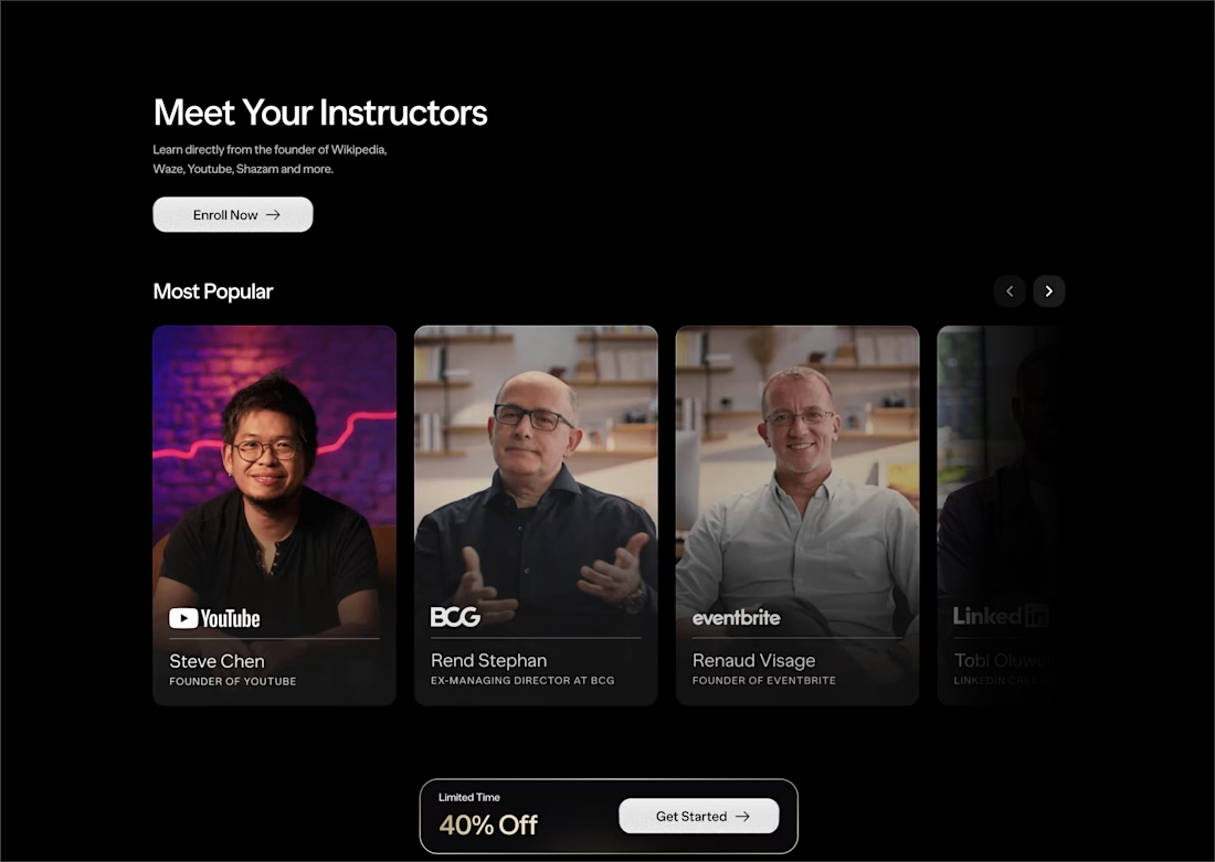
This UI is so clean I tried clicking the screenshot to explore more 😄👏
Designing a landing page for an AI automation product taught me one thing "The animation has to earn every frame".
Here's a walkthrough of ArcFlow: The hero concept, The floating UI cards, and why the grass hill reveal was the moment the whole page clicked.
#UIDesign #LandingPage #AIDesign
Sharing our latest landing page exploration for a modern furniture brand focused on simplicity, craftsmanship, and timeless living.
We paired clean layouts with subtle motion in Jitter to create a browsing experience that feels calm, warm, and intentional.
Would love to hear your thoughts on the overall feel and animation.
Trending
Claude
Claude has entered the design space. How are you using Claude Design?
Contra University
Learn from expert creatives how to earn more using next-gen AI tools.
creativeaiflow
Creative AI workflows are evolving. What tools do you use, and what are their strengths and weaknesses?
portfolioreview
The best portfolios tell a story, not just show a grid. Share yours for feedback.
freelancerlife
Freelancer life is wins, pivots, and everything in between. What’s yours right now?