The network for creativity
Join 1.25M professional creatives like you
Connect with clients, get discovered, and run your business 100% commission-free
Creatives on Contra have earned over $150M and we are just getting started
Back to feedPost


📊 TEO Audit - Corporate Website Redesign for an Audit Company
📌 Project Overview
This project involved redesigning and improving the corporate website for an audit company based in Kyiv — TEO Audit.
The main goal was to modernize the website, improve visual presentation, and enhance user experience while maintaining a professional and trustworthy brand image.
⚙️ What Was Done
🎯 Homepage Redesign
- Fully redesigned the homepage structure
- Added a video hero banner to create a stronger first impression
Improved key sections:
- “Why Choose Us”
- “About Company”
- Enhanced content hierarchy and clarity
🧩 Internal Pages Optimization
Redesigned and improved core sections:
- Team page
- Services
- News
Improved layout consistency and readability
Refined structure for better user navigation
📱 Mobile & Responsiveness
- Enhanced responsiveness across all devices
- Improved mobile usability and layout behavior
- Optimized content display for smaller screens
🚀 Key Improvements
- Modernized visual design
- Stronger first-screen impact with video
- Improved content structure and readability
- Better navigation across key pages
- Fully responsive experience
📈 Result
- Increased overall website professionalism and trust perception
- Improved user experience across all devices
- Enhanced clarity of services and company positioning
- Created a more engaging and modern digital presence


The network for creativity
Join 1.25M professional creatives like you
Connect with clients, get discovered, and run your business 100% commission-free
Creatives on Contra have earned over $150M and we are just getting started
Related posts


Rug Pad Wizard: a Figma design for a premium rug pad brand.
One site for two buyers, trade dealers and homeowners.

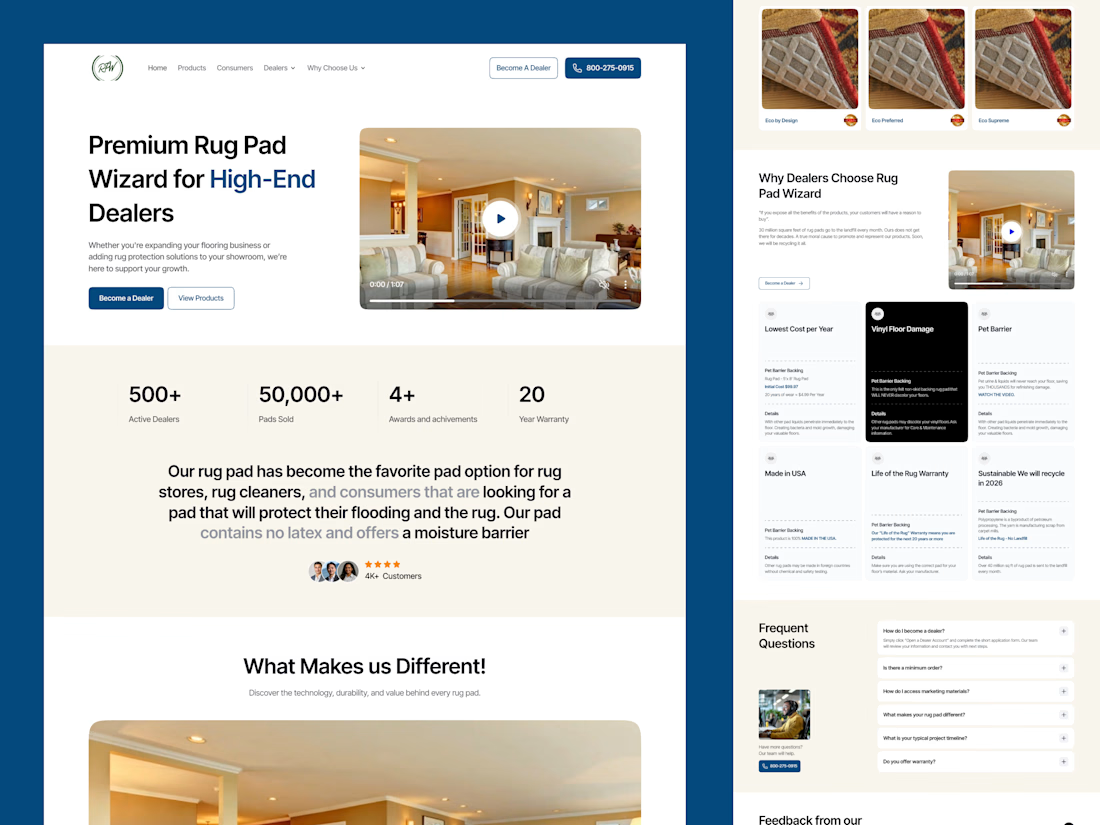

Smart to split dealers and homeowners on one site. The stats row under the hero is clean.

AI Freight landing page design completed for 5U AI.
They raised $3.2M recently.
I'm open for the new projects. 🤝

this is amazing website. smooth animation love the visual

13:40: a finished Figma frame. 15:48: this, live on Vercel
Claude wrote every line of the code. I spent those two hours on the part clients actually pay for: looking at each version and saying what's off
17 commits, each one deployed. My notes went in as screenshots with red circles:
→ make the button edges look like ticket cutouts
→ replay the story chips every time you scroll past them
→ spacing 156, then 92, then back to 156
What made it fast was one Figma frame called "Ready for Dev". Every size, color and gap came from there, so nobody had to guess what the mockup meant
For a founder this means a real link on day one, and a fix you ask for at lunch is live by the afternoon


