The network for creativity
Join 1.25M professional creatives like you
Connect with clients, get discovered, and run your business 100% commission-free
Creatives on Contra have earned over $150M and we are just getting started
Back to feedPost


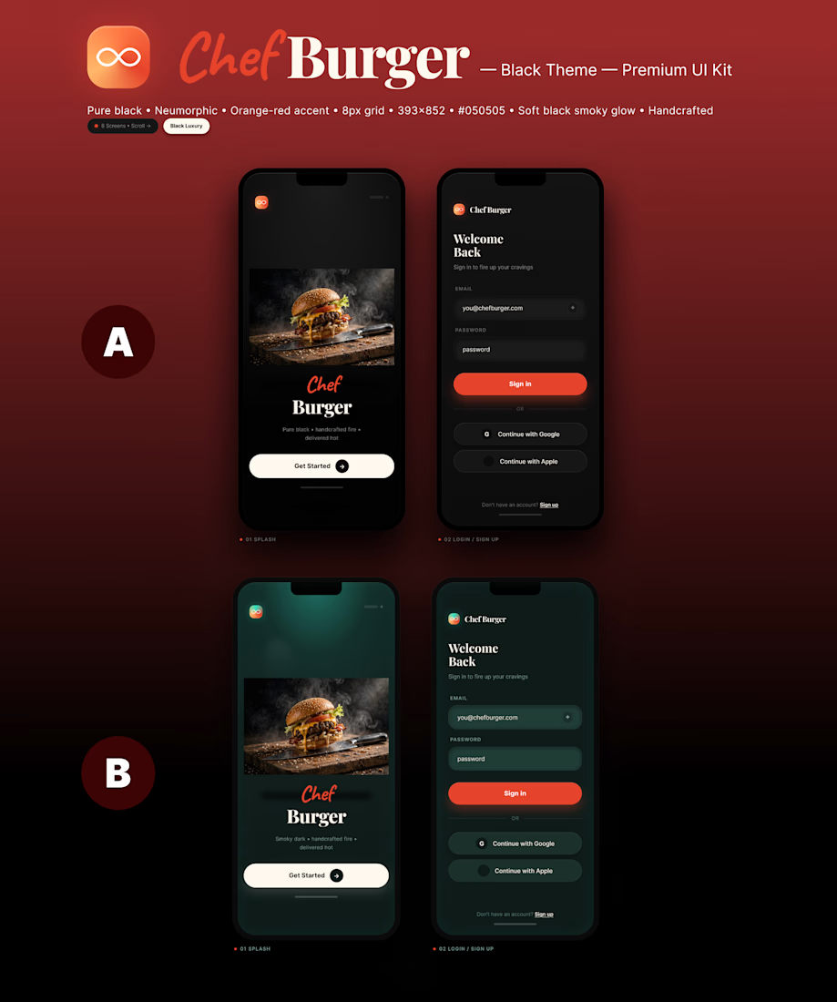

B. On A the burger sits on flat black, so the photo and the UI stay two layers. On B the smoky green wraps the photo and the fields, and the screen reads as one light. The orange Sign In still has a place to land.

Thanks, Noel! That makes sense. The flat black does split the photo and the UI into two layers. I'll try wrapping everything in the smoky green like B and see how it feels.
Keep the orange as the only hot color when you wrap the screens in the green. If the fields, the photo, and the button all go smoky, the Sign In loses the place it had on B. The green should be the room. The orange stays the action.
Got it, Noel! Green as the room, orange as the action. That's a clean rule. I'll keep the Sign In as the only warm color and let everything else sit in the green.
The network for creativity
Join 1.25M professional creatives like you
Connect with clients, get discovered, and run your business 100% commission-free
Creatives on Contra have earned over $150M and we are just getting started





Related posts


Definitely the new one. Seems more fluid and easier to interact with


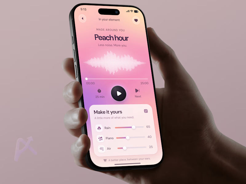
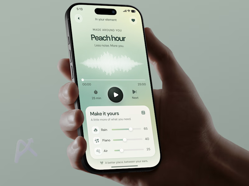
🧪 TASTY TEST Which version would you press play on after a long day?Same wellness player. Same controls. Two moods.
🍑 A · Peach Glow
Peach, pink, and lilac. Warm and playful
🌿 B · Sage Calm
Sage, mint, Soft and airy
Both let you mix rain, piano, and air. But the palette sets an expectation before you hear anything.
💡 Growth Insight: The listening experience starts before the sound does.
My hypothesis: matching the palette to how users want to feel could encourage them to start. I’d test time to first play and session start rate.
Which feels like your kind of reset? 🍑 A or 🌿 B?
Follow for the next Tasty Test.
👉 Building a wellness app? Book a mobile app strategy session
https://calendly.com/asol_design/book-diagnostic-call-linkedin-clone
#MobileAppDesign #WellnessApp #AsolDesign

13 voted
42%
18 voted
58%
31 votes
Closed

sage calm..🎉


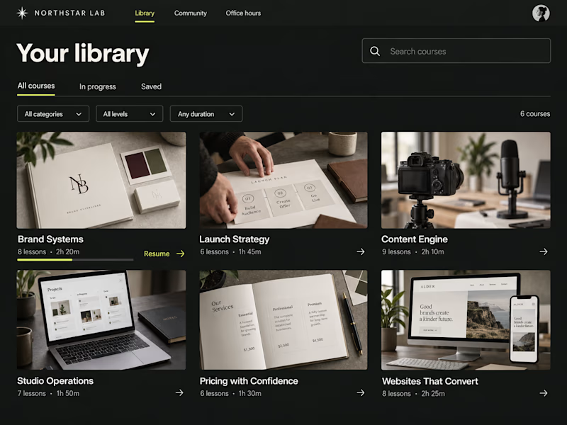
Light or dark—which Kajabi library would you choose?
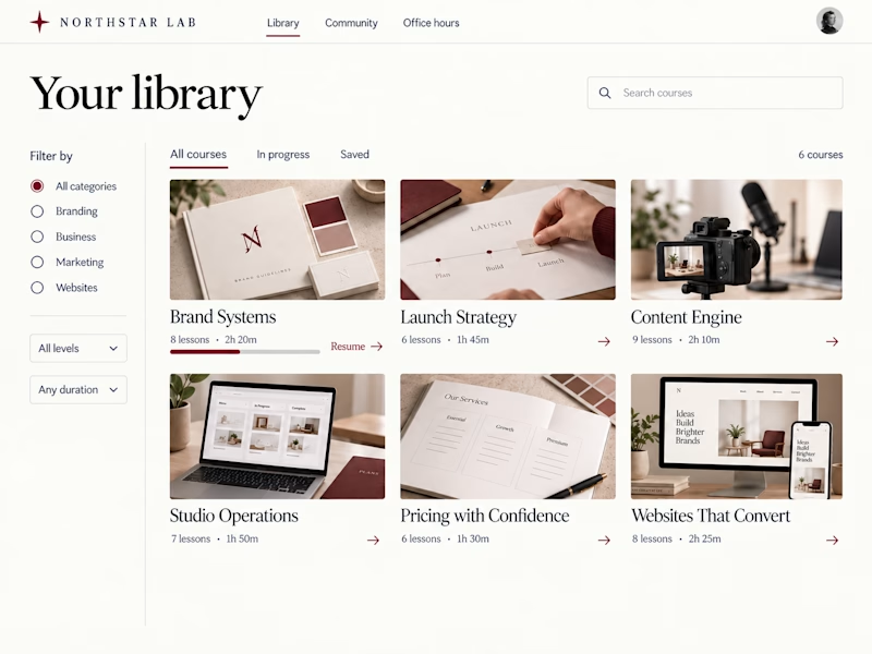
Two concepts for Northstar Lab, a fictional creative education brand. Same courses, two ways to browse:
A — Light Editorial: warm tones, serif type, and sidebar filters.
B — Dark Studio: charcoal, chartreuse accents, and compact dropdown filters.
Which would you rather learn in—and why?

27 voted
56%
21 voted
44%
48 votes
Closed

Clean and professional. I prefer the light editorial style.