The network for creativity
Join 1.25M professional creatives like you
Connect with clients, get discovered, and run your business 100% commission-free
Creatives on Contra have earned over $150M and we are just getting started
Back to feedPost

Built a mobile Fitness + Meditation app focused on smooth animations, shared element transitions, and immersive UI
🔗 Live Prototype: https://cub-skid-71998866.figma.site/
Would love your thoughts 🙌

The shared element transitions feel really smooth — especially how the workout cards expand. That continuity adds a premium feel. You might experiment with slightly easing the exit animation to make it feel even more natural.
The shared transitions feel intentional — especially how the detail view maintains context from the card. That continuity makes the flow feel premium.
The network for creativity
Join 1.25M professional creatives like you
Connect with clients, get discovered, and run your business 100% commission-free
Creatives on Contra have earned over $150M and we are just getting started











Related posts

Home & Map view for our simple Pulse Athletics app...
more on this project in my case study:)
#athletics #sportsapp # community #communityapp #cleanui #modernui #productdesign #uidesigner #userresearch #uxdesigner #brandstrategy #brandvisuals #brandassets #runclub #running #runningapp

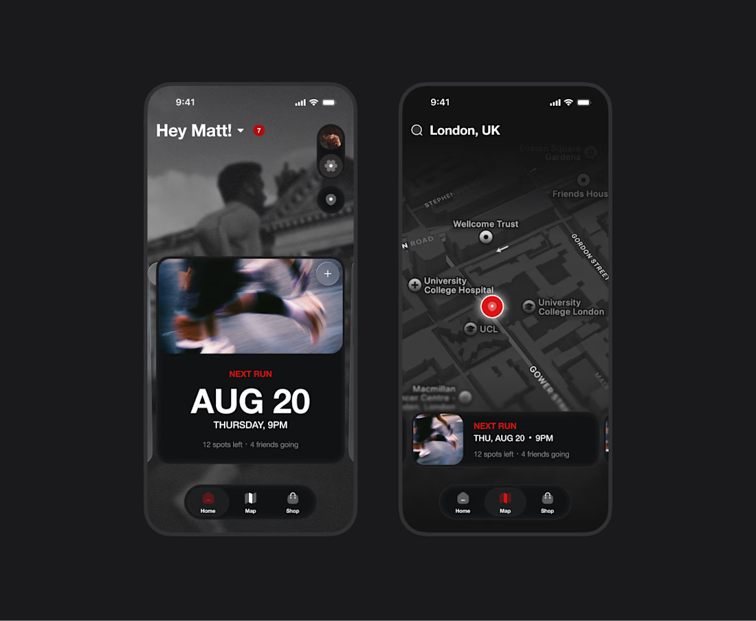

The dark mode here is so clean. The Next Run card with the spots left count feels like a proper community driver, not just a pretty widget. Putting the map next to home with the runner pins keeps the social layer front and center. Did you lean on user research for what keeps...

New mobile app design for a ticketing app
check it out 🌎 https://tixtango.com
I am available for work
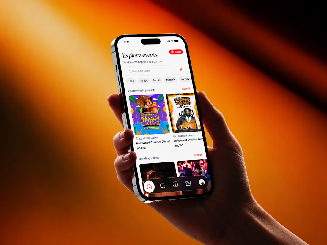
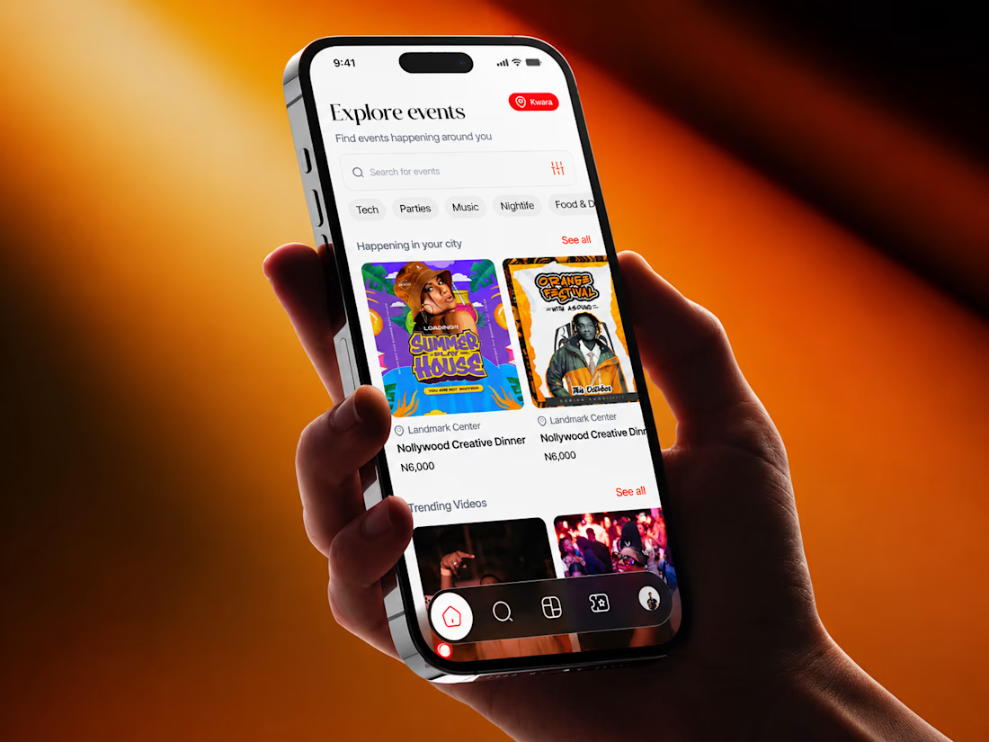
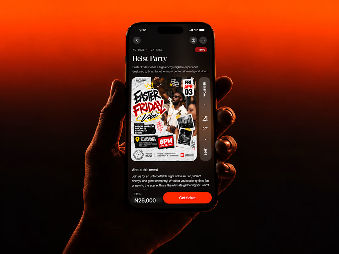
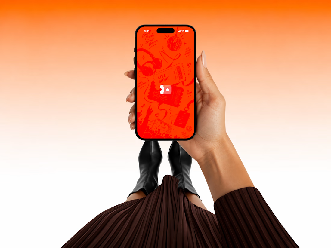

Fire design Ozenua! 🚀 TixTango looks super energetic - that orange to red gradient really pops and fits the event/ticketing vibe perfectly. Love the clean card layout on Explore and the dark mode detail screen. Presentation with the hand mockups is on point. Best of luck, hope you land some great gigs!


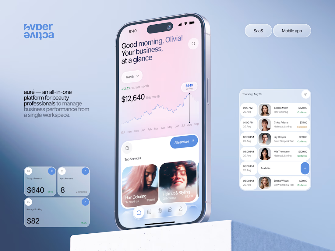
Finally wrapped up this project, and I’m excited to share the case study! 💅 A fresh product design concept for a beauty dashboard. Would love to hear your thoughts! ✨

A beauty dashboard is such a fun product design challenge, Oleksandra. The Good morning, Olivia! greeting in the header makes business metrics feel personal instead of clinical, which is exactly what a beauty professional would want.