The network for creativity
Join 1.25M professional creatives like you
Connect with clients, get discovered, and run your business 100% commission-free
Creatives on Contra have earned over $150M and we are just getting started
Back to feedPost
Designed a complete brand identity system for a chain-abstracted crypto wallet - from logomark and color system to merchandise, co-branding, and digital touchpoints.
The Brief:
Astra Wallet set out to simplify the multi-chain crypto experience with a single, unified balance across all networks. The product promise - "All Chains, One Balance" - needed a brand identity that could match: accessible enough to onboard newcomers, sharp enough to earn credibility with crypto-native users.
I was tasked with developing the full brand identity system from the ground up - logo, color palette, typography, brand applications, and co-branding frameworks.
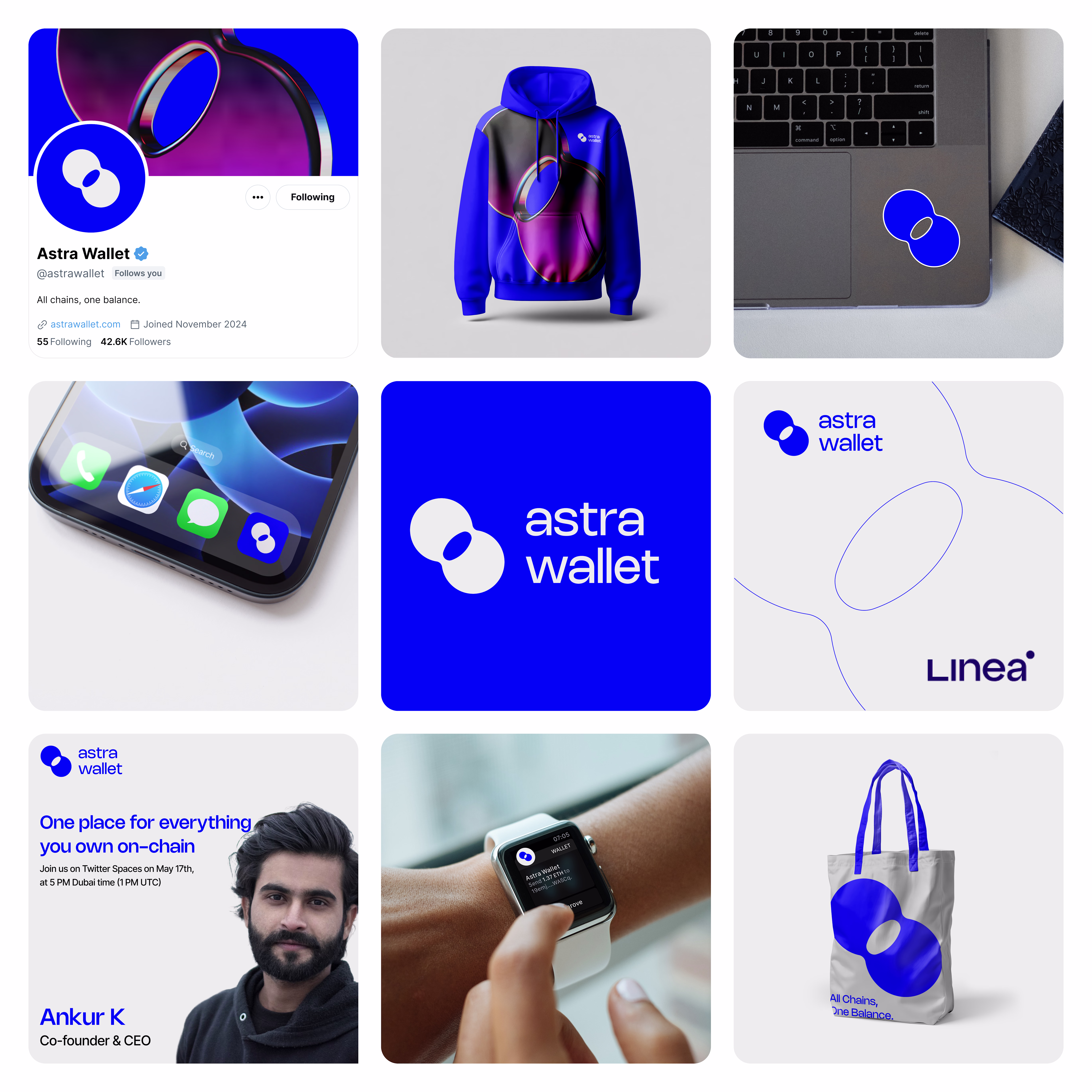
Direction A - "Signal" (Blue)
Concept: The logomark is built around a speech-bubble-meets-portal form - a shape that suggests both communication and movement between worlds (chains). The cutout within the mark hints at a keyhole or passage, reinforcing the idea of access and entry.
Color System: A bold, saturated blue (#0038FF range) anchors the identity, giving it instant recognition and a confident, institutional feel without being corporate. The palette pairs with deep gradients (violet to magenta) for editorial and social moments.
Typography: Clean, lowercase sans-serif wordmark. The all-lowercase treatment keeps the tone approachable and modern - no shouting, just clarity.
Applications designed:
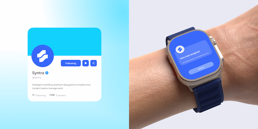
Social media profile and header system (Twitter/X)
Branded merchandise - hoodie, tote bag
App icon and smartwatch UI
Laptop sticker and device mockups
Co-branding lockup with ecosystem partner
Twitter Spaces event promotional asset
Editorial/blog cover system
Why this direction works: It's instantly ownable. The blue is aggressive in the best way - it cuts through the noise of the typical Web3 visual landscape (dark themes, neon gradients). The logomark scales beautifully from a favicon to a tote bag.
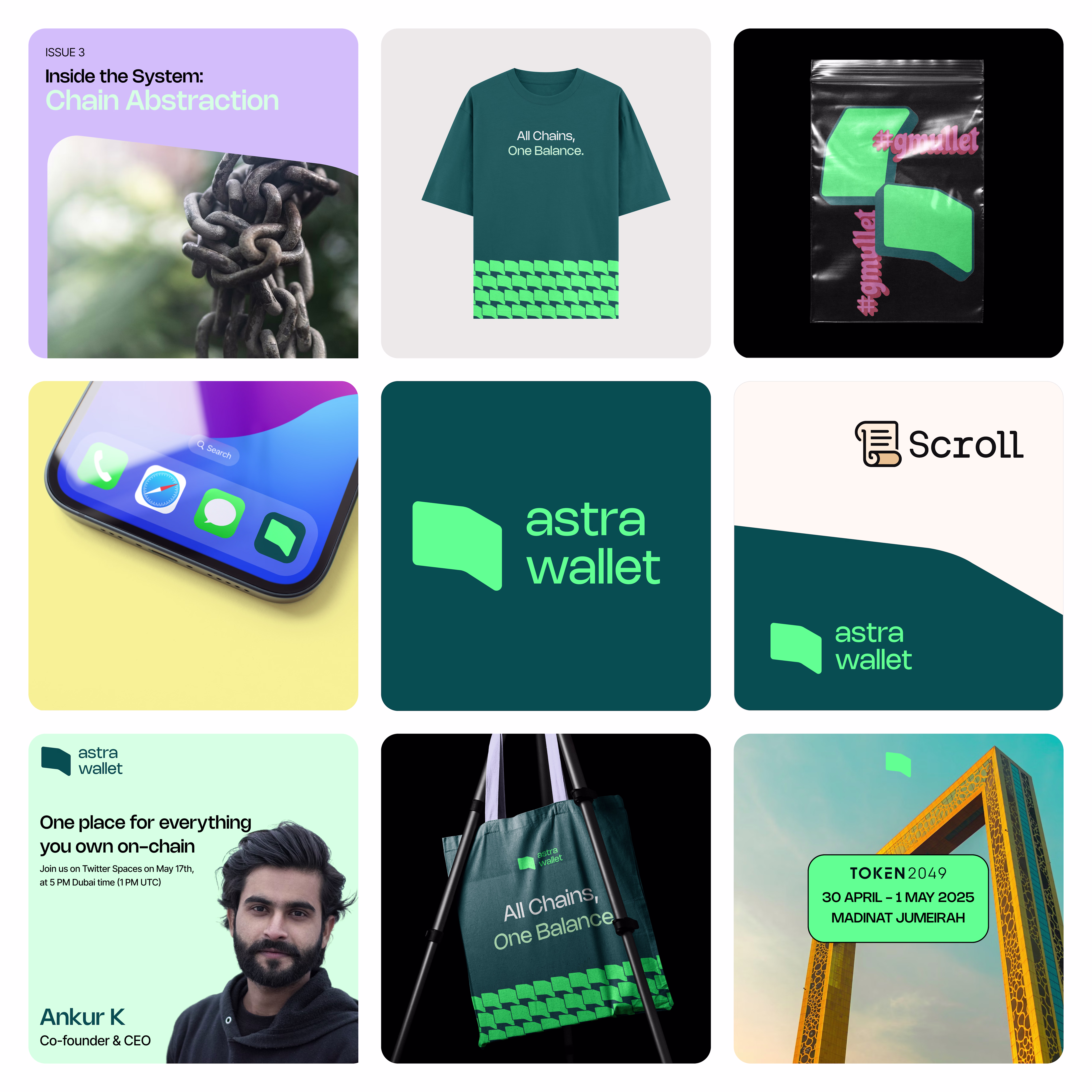
Direction B - "Terrain" (Teal & Green)
Concept: This direction takes a different posture - quieter, more editorial, with a nod to sustainability and groundedness. The logomark is a folded flag or ribbon shape, suggesting movement and signaling without being loud.
Color System: Deep teal (#0D4D4D range) paired with a bright mint/green accent. The combination feels fresh and distinct - almost no one in Web3 owns this palette. A soft lavender is used as a secondary accent for editorial content.
Typography: Bolder, more expressive type treatment with mixed-weight pairings. The editorial moments (like "Inside the System: Chain Abstraction") lean into magazine-style layouts.
Applications designed:
Editorial/blog cover with photography integration
Branded merchandise - t-shirt, tote bag, sticker pack in sealed packaging
App icon and mobile device mockup
Co-branding lockup with ecosystem partner
Conference/event branding
Twitter Spaces event promotional asset
Social media profile system
Why this direction works: It carves out a completely different lane. Where most wallets go loud and techy, this direction feels like a lifestyle brand that happens to be in crypto. The editorial system is especially strong - it could power a content-driven growth strategy naturally.
Across Both Directions
Each direction was developed as a complete system, not just a logo. The goal was to demonstrate how the brand would live across every touchpoint a crypto wallet actually needs - from the app icon someone sees 50 times a day, to the merch a community member wears to a conference, to the co-branding moment with an L2 partner.
Key deliverables across both:
Primary logomark + wordmark lockup
Color system (primary, secondary, accent)
Typography system
Social media templates
Merchandise design (apparel, accessories, stickers)
Device and app mockups
Co-branding/partnership framework
Event and editorial content templates
Outcome
Two fully realized brand directions presented as competing visions - each viable, each with a distinct strategic rationale. The project demonstrates end-to-end brand thinking: from a product truth ("All Chains, One Balance") through to the tote bag someone carries at events.
The network for creativity
Join 1.25M professional creatives like you
Connect with clients, get discovered, and run your business 100% commission-free
Creatives on Contra have earned over $150M and we are just getting started
Related posts
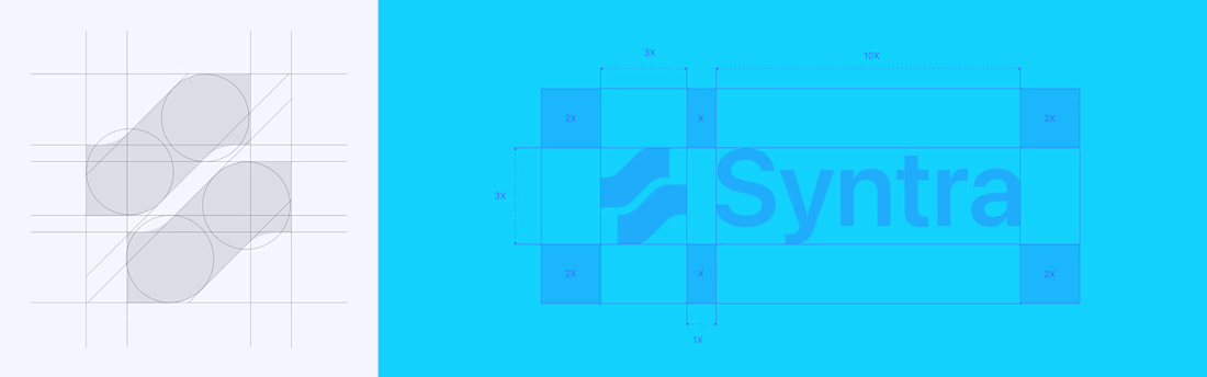
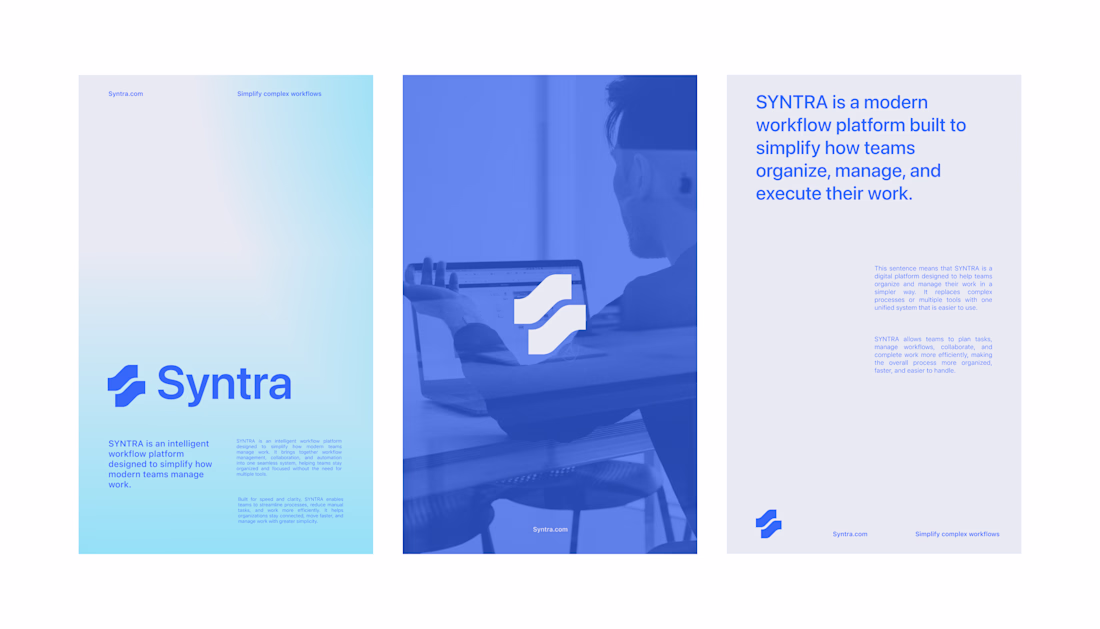
Exploring the foundation of Syntra
an intelligent workflow platform built for modern teams.
This initial concept focuses on establishing a clear and scalable visual system through logo grid, typography, and color direction. The goal is to reflect SYNTRA’s core values of clarity, efficiency, and seamless collaboration, translating complex workflows into a clean and structured visual language.
Amazing!
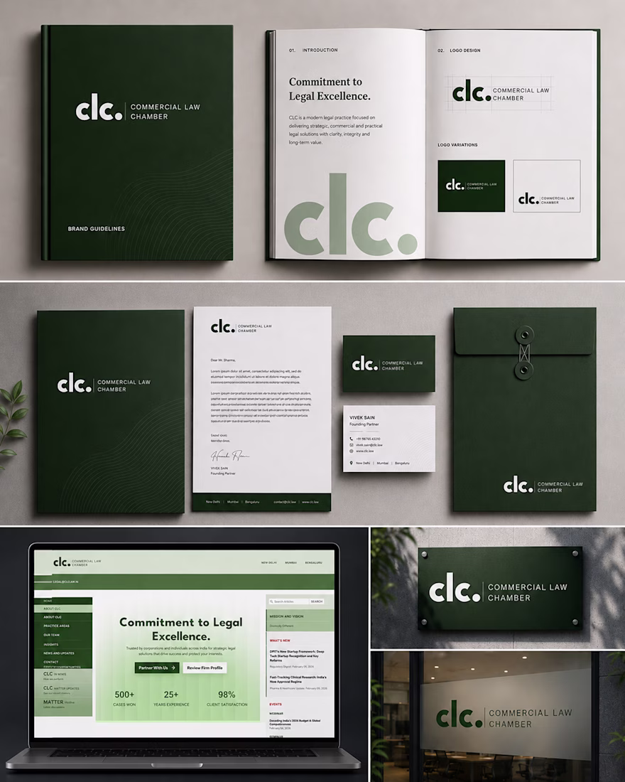
Not every legal brand has to look the same.
For Commercial Law Chamber, we built a complete identity system that reflects clarity, credibility, and confidence—across print, digital, and every client touchpoint.
A logo was just the beginning. The goal was a brand people remember and trust.
Swipe through the transformation.
#CaseStudy #BrandIdentity #LegalBranding #BrandDesign #Beeztech
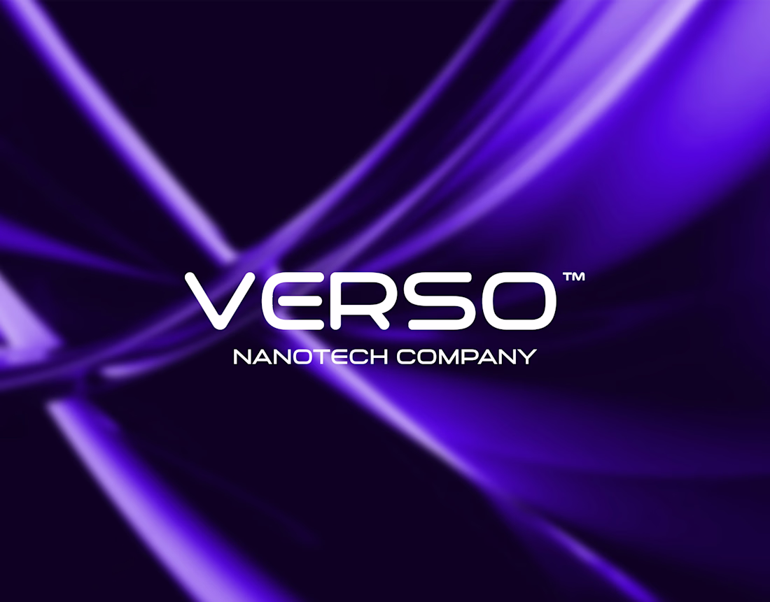
A strong tech brand needs to feel precise, intelligent, and future-ready.
For Verso Nanotech, the visual identity was updated to create a cleaner, sharper, and more scalable brand system.
The direction focuses on modern typography, scientific precision, and a visual language that reflects innovation, trust, and advanced technology.
A refreshed identity designed to feel minimal, technical, and built for growth.
Feedback is always welcome.
#BrandIdentity #LogoDesign #VisualIdentity #TechBranding #Nanotech #GraphicDesign #AdobeIllustrator #ContraCreator
Trending
Claude
Claude has entered the design space. How are you using Claude Design?
Contra University
Learn from expert creatives how to earn more using next-gen AI tools.
MagicPath
The canvas is infinite, and exploration is becoming the workflow. How are you using MagicPath?
creativeaiflow
Creative AI workflows are evolving. What tools do you use, and what are their strengths and weaknesses?
freelancerlife
Freelancer life is wins, pivots, and everything in between. What’s yours right now?