The network for creativity
Join 1.25M professional creatives like you
Connect with clients, get discovered, and run your business 100% commission-free
Creatives on Contra have earned over $150M and we are just getting started
Back to feedPost

Brand design has been really fun lately.
Here's a glimpse of a few recent projects, as I try to find the time to build out full portfolio pieces. 😅


So hypnotic 😍


Incredibly smooth.

That resort mark moving into the pool shot sells the whole mood in two seconds flat, Jitter was clearly worth learning. Is the portfolio backlog piling up because paid work keeps winning out, or is it more the classic struggle to make time for your own stuff?
Thank you! And always a little bit of both but mainly because of some great paid projects here on Contra 😊

Lindsey i really love this brand design😊 😊

The wordmark splitting apart to reveal the resort photo underneath is such a clean way to introduce a brand and a place at the same time. Worth the time to build a full case study around this one.

love the dynamise with the motion.
The network for creativity
Join 1.25M professional creatives like you
Connect with clients, get discovered, and run your business 100% commission-free
Creatives on Contra have earned over $150M and we are just getting started











Related posts


Same brand. Same palette. Two completely different proposals for a real estate developer.
A: An isotype built from blocks. Geometric, precise, the language of construction. It says we build.
B: Custom lettering with movement. Warmer, more editorial. It says we build places you’d want to live in.
36 voted
51%

35 voted
49%

71 votes
Closed

My vote is B, Milagros. Custom lettering with movement has real editorial warmth, which suits a developer selling places people actually want to live in.

VÉLLE - Minimal Luxury Fashion Brand Identity
A conceptual fashion brand built on quiet luxury and timeless essentials.
What I did:
→ Logo Design (Primary + Secondary)
→ Brand Identity & Color System
→ Product Mockups (T-Shirt, Cap, Tote Bag)
Concept: Less is more. Clean serif typography with subtle accent for premium feel.
Palette: Beige #E8DDD0 / Black #0A0A0A
Full case study on Behance: behance.net/gallery/257321557
Open for freelance projects - DM for fashion branding.


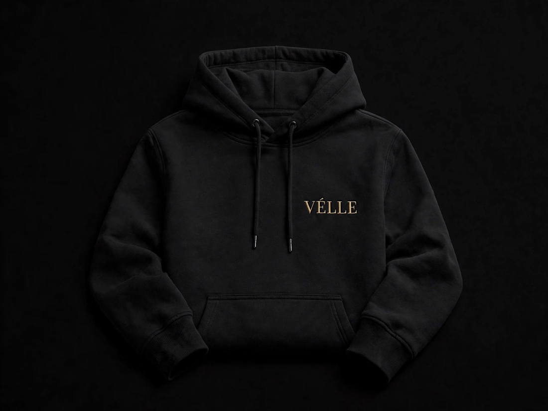
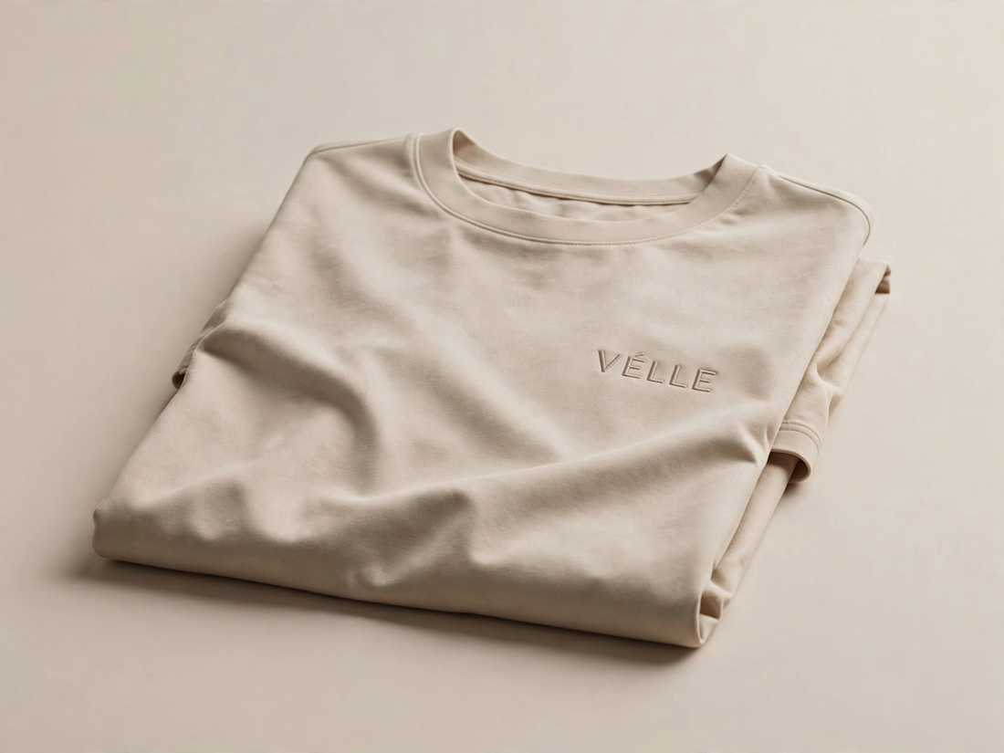
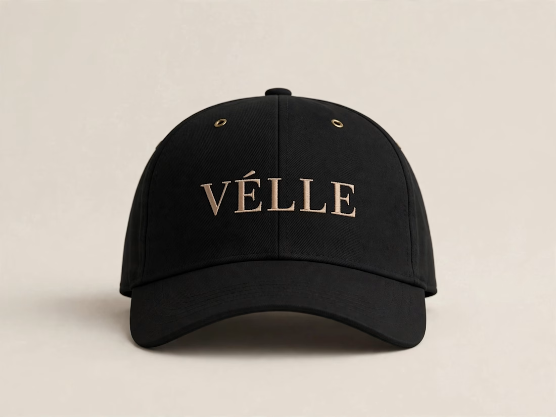
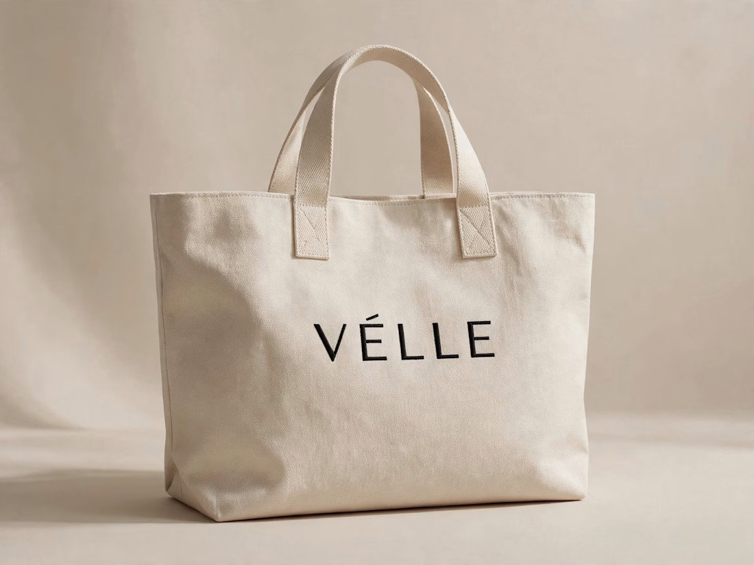

love the minimal direction on this. VÉLLE feels expensive but not loud, the tote and cap mockups are so good

Same content, different experience. A few thoughtful design choices can completely change how a presentation feels, flows, and communicates. Which version would you choose?
11 voted
31%
24 voted
69%
35 votes
Closed

Verde Vista 1 is more modern and futuristic specially with blue colors and robotic hand❤️
Great job Rasid🎉🎉🔥🔥