The network for creativity
Join 1.25M professional creatives like you
Connect with clients, get discovered, and run your business 100% commission-free
Creatives on Contra have earned over $150M and we are just getting started
Back to feedPost
A sneak peak to a B2B solution I'm building.


Thanks so much Sasha, I appreciate you❤️
The network for creativity
Join 1.25M professional creatives like you
Connect with clients, get discovered, and run your business 100% commission-free
Creatives on Contra have earned over $150M and we are just getting started

Challenges
View all


Related posts


Web Design for Contra Labs — an extension of the Brand Identity we created.
Translating the visual language, principles, and character of the identity into a cohesive digital experience.


Public animation for Revolut.
What do you think?


Love it 😍

Your votes are in! Here's the final TutorIQ website ☀️
Thank you to all 20 of you who voted on the two concepts 🏄🏼♀️ It was close: 55% chose light and playful and 45% chose softer and calmer.
The final version mixes the two moods. Its bright colors are from the playful first concept. From the second one, it took the serif headline and the product preview on the first screen.
Quick context: TutorIQ is an AI tutoring platform for UK families. It matches each child with a tutor based on how they learn. Our task was a website that attracts parents and tutors before the platform launches.
Every parent comes with one question: 'Is this the right place for my child?' So the first screen answers it with the product itself. Parents see the lesson schedule and the AI summary they get after each lesson.
Now it's your turn 👇🏻 What would you keep from this version? And what would you change?

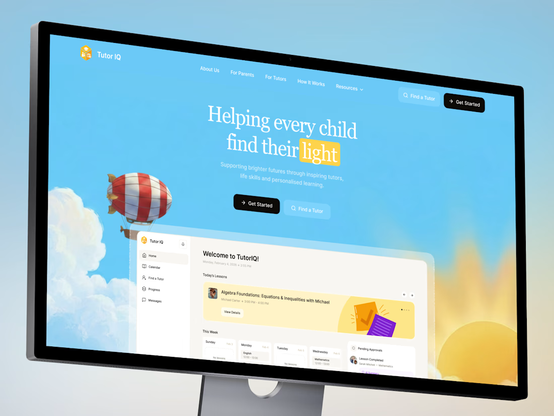
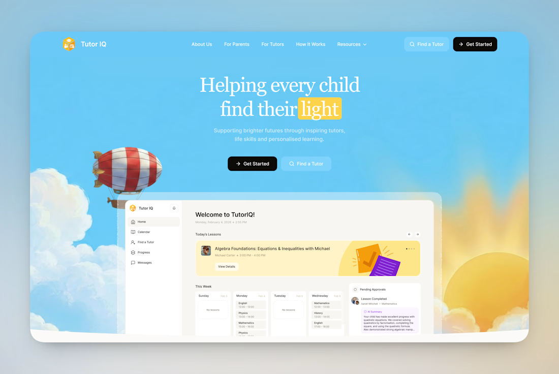

Keep: the “light” metaphor, a single idea that earns trust before the product appears. Change: contrast.


