The network for creativity
Join 1.25M professional creatives like you
Connect with clients, get discovered, and run your business 100% commission-free
Creatives on Contra have earned over $150M and we are just getting started
Back to feedPost

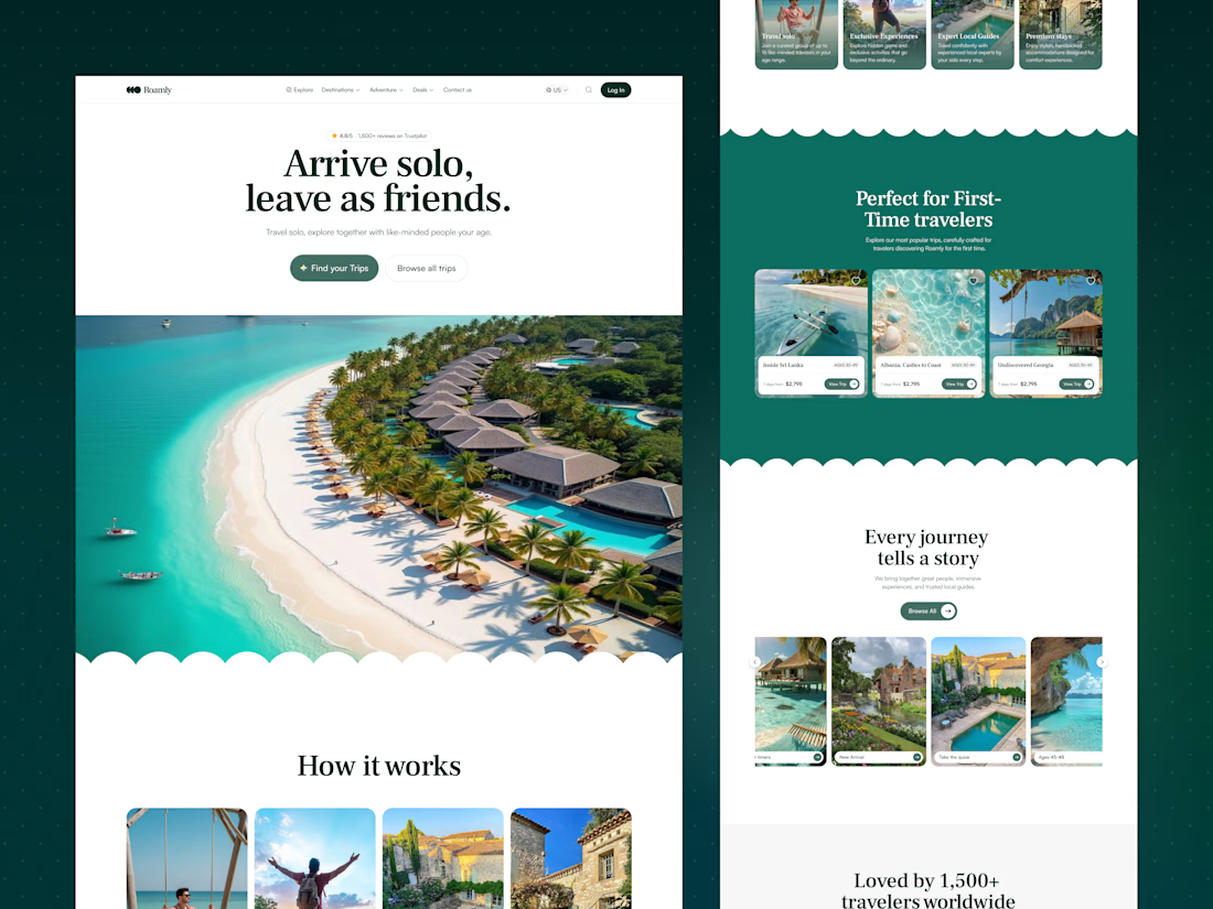
Roamly: A Landing Page that turns solo travelers into a community
Overview
Roamly helps solo travelers join small group trips and meet people their age. I designed the complete landing page in Figma, from structure and layout to the final UI. My goal was to make visitors feel welcome, safe, and excited to book.
The Problem
Traveling alone is exciting, but it comes with worries: Will I be lonely? Is this trip right for me? Can I trust this company? The page had to answer these questions as people scrolled and guide them to a trip without pressure.
My Approach
I designed the page like a conversation. It opens with an emotional hook, explains how it works, shows trips, and builds trust with real stories. Each section answers the next question a visitor is likely to have.
Key Design Decisions
1. A friendly hero. The headline “Arrive solo, leave as friends" says the whole promise in one line. A 4.8/5 Trustpilot rating sits right above it, so trust comes first. Two buttons serve two kinds of visitors: “Find your Trips” for people ready to act, and “Browse all trips” for people who want to look around.
2. “How it works” in four simple cards. Photos and short text explain the idea quickly: travel solo, exclusive experiences, expert local guides, and premium stays. People understand the offer without reading long paragraphs.
3. Trips made for first-timers. The “Perfect for First-Time Travelers” section shows popular trips with the age group, trip length, and price. These are the three things people check first. A heart icon lets them save trips for later.
4. Easy browsing. The “Every journey tells a story” carousel includes filters like age range and a quiz, so visitors can find a trip that fits them instead of feeling lost.
5. Real stories for trust. The “Loved by 1,500+ travelers” section uses colorful testimonial cards with a photo of happy travelers in the middle. It shows real people and feelings, not marketing claims.
6. A soft, memorable style. Wavy section dividers add a playful, relaxed feeling that suits travel. Deep green keeps the page calm and trustworthy. Burgundy and blue cards add warmth and variety. A serif headline font adds personality, and a clean sans-serif keeps the body text easy to read.
7. A clear ending. The page closes with “Your Next Adventure Awaits” and one more button, so visitors who finish scrolling have an obvious next step. The footer is organized into About, Policies, and social links for quick access.
The Result
A warm, easy-to-scan landing page that builds trust early, helps visitors explore trips with confidence, and keeps the next action visible all the way down the page.
Tools Used
Figma
Let’s Work Together
Need a website that feels clear, friendly, and human? Message me and let’s design something your users will enjoy.

The network for creativity
Join 1.25M professional creatives like you
Connect with clients, get discovered, and run your business 100% commission-free
Creatives on Contra have earned over $150M and we are just getting started



Related posts


cool

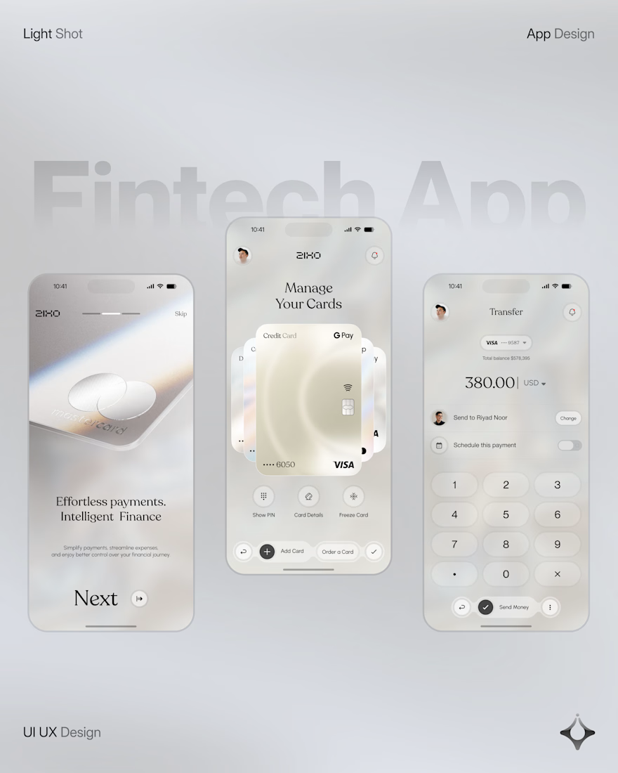
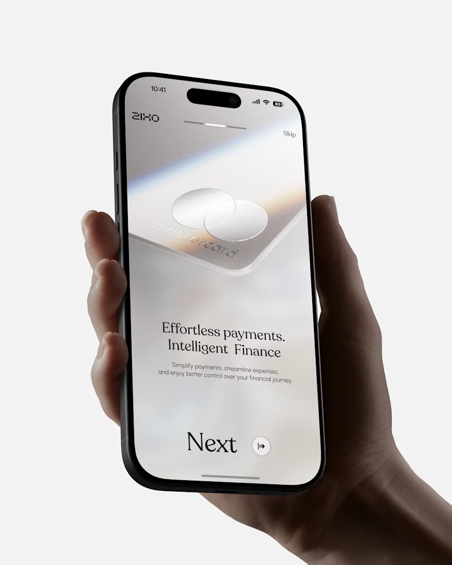
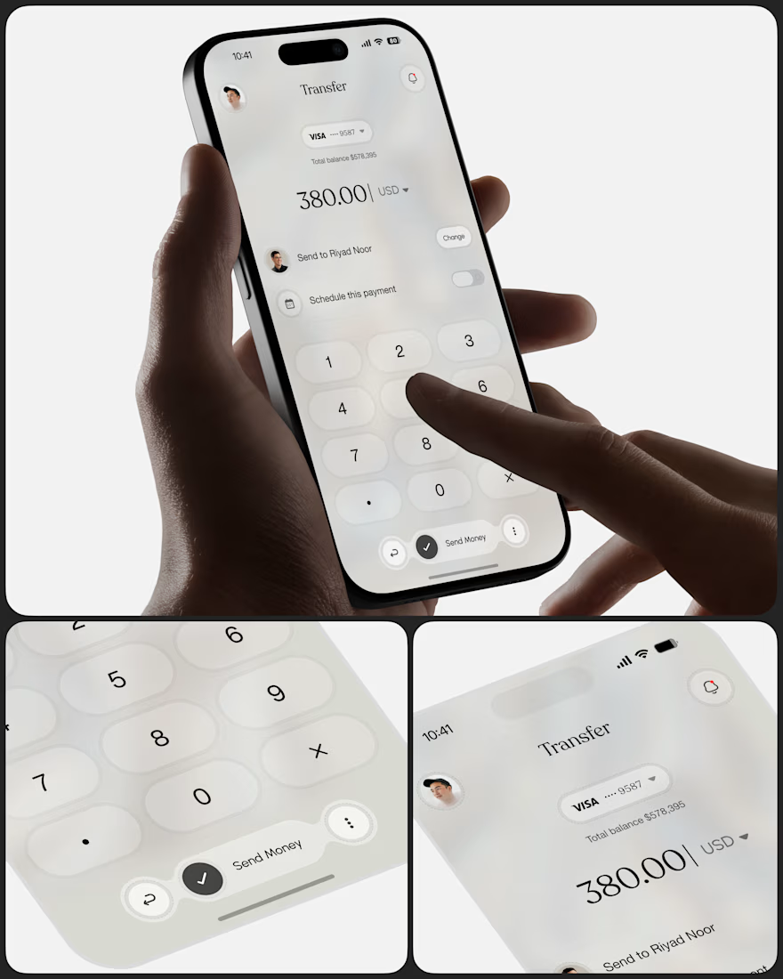
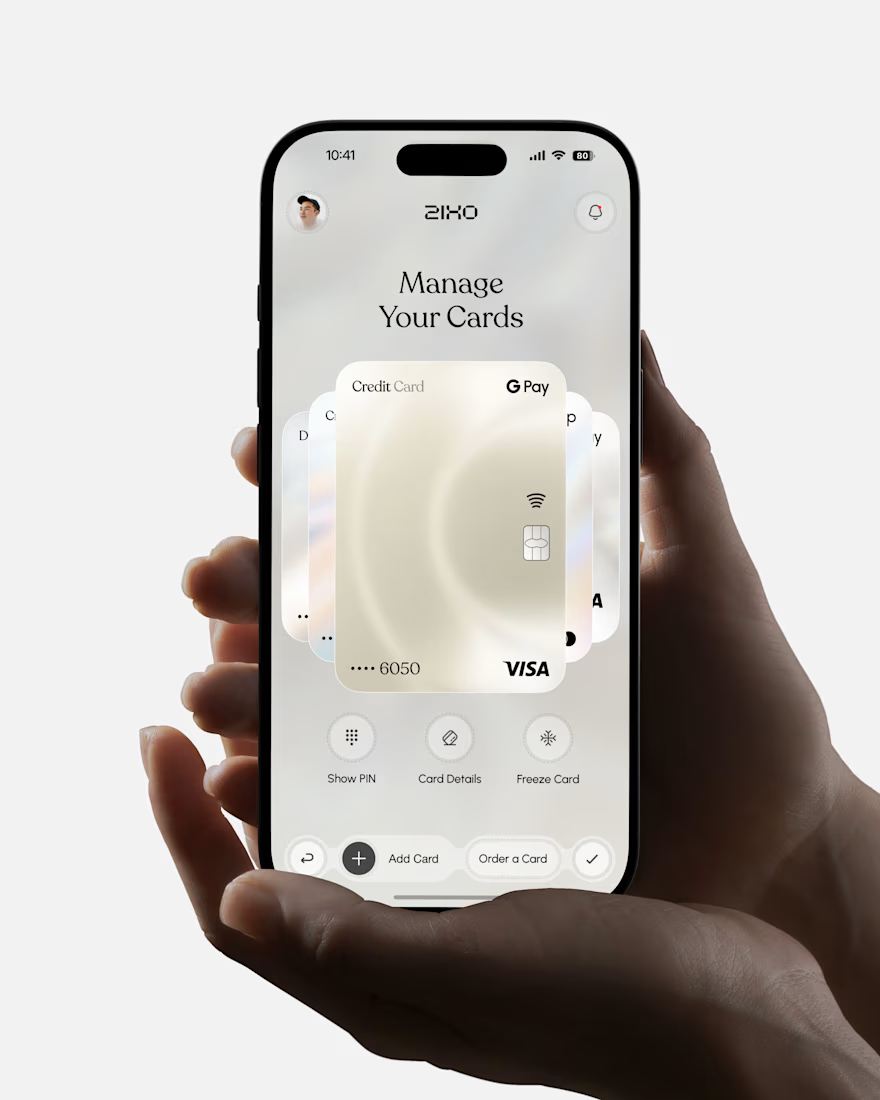
People don’t just want a banking app. They want to feel in control of their money.
Great fintech design doesn’t just look premium. It makes money feel simpler, safer, and easier to control.
Meet Ziko, a mobile banking concept where every interaction is designed to reduce friction and build trust.
What wins your trust first: 🔒 Security, ✨ Simplicity, or ⚡ Speed?



Stunning