The network for creativity
Join 1.25M professional creatives like you
Connect with clients, get discovered, and run your business 100% commission-free
Creatives on Contra have earned over $150M and we are just getting started
Back to feedPost

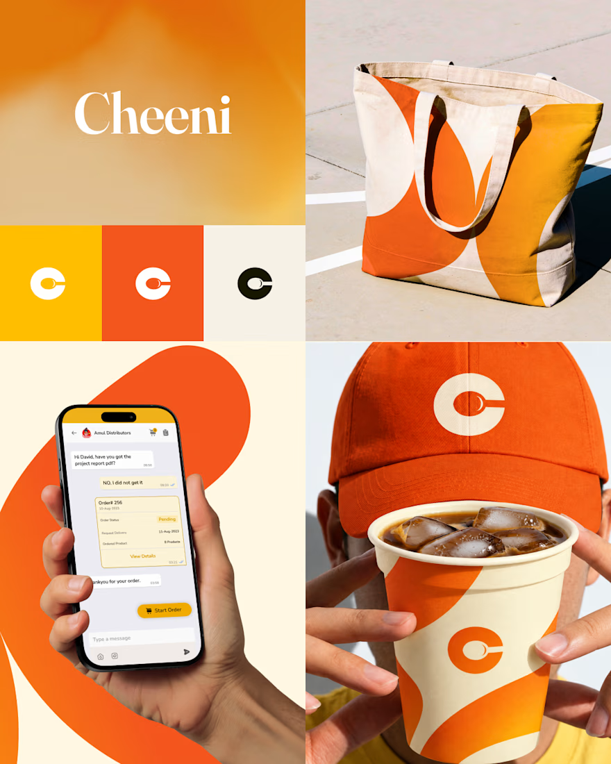
🍽️ Cheeni — Connecting Restaurants & Suppliers
🔎 The Challenge
Restaurants and their suppliers often rely on 📞 phone calls, 💬 WhatsApp messages, and 📒 paper order books to manage orders.
This creates a fragmented process that can be ⏳ time-consuming, difficult to track, and prone to miscommunication.
💡 The Idea
Cheeni is an AI-powered ordering platform designed to bring 🍽️ restaurants and 📦 suppliers onto the same page.
Instead of managing orders across multiple channels, both sides can use one connected platform to communicate, place, manage, and track orders more efficiently.
🎨 My Role
I worked as the UI/UX Designer for the Cheeni mobile and desktop application.
My work covered the complete design process — from 🧠 understanding user needs and structuring workflows to 📝 wireframing, 🖥️ interface design, and creating the final UI.
🚀 The Solution
I designed a clear and intuitive desktop experience that simplifies complex ordering workflows and makes important information easier to understand and act on.
The goal was simple:
Replace 📞 calls + 💬 WhatsApp chaos + 📒 paper orders with one connected digital experience.
✨ The Outcome
Cheeni transformed a traditionally fragmented ordering process into a more organized digital workflow, giving restaurants and suppliers a shared space to manage their everyday ordering experience.
Full Case Study 👉https://www.behance.net/gallery/254649221/AI-Powered-Ordering-Platform


The network for creativity
Join 1.25M professional creatives like you
Connect with clients, get discovered, and run your business 100% commission-free
Creatives on Contra have earned over $150M and we are just getting started





Related posts

Winder is a bold brand identity built around a geometric W-inspired symbol, combining sharp angles and forward movement to represent progress, speed, and direction.
The identity uses a striking red and deep burgundy palette, supported by clean typography and a consistent visual system across brand guidelines, digital applications, and product mockups.
Progress in Motion.



Great logo it feels it really has an identity 🎉🎉

Still waiting to hear back from @Contra HQ
So I did what any designer would do: I made the card myself 😂
Brushed metal. Laser-engraved logo. Holographic Mastercard rings. Full 360° spin. I'm going to keep polishing this until the real one shows up in my mailbox. Your move, Contra 👀
(Concept / fan design, not an official Contra product..Yet 🙌 )


“Okay, this looks WAY too good 🔥 Contra needs to make this real 👀”

Saas Management Landing Page Design
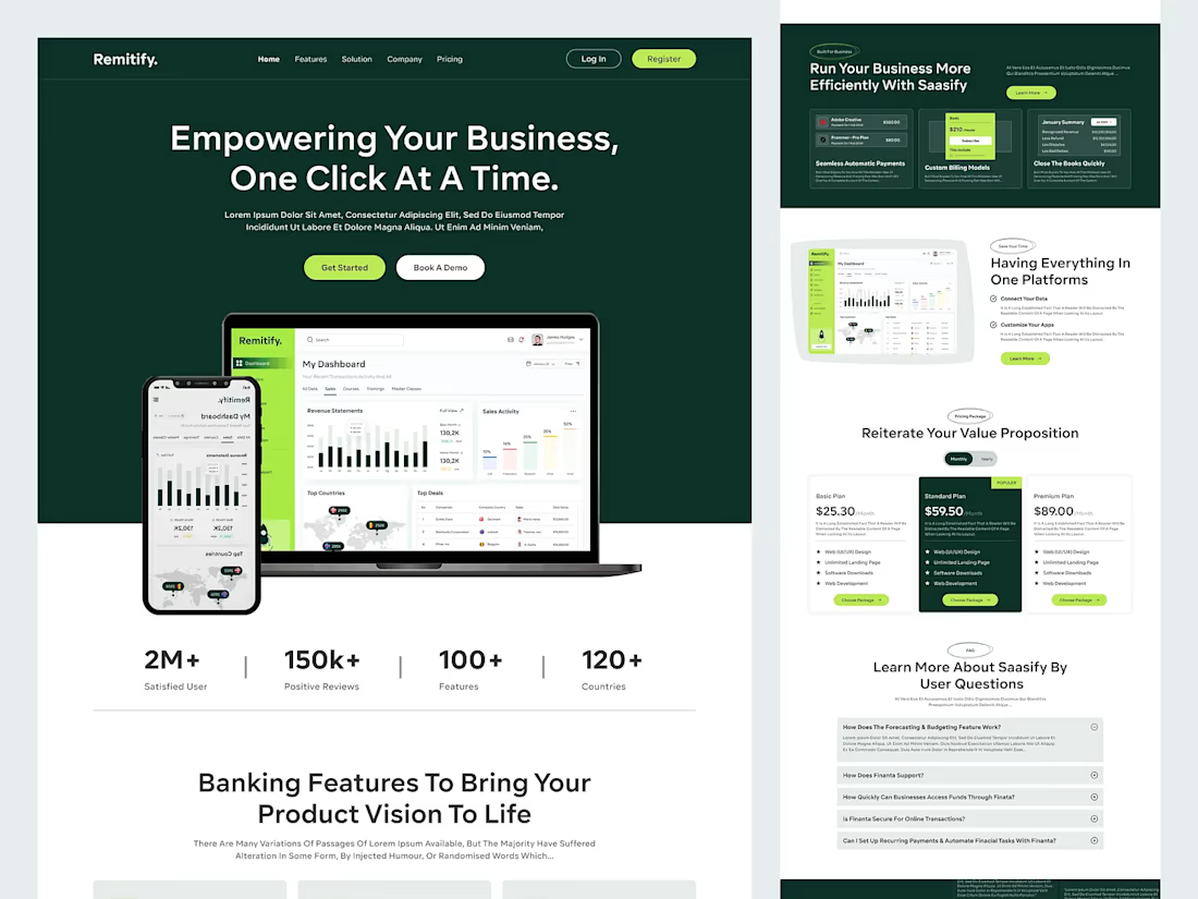
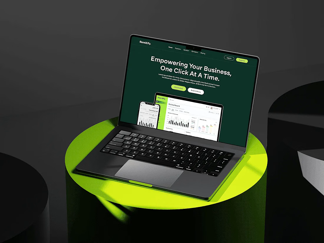

The deep green with lime accents reads "finance you can trust" without feeling like a bank, and the stats row right under the hero adds instant credibility. When pages like this get built, the dashboard in the hero is the part I'd make live: a lightweight animated version with...