The network for creativity
Join 1.25M professional creatives like you
Connect with clients, get discovered, and run your business 100% commission-free
Creatives on Contra have earned over $150M and we are just getting started
Back to feedPost


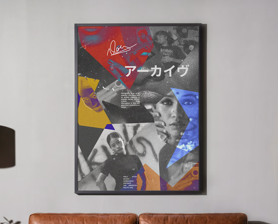

Premium design 🙂

The collage has a great editorial tension—the saturated geometric shards give the monochrome portraits a strong rhythm. The Japanese type adds just enough cultural texture without competing with the focal image.


Nice!
The network for creativity
Join 1.25M professional creatives like you
Connect with clients, get discovered, and run your business 100% commission-free
Creatives on Contra have earned over $150M and we are just getting started







Related posts

Cachet brand exploration.
Exploring patterns, textures, materials and hand-drawn illustrations
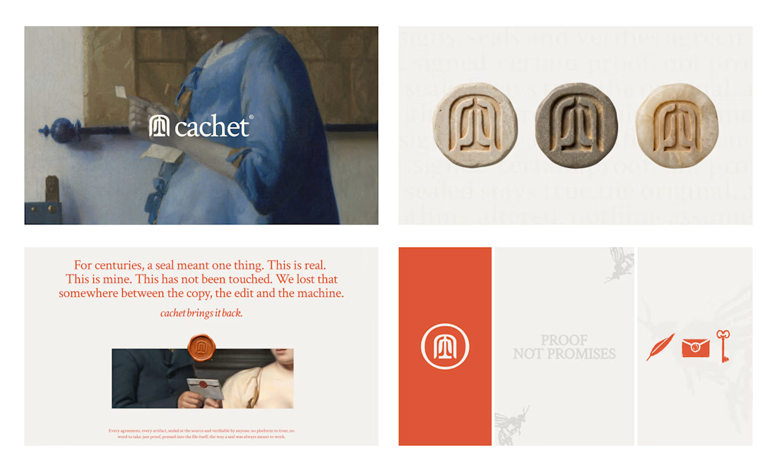

That's interesting I like it that's really unique ❤️❤️🎉🎉

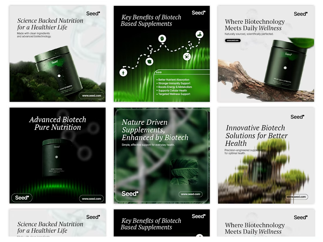
Social Media Concept Design for Seed


Made this Static ads for a payment platform
what do you think?
#motion #designer
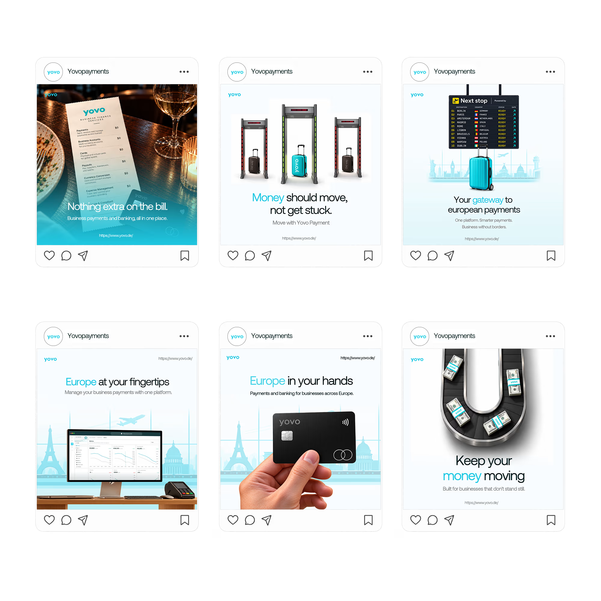

Pairing one physical object per tile (the menu, the security gate, the card) with a short headline keeps six ads feeling like a single system. Which of them ended up pulling the most attention, the literal card shot or one of the metaphor ones?