The network for creativity
Join 1.25M professional creatives like you
Connect with clients, get discovered, and run your business 100% commission-free
Creatives on Contra have earned over $150M and we are just getting started
Back to feedPost


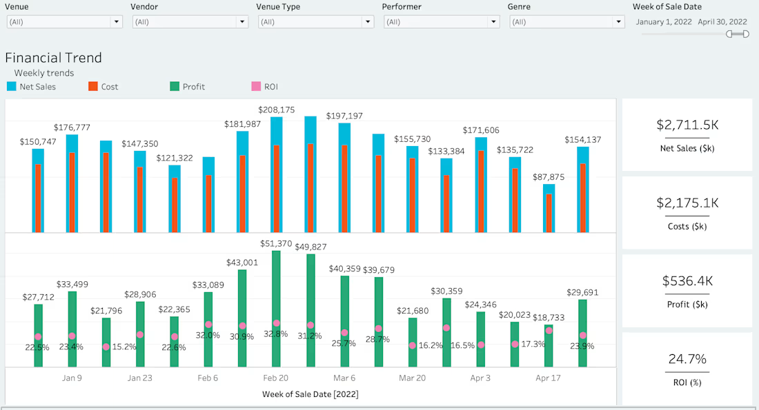
Financial dashboards shouldn’t just show trends — they should explain what’s driving profitability.
In this project, I built a Tableau dashboard that connects weekly sales, costs, profit, and ROI in a single view, allowing leaders to see where and when returns were actually being generated.
What I focused on:
Aligning sales, cost, and profit to the same time grain
Making ROI visible alongside volume, not buried in spreadsheets
Enabling quick comparisons across venues, vendors, and performers
The result:
Teams could identify high-ROI weeks and segments and make informed decisions about pricing, spend, and future bookings.

The network for creativity
Join 1.25M professional creatives like you
Connect with clients, get discovered, and run your business 100% commission-free
Creatives on Contra have earned over $150M and we are just getting started







Related posts

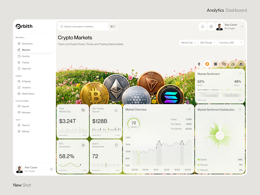
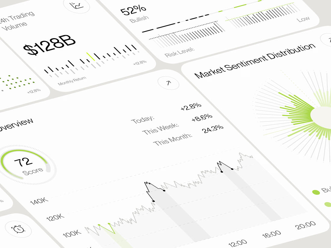
Most crypto dashboards show numbers. Great design turns those numbers into decisions.
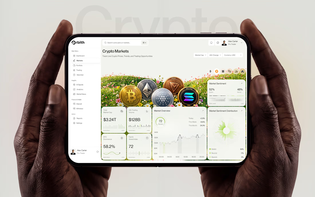
Meet Orbit — a crypto analytics dashboard where real time insights meet a premium, data-driven experience.
Would you trust this interface with your next trading decision?
#UIDesign #DashboardDesign #CryptoTrading #FintechDesign #ProductDesign




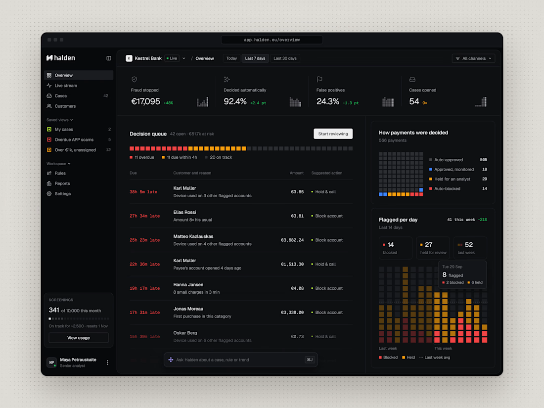
Most dashboards show everything at once. Halden's overview starts from one question: what needs a decision right now?


would actually use this lol. the customizable part is what runners care about