The network for creativity
Join 1.25M professional creatives like you
Connect with clients, get discovered, and run your business 100% commission-free
Creatives on Contra have earned over $150M and we are just getting started
Back to feedPost

Project Title
DR. PEELER Gummy Candy | Packaging & Brand Design
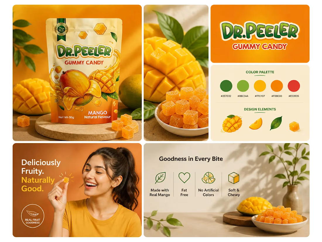
A vibrant and playful packaging design created for DR. PEELER Gummy Candy, featuring a mango-inspired visual direction designed to communicate flavor, freshness, and fun.
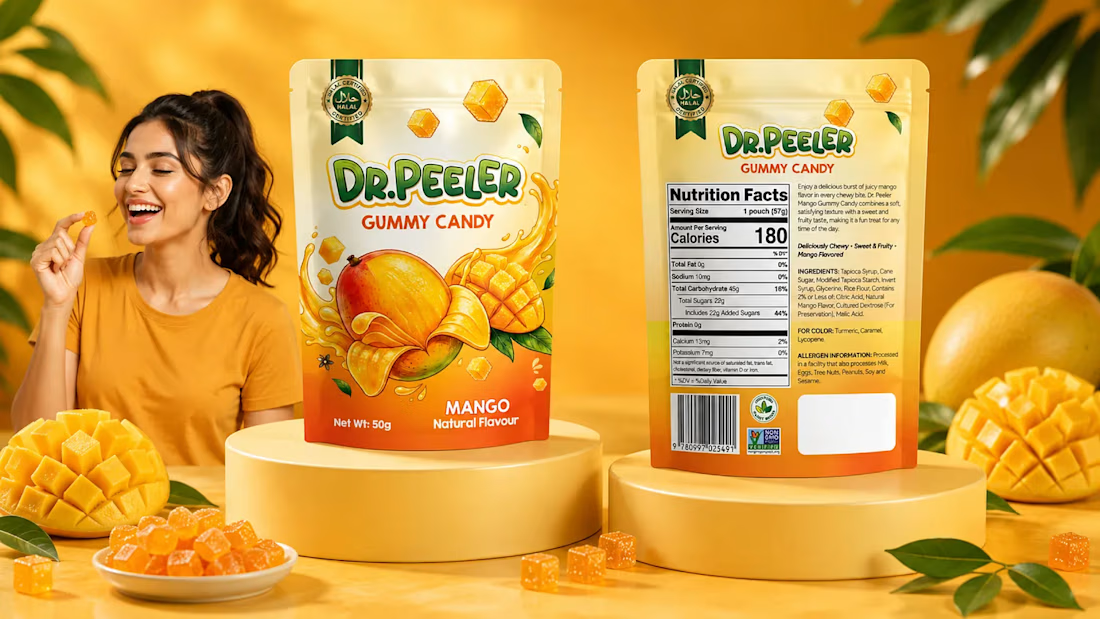
The packaging combines bold typography, bright colors, fruit illustrations, and appetizing product visuals to create strong shelf appeal. I developed a cohesive visual system that carries the brand identity across the pouch packaging and supporting promotional graphics.
The final presentation demonstrates how the packaging can extend into lifestyle and marketing visuals while maintaining a consistent and recognizable brand look.
My work included:
• Gummy pouch packaging design
• Brand visual direction
• Color palette development
• Fruit graphics & visual elements
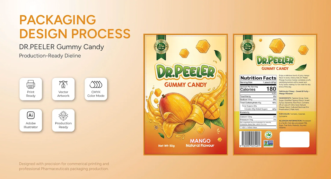
• Typography & layout system
• Product mockups & presentation
• Marketing visuals
• Print-ready artwork preparation


The network for creativity
Join 1.25M professional creatives like you
Connect with clients, get discovered, and run your business 100% commission-free
Creatives on Contra have earned over $150M and we are just getting started






Related posts

Inspiration design of the day 🔥

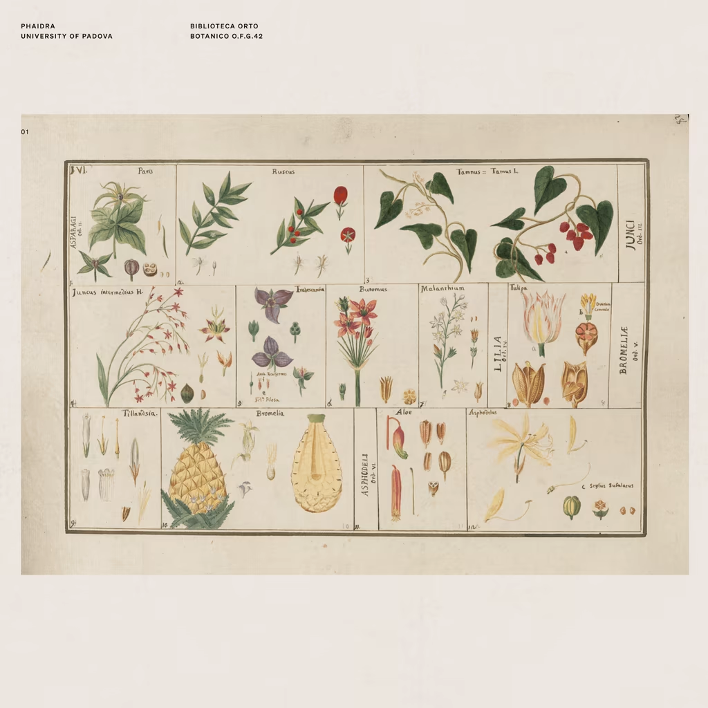
There's a shop in Barcelona that sells vintage prints from artists long gone.
On one of my visits, I found myself completely drawn to the way they used to illustrate flowers, fruits, objects, animals. A real exercise in consistent observation, one that's been lost in a generation...


Libra season is here, and so is spring (in my side of the world)!
🌸🍃 ☀️🌈
I'm using this blooming moment to rebuild my personal brand from the ground up: re-evaluating, brainstorming, and bringing my whole toolset to the table. 💻🧠⚡️
As a multipotential creator, making everything I do fit into one clear story isn't always easy. So I'm giving it the time it deserves, and I'm curious to see where it leads.
STAY TUNED! 😊


A little taste of Regal Brews ☕✨
A visual exploration of bold coffee branding, packaging, and product styling for Regal Brews, bringing together distinctive colors, playful patterns, and a premium product presentation.
#BrandIdentity #PackagingDesign #CoffeeBrand #RegalBrews #ProductDesign #CreativeDirection #DigiLabss