The network for creativity
Join 1.25M professional creatives like you
Connect with clients, get discovered, and run your business 100% commission-free
Creatives on Contra have earned over $150M and we are just getting started
Back to feedPost

Spent most of an afternoon once redrawing a single icon for Cliff Studio's catalog on Tilda, long after the client had already approved it.
It looked perfect at the size it shipped in the brief. Then it needed to sit inside a smaller thumbnail grid on a different page, and the detail that made it read as premium at full size turned into a grey smudge at 32 pixels. Nobody had asked what the icon needed to survive. Everyone, including me, had just checked what it needed to look good as.
I redrew it checking the smallest size it would ever appear at open on one monitor and the largest on another, adjusting until both held up, instead of designing once and hoping it would scale.
Small decision, but it's stuck with me longer than any of the bigger catalog work from that project.
What's the smallest asset on your last project that quietly took the most rework?
The network for creativity
Join 1.25M professional creatives like you
Connect with clients, get discovered, and run your business 100% commission-free
Creatives on Contra have earned over $150M and we are just getting started



Related posts

Recent thumbnail design
Which thumbnail will you click?
0 voted
1%

0 voted
1%

0 votes
Closed

Bondri has been featured by 6 different curators in the past month and I’m still a bit in disbelief.😮
I put a lot of care into every detail of this one, from the illustrations to the packaging to how the day and night variants talk to each other. Seeing it recognized like this means a lot.
What makes you stop and really look at a project when you’re scrolling?

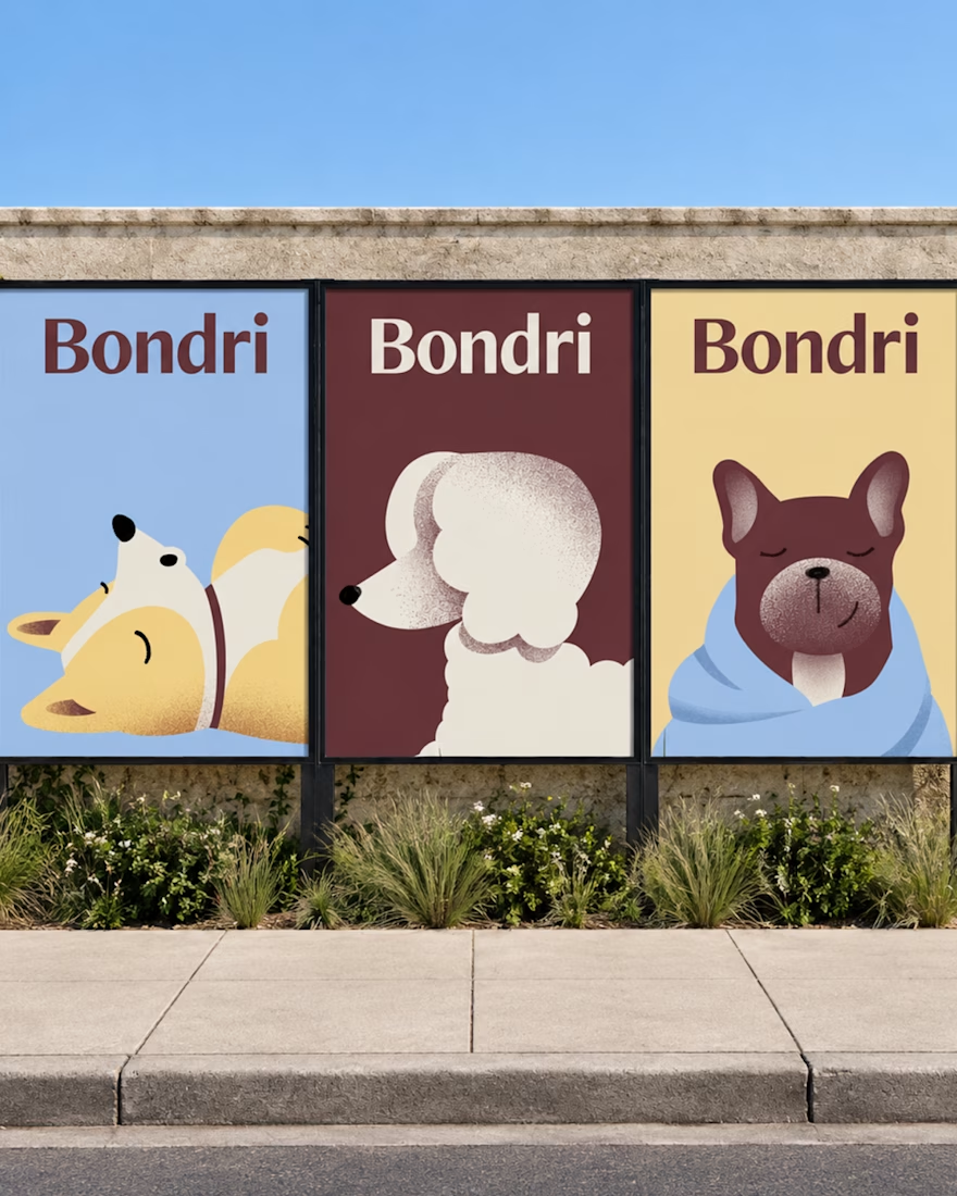
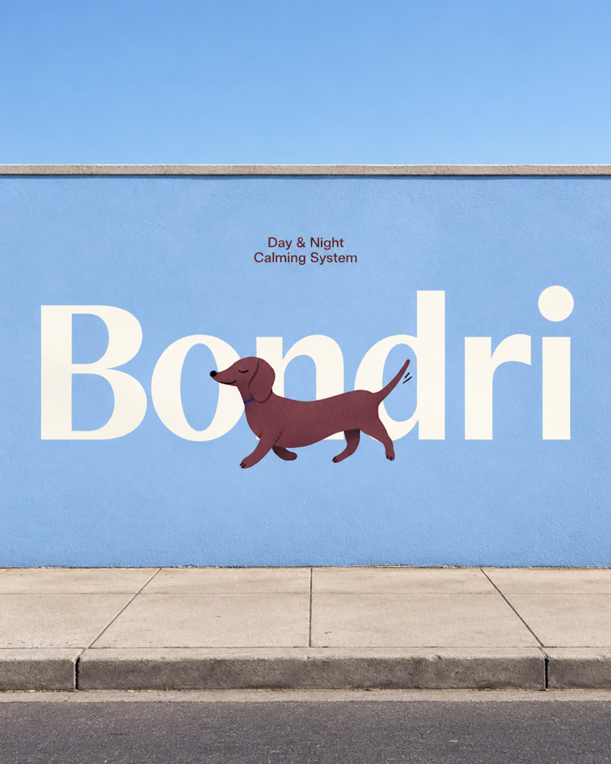

I think it’s the little details that make a project stand out. When everything feels intentional and tells a story, it naturally makes you want to stop and take a closer look. Love how much thought went into this! 👏
Well-done Chantal

I was working on the visual identity for the Ivy and wanted to experiment with stippling.
Thousands of tiny dots forming an image. Simple enough as an idea.
Figma had other plans.
I tried plugins, but the number of SVG elements was too much.
My laptop slowed down, and eventually the workflow became unusable.
I remember thinking, "Why am I trying so hard to make this work inside Figma?"
I didn't need another plugin. I needed a different tool.
So I built one.
It's called Stippling Studio.
Nothing revolutionary.
Just a tool that lets me experiment with the visual treatment I had in mind.
But the experience stuck with me.
For years, I learned to work around the limitations of my tools. Now I can sometimes build my way around them.
https://stippling.pash.website/

So cool!!