The network for creativity
Join 1.25M professional creatives like you
Connect with clients, get discovered, and run your business 100% commission-free
Creatives on Contra have earned over $150M and we are just getting started
Back to feedPost

Good visuals get attention in design.
Good thinking makes products actually useful.
I’ve seen really good-looking interfaces fail because they didn’t answer simple questions for the user: what do I do here, what happens next, why does this matter.
When those questions aren’t clear, people hesitate. Or they drop off.
And for me, that’s what good design comes down to. It’s not just how it looks, it’s how easily someone can move forward without thinking too much.
The network for creativity
Join 1.25M professional creatives like you
Connect with clients, get discovered, and run your business 100% commission-free
Creatives on Contra have earned over $150M and we are just getting started











Related posts

15 seconds of smooth UI, editorial layouts, and micro-interactions.
Kept the micro-interactions snappy, typography expressive, and transitions buttery smooth.
Rate this UI animation from 1 to 10 in the comments, or tell me what you’d improve! 😉


Solid 10/10 bro! 🔥 Micro-interactions are super snappy and transitions are buttery smooth indeed. Editorial layout game is strong. Keep it up!


Lovely cohesive work, Alex. The motion is spot on!

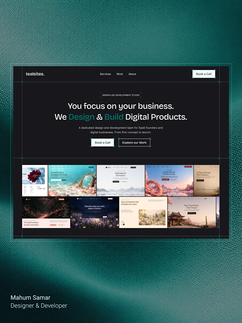
Final hero section for TealSites, a web design & development agency.
Designed in Figma.
The thinking behind the design was simple:
Clear messaging that communicates the agency's value right away.
A project showcase directly below the headline, letting the work speak for itself.
Subtle grid lines, corner brackets, and teal accents to create a distinct visual identity.
Two clear CTAs, one for potential clients ready to connect and another for those who want to explore the work.
The goal was to balance visual appeal with clarity, structure, and usability.
Clean design, thoughtful details, and a clear purpose behind every element.
What do you think?

Excellent