The network for creativity
Join 1.25M professional creatives like you
Connect with clients, get discovered, and run your business 100% commission-free
Creatives on Contra have earned over $150M and we are just getting started
Back to feedPost

Custom Product Icon Set for Responsive
We originally developed the brand identity for Responsive, then extended it into a custom icon system for their platform.
The goal was to make every product touchpoint feel recognizably Responsive while keeping the icons clear, functional and scalable.
A first look at a few icons in motion. Full set coming next!


This is Awesome 😍

Beautiful work, clean motion and textures.

Extending a brand identity into a full icon system is such a natural next step but easy to get wrong. What was the trickiest part of keeping every icon feeling recognizably Responsive while still staying functional?


Really like how the brand identity carries into the icon system. The motion makes them feel even more alive.

Keeping this glossy and dimensional while still promising it stays "clear and functional" is the real test for an icon system - that green folder reads great at this size, curious how it holds up once it's rendered at the actual in-app pixel size.

Love how the icon system extends the brand identity beyond the logo and into the actual product experience. Consistency, clarity, and scalability all coming together really well here.

beautiful blur/glass effects, well done !
The network for creativity
Join 1.25M professional creatives like you
Connect with clients, get discovered, and run your business 100% commission-free
Creatives on Contra have earned over $150M and we are just getting started





Related posts

Brand Identity & Packaging Design
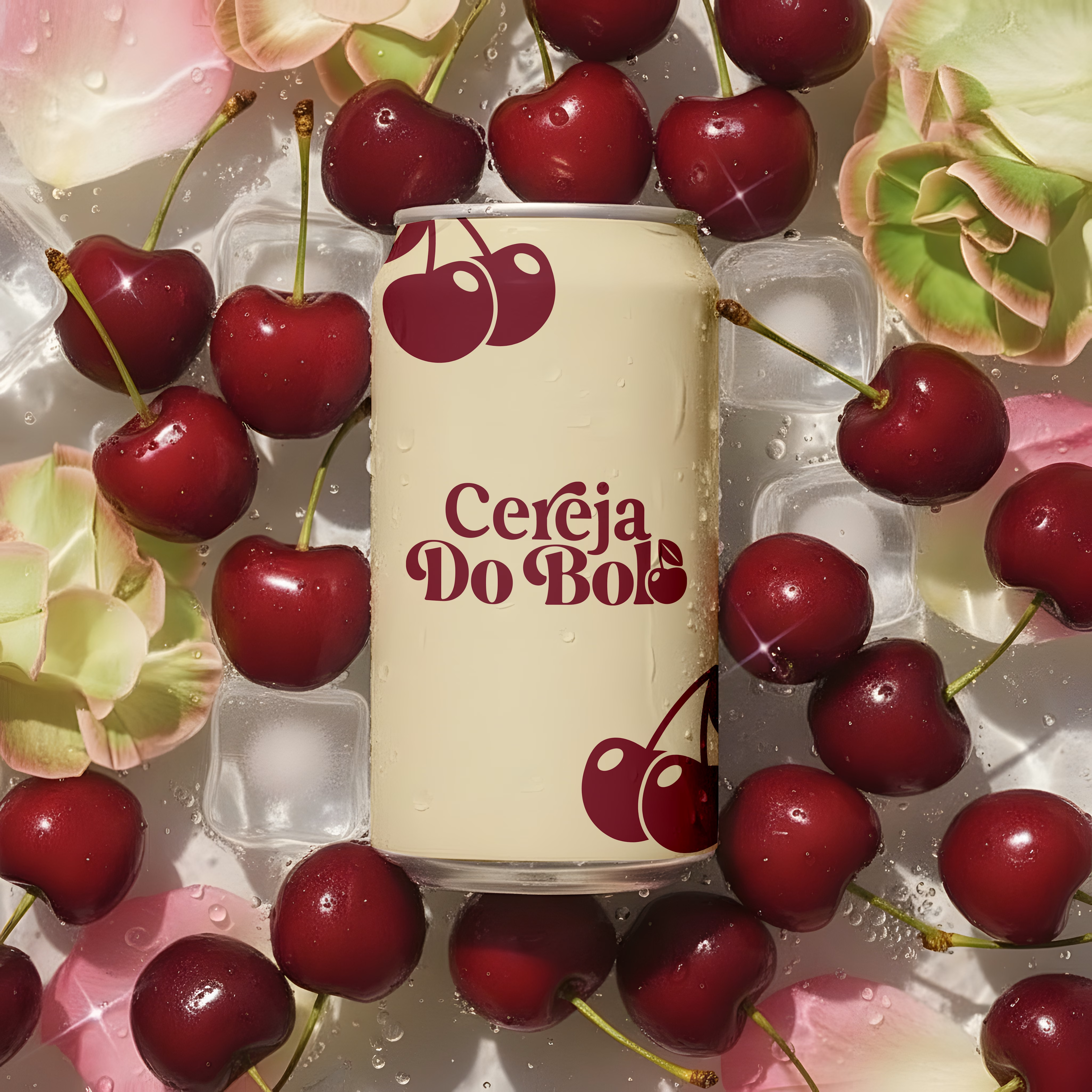
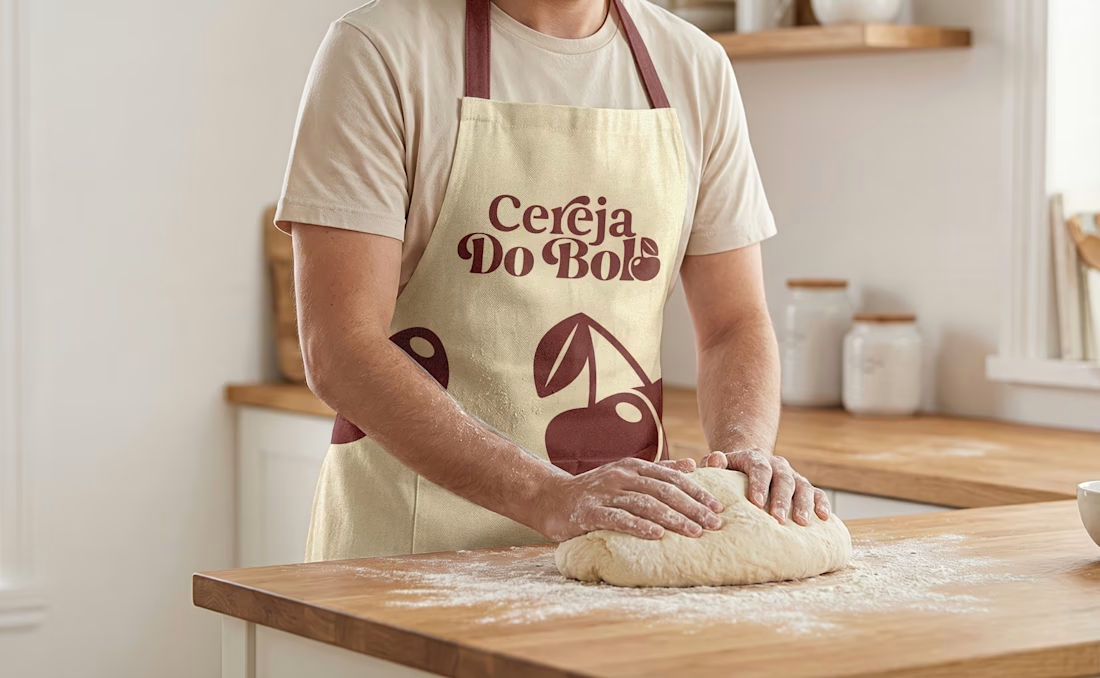
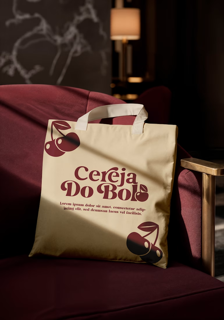
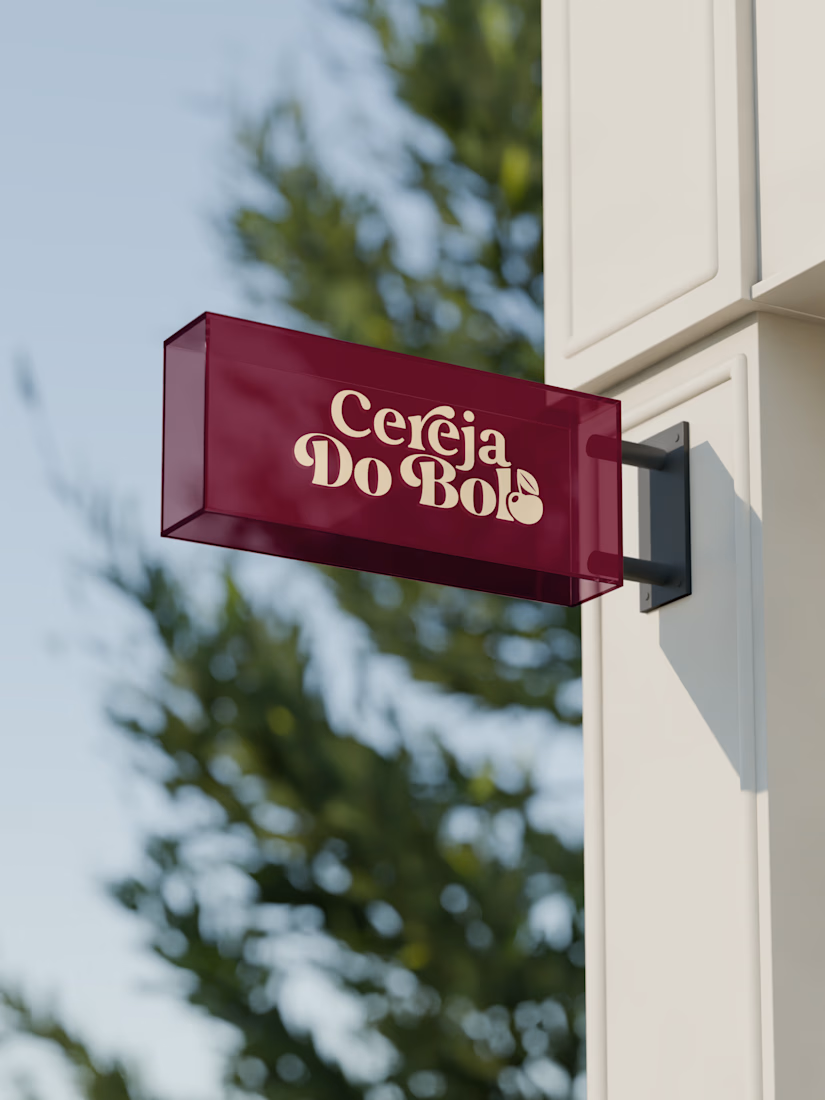
A complete visual identity and packaging concept for Cerveja do Bolo, including branded packaging, merchandise, and outdoor signage. I developed the visual direction and applied the brand consistently across multiple touchpoints to create a cohesive and recognizable identity.


Wow, love it

What if a salvage company's brand looked like it belonged in a stamp album, not a treasure map?
Introducing BALEEN — marine salvage & shipwreck archaeology, built on vintage natural-history stamp DNA. Every object recovered, catalogued, provenanced.
Website here
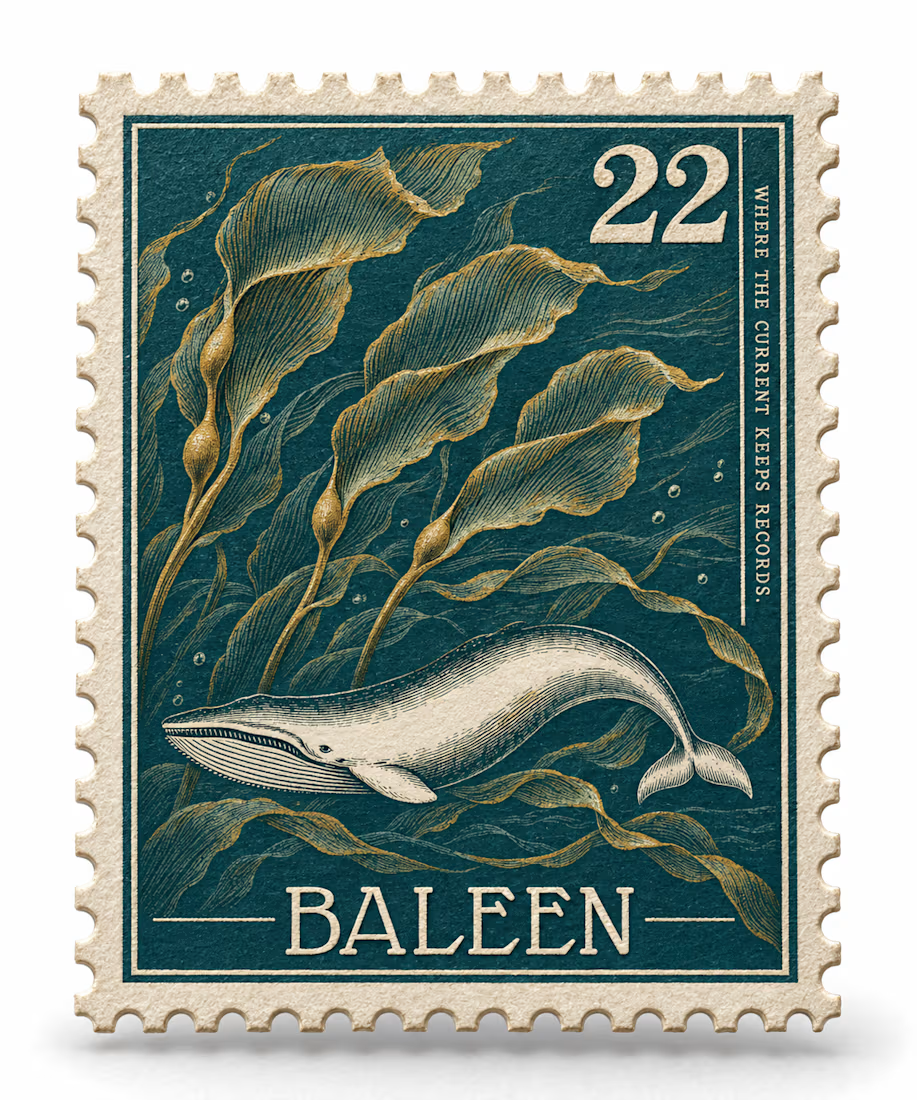
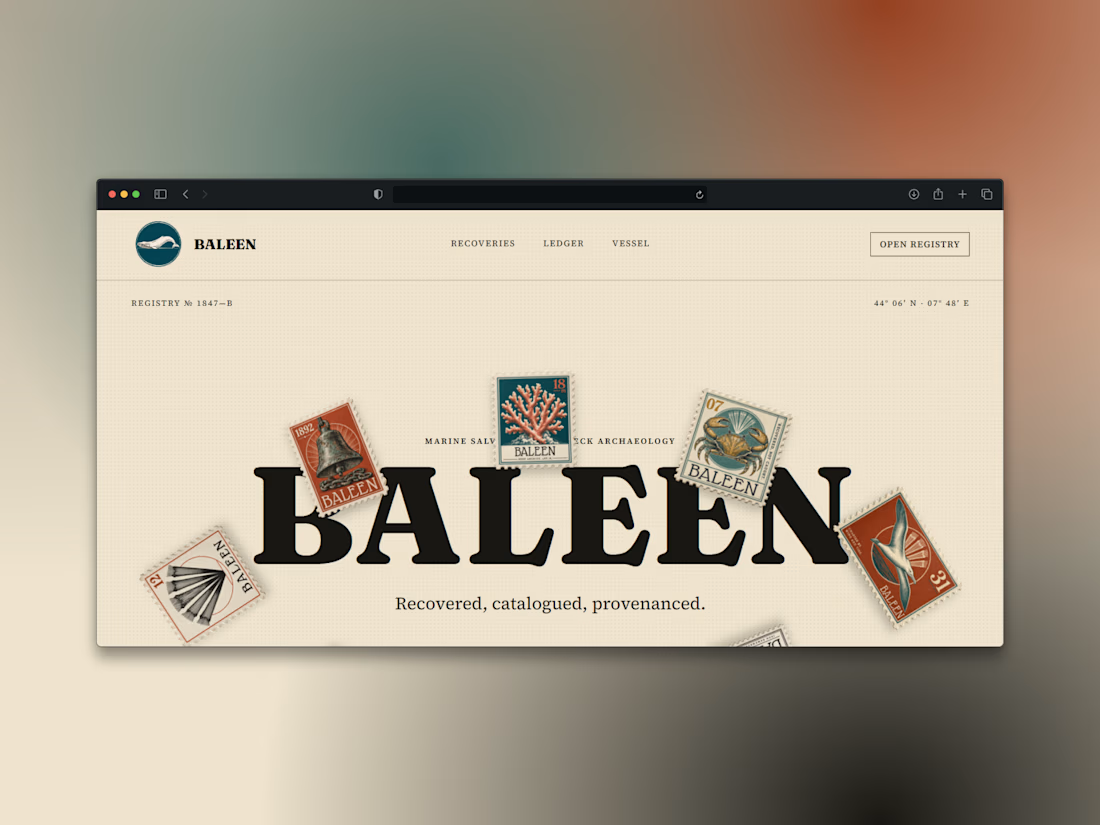

Just shipped the BALEEN site — a marine salvage brand's home isn't a brochure, it's a registry.
A draggable archive of hyperrealistic specimen stamps as the hero. A live ledger of recovered objects. A vessel section with working depth and call sign.
Every object catalogued, never sold as treasure. 🐋⚓️

100% brochure, from layout, typography, sections, color palete and the description 100% AI generated. I use AI as well, but it seems like you did not put any human output anywhere.