The network for creativity
Join 1.25M professional creatives like you
Connect with clients, get discovered, and run your business 100% commission-free
Creatives on Contra have earned over $150M and we are just getting started
Back to feedPost

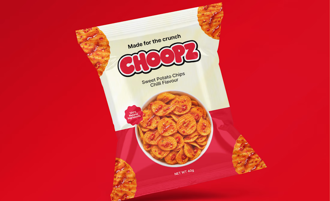
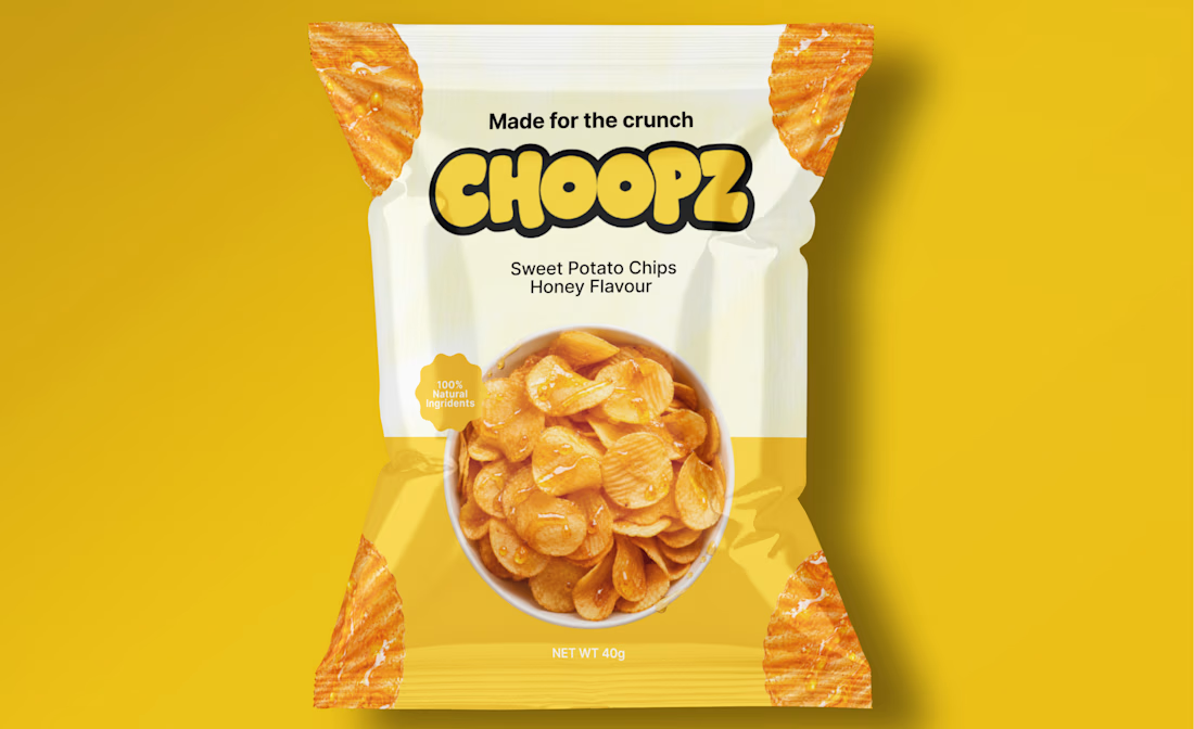
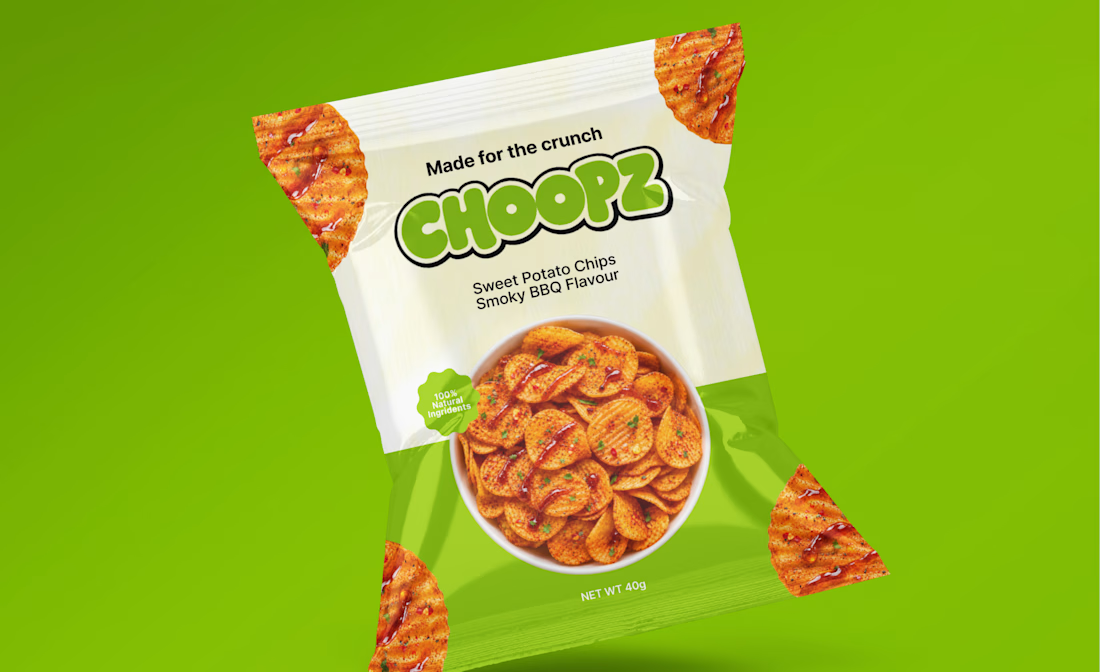
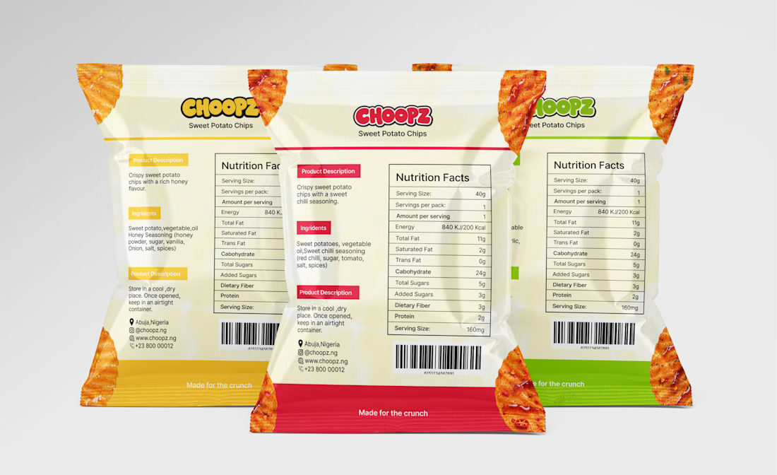
CHOOPZ is a conceptual brand identity and packaging design project for a sweet potato chips brand.
The goal was to create a bold, energetic identity with a playful edge, one that connects with Gen Z while remaining distinctive and recognizable. The visual direction brings together a custom wordmark, a vibrant color palette and a consistent packaging system designed to give each flavor its own character while maintaining a clear brand identity.
From the logo and color choices to the packaging and lifestyle visuals, every element was developed to work together as one cohesive brand experience.
How effectively do you think the visual identity communicates the brand’s personality and positioning?
The network for creativity
Join 1.25M professional creatives like you
Connect with clients, get discovered, and run your business 100% commission-free
Creatives on Contra have earned over $150M and we are just getting started



Related posts

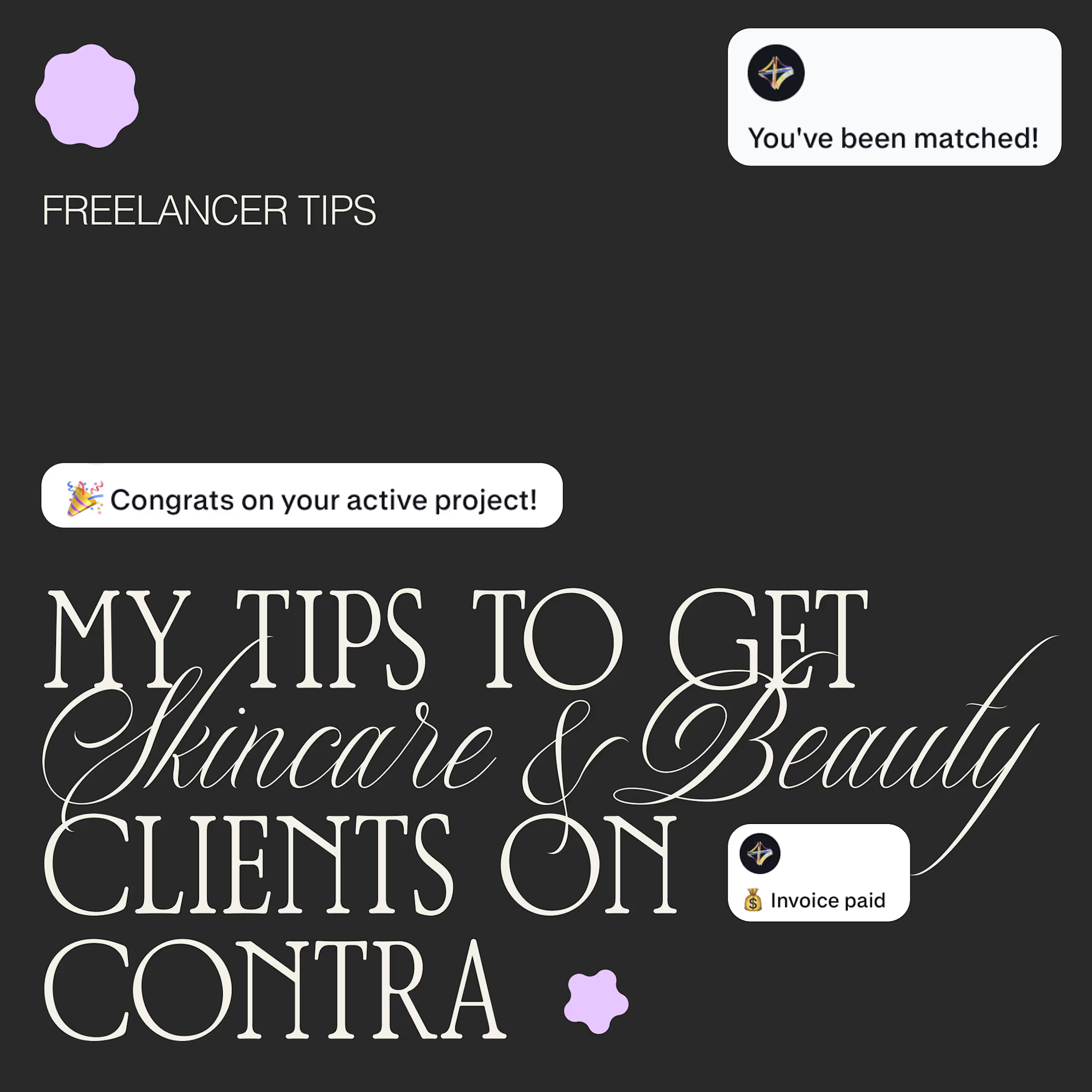
I get asked a lot how I get beauty and skincare clients, so here is what has helped me most:
📚 A portfolio that shows the work you want to get hired for. No real clients yet? Make passion projects for dream brands.
🎯 Apply only when your portfolio matches the job. Clients are very visual, and a product design portfolio won’t win a packaging project.
🔍 Research a lot. Follow the brands, learn how they talk and who they speak to.
💬 Apply to jobs that resonate with your skills and share related projects to potential clients.
🧴 Buy the products and analyze the packaging. Typography, finish, weight, how the label sits. You’ll notice things you can talk about in your pitch ✨
What would you add?

a portfolio that shows the work you want to get hired for is the best advice here. passion projects for dream brands really work

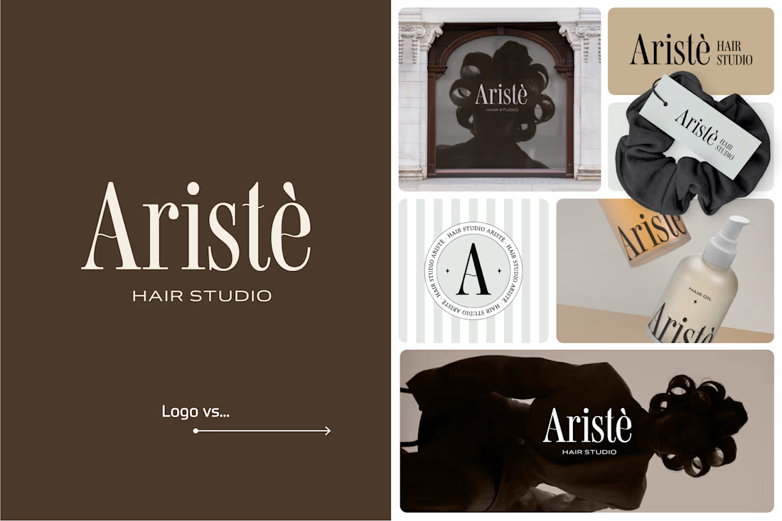
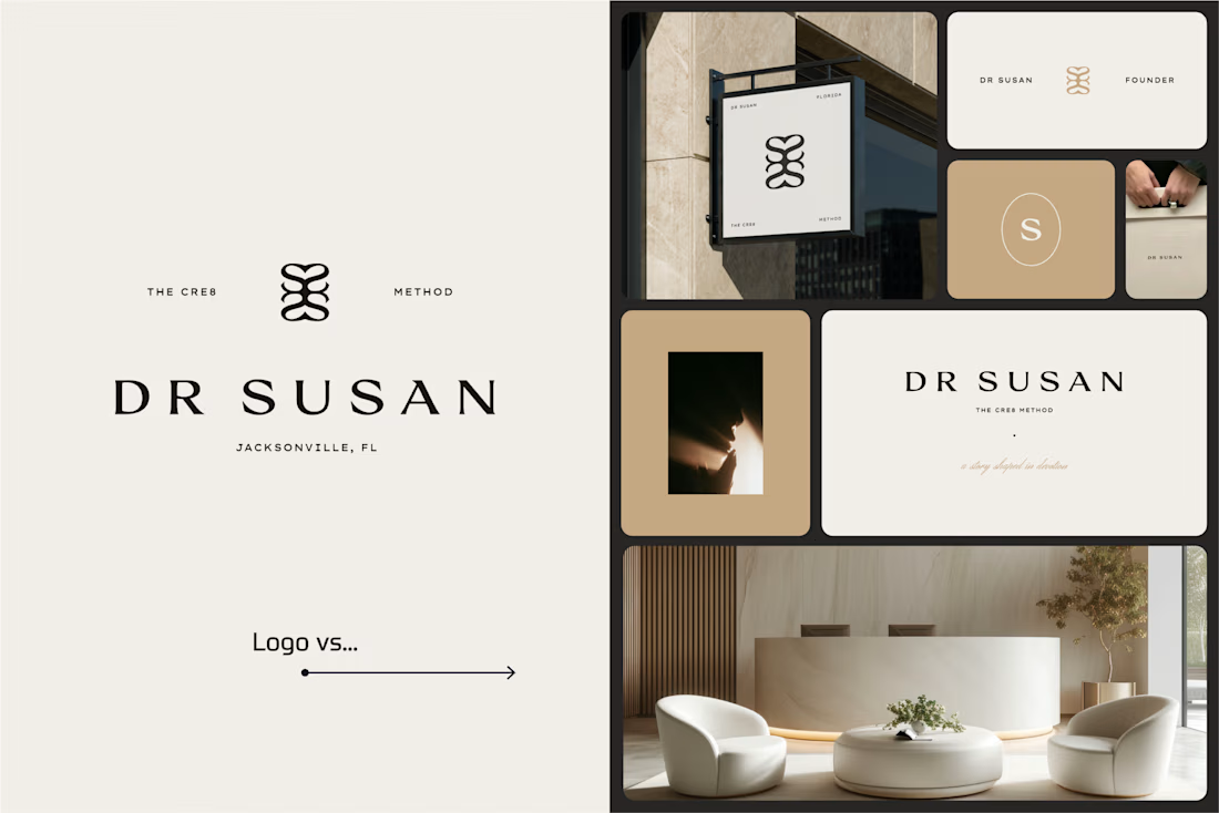
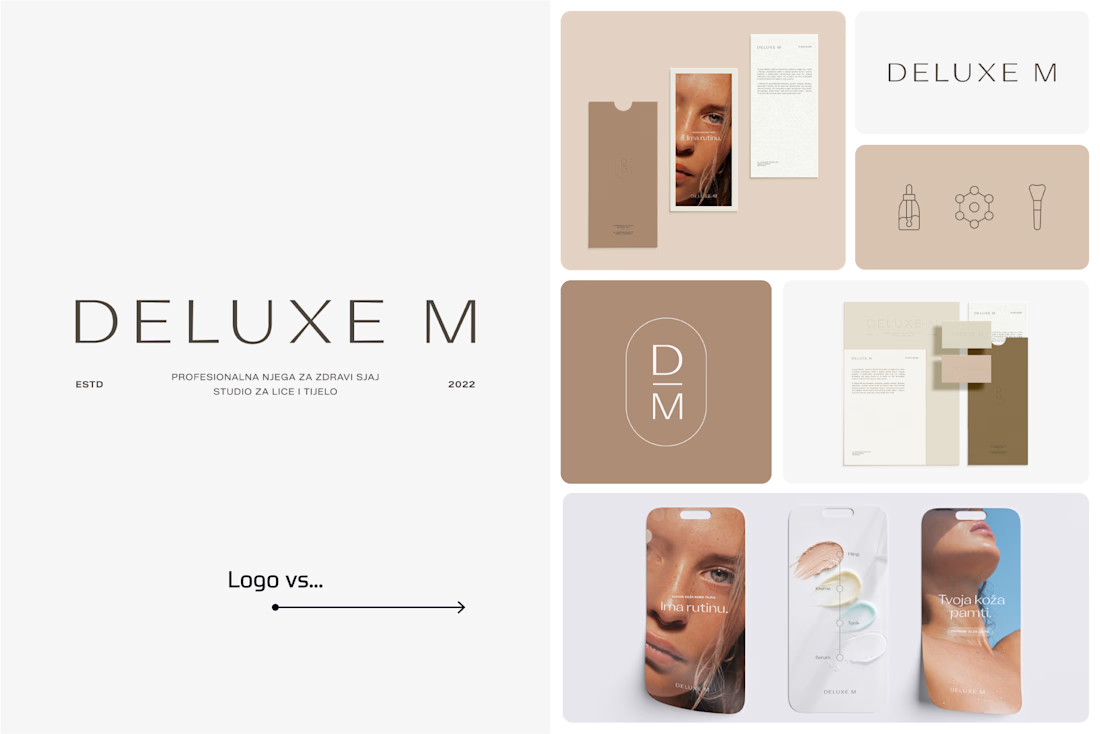
A logo is one thing. Giving it a whole personality is another. 👀
I picked a few of my branding projects to show what happens beyond the logo.
First, the logo on its own. Then, the full visual identity: colours, typography, graphic elements, patterns, packaging, and all the little details that make each brand feel like itself.
Because I don't want a logo to just look good sitting on a presentation slide. I want to see what it can become when it gets out into the real world.
Every project has a different story, personality, and visual direction. And that's probably my favourite part of brand design: figuring out how to turn one initial idea into a whole visual language.
Swipe through and meet the logos, then their bigger personalities. ;)
A logo is the starting point. The fun really begins after that.
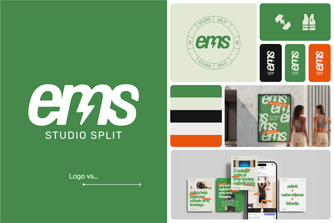

Clever use of the lightning bolt in the EMS logo!

Brand work for Boofi, DeFi platform
We are working on visual direction, motion and animations


So cute! Love it!