The network for creativity
Join 1.25M professional creatives like you
Connect with clients, get discovered, and run your business 100% commission-free
Creatives on Contra have earned over $150M and we are just getting started
Back to feedPost
Taste Test

Exploring the visual mood for a new brand identity. Which direction feels more distinctive and has more potential to grow into a recognizable brand system?
2 voted
40%
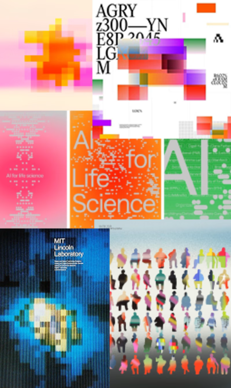
3 voted
60%
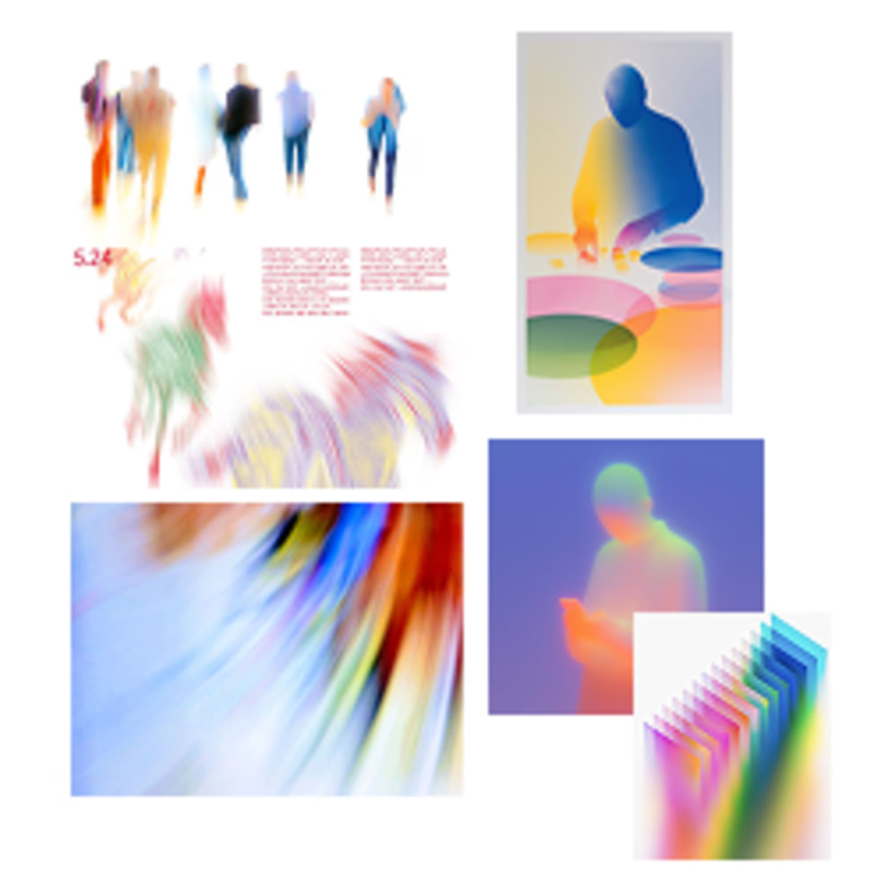
5 votes
Closed

Fluid is actually more easy to eyes ⭐ also because it have gradient colour, to be good second one needs less contrasting colours

fluid self

Organised gradients for me. Fluid Self looks gorgeous but it is hard to reproduce consistently across a whole system, while the structured grid gives you a repeatable language a brand can actually own. Distinctive plus scalable beats pretty but slippery.

I’d go with Fluid Self. The visual language feels more ownable and expressive
The network for creativity
Join 1.25M professional creatives like you
Connect with clients, get discovered, and run your business 100% commission-free
Creatives on Contra have earned over $150M and we are just getting started








Related posts


Which feels more established to you?
22 voted
30%
52 voted
70%
74 votes
Closed


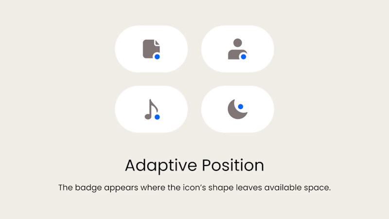
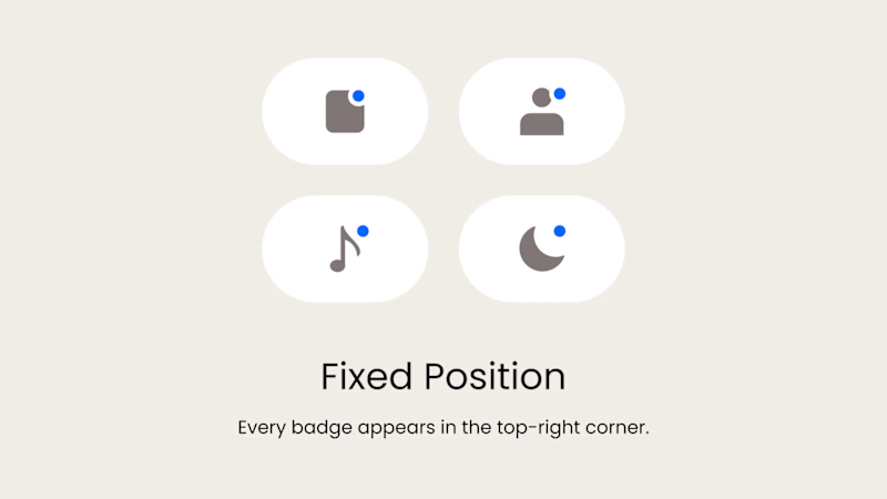
Badge Placement: Consistency or Visual Balance?
Even a small indicator can change how the entire interface feels
Adaptive Position
The badge placement changes depending on the icon’s shape and available space. The result feels more visually balanced but requires individual adjustments.
Fixed Position
The badge always appears in the top-right corner. This creates a consistent and predictable system, but on some icons it may feel disconnected or awkwardly placed.
What matters more in a design system: consistency or optical balance?
17 voted
43%
23 voted
57%
40 votes
Closed

Fixed for me. In a system, people learn where to look. I'd tweak the odd icons before breaking the rule.

Title: Proper Form — Brand Identity & Visual Language
A brand identity for Proper Form built around a more modern, movement-driven take on recovery and healthcare.
The visual system extends the logo into a complete language through color, typography, imagery and layout, creating a consistent identity across different brand touchpoints.
Created by Lepisov Branding in collaboration with @Creative Mints
Logo design: Ilya Gorchanyuk
Creative direction: Dmitry Lepisov
Brand identity: Lepisov Branding × Creative Mints


Using the logo mark as the big graphic across the layouts is smart. The purple to pink gradient gives recovery a more energetic feel.