The network for creativity
Join 1.25M professional creatives like you
Connect with clients, get discovered, and run your business 100% commission-free
Creatives on Contra have earned over $150M and we are just getting started
Back to feedPost

From just a few thoughts to the final product
RECOMMENDED
“The Spacebar team was attentive to our needs and thoughtful about every UX and UI decision. Their communication was clear and transparent throughout the project. We are very satisfied with the final product they delivered.”


Véronique Turgeon
Halotalent inc.The network for creativity
Join 1.25M professional creatives like you
Connect with clients, get discovered, and run your business 100% commission-free
Creatives on Contra have earned over $150M and we are just getting started






Related posts

I had 10 minutes to make a film. Live on stage. From a brief I'd never seen.
That's the AI Creative Challenge by The One Club and Google: eight AI creators, knockout rounds, a secret brief spun on a wheel, and a finished film playing at the buzzer.
I won the Sydney heat. Next: the Grand Finale in New York.
This is my quarter-final film: a claymation hermit crab doing the Sydney commute. In the next two posts I'll show you exactly how I made it, step by step.
Part 1 of 3. Next: how a rock pool became a clay Sydney.


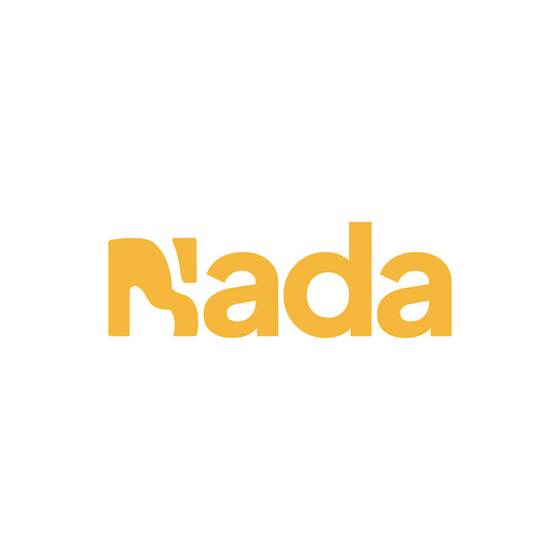
Challenge: Nada's old logo had a unique shape, but the "N" was hard to read and the design didn't connect to music.
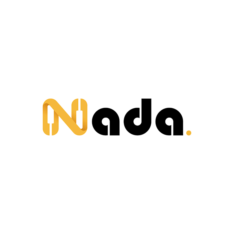
Solution: I redesigned the logo with a piano-built "N" monogram and letterforms that carry music notes. A golden dot closes the wordmark like a final note. The warm gold stays, now paired with black for a more premium look.
Result: A clearer, more memorable logo that tells the brand story at a glance. The client loved it.
1 vote
Ends in 1d

Amazing work. The idea with the sound waves insignia is insane! Love to see creativity as its peak. ✨

New brand!
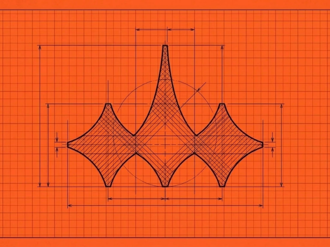
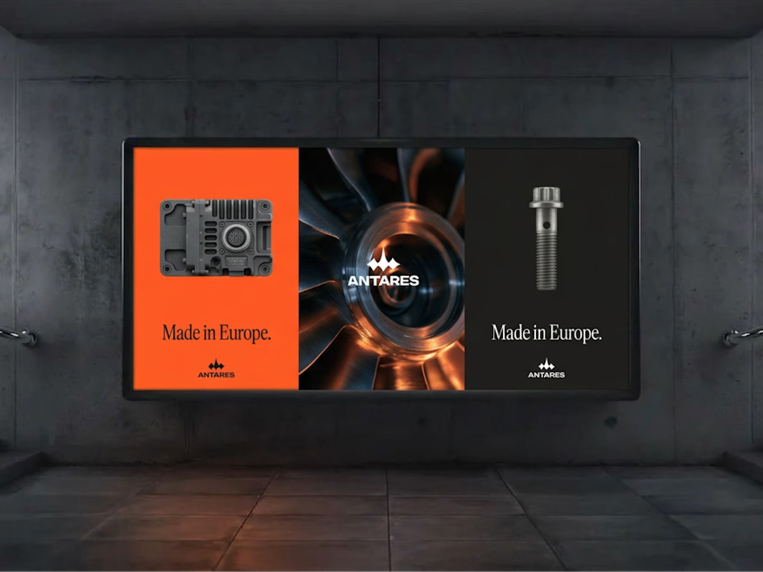
Antares is a proudly european based industrial production company, and they came to a proud european for their identity! 🇪🇺
I helped the founder fleshing out a cohesive, modern industrial identity for their initial stealth phase. There is much more to come, but it's gonna stay under wraps for now 👀