The network for creativity
Join 1.25M professional creatives like you
Connect with clients, get discovered, and run your business 100% commission-free
Creatives on Contra have earned over $150M and we are just getting started
Back to feedPost

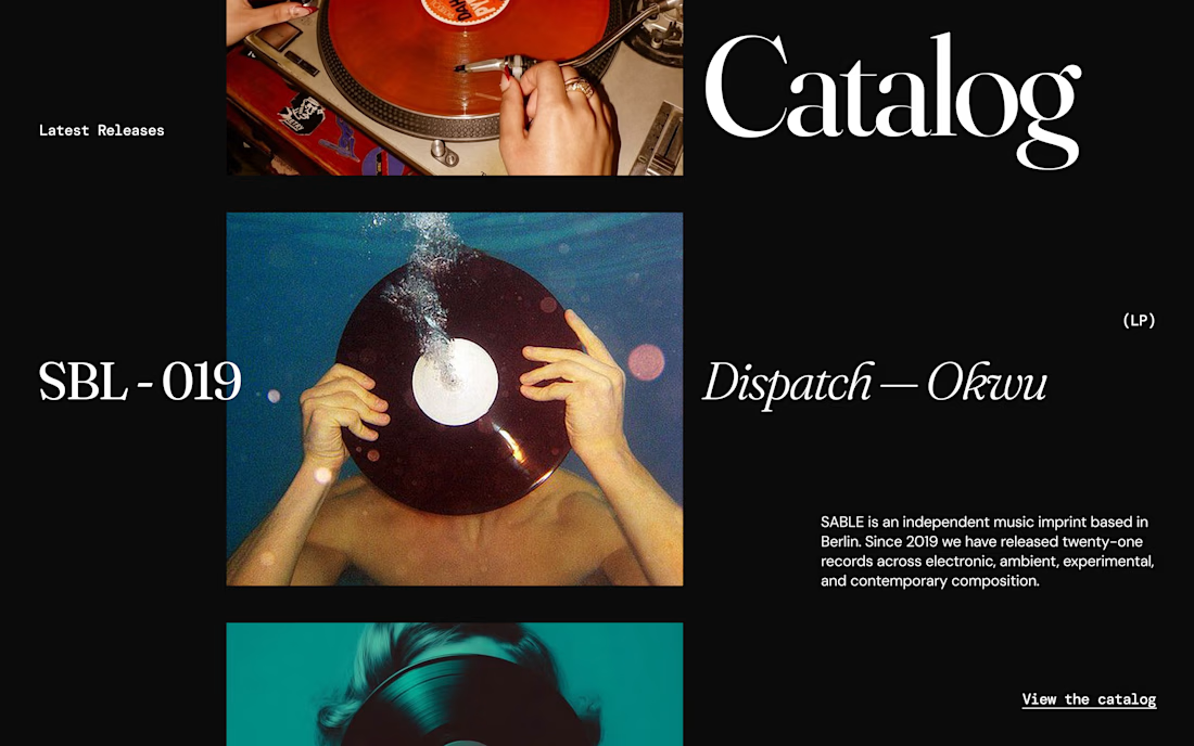
Continuing my exploration of the Sable Records website concept.
This is the Catalogue section, designed to showcase the label's latest releases through a more editorial and immersive approach.
Instead of relying on a standard card grid, I explored a composition built around oversized typography, strong imagery, asymmetry and intentional negative space.
The idea is to make each release feel like more than just an item in a catalogue.
A website can be functional without feeling generic—and for a music label with a strong identity, the browsing experience should be part of the world the label is creating.
Direction: Editorial / Experimental / Minimal
#Framer #WebDesign #CreativeDesign #EditorialDesign



thank you :)

Love the layout!

very impressive design

This deserves more than just liking, this deserves to be featured! 🏆 Moving away from standard card grids into an editorial composition gives the catalogue such an immersive feel.

Ditching the standard grid for this editorial, magazine-spread feel makes scrolling the catalog feel like flipping through liner notes instead of a shop page. What almost didn't survive the jump from your first concept to what's on screen now?

Congratulations 🎉


It’s cool.

Lovely font choices! 😊

Well done 👍

This is cool

Treating each release as an editorial feature fits a record label much better than making everything feel like inventory. I’d love to see how this direction handles a larger back catalogue—perhaps the expressive latest releases paired with a compact archive for quick browsing.

Ditching the standard card grid was the right instinct. Letting the hand and the vinyl bleed across the layout gives it a tactile quality most catalogue pages lose in favor of tidy rows.

Love it
The network for creativity
Join 1.25M professional creatives like you
Connect with clients, get discovered, and run your business 100% commission-free
Creatives on Contra have earned over $150M and we are just getting started











Related posts

A little peek at the brand work we did for Elio Mortgage.
A warm, approachable identity full of warm vibrant colors paired with soft sun rising inspired gradients, inner glows and custom illustrations & more. Loved this direction!
Full case study coming soon, from process to final identity.
Plenty of logo explorations to share too!


That color palette takes the whole identity to a different level!! I loove it.

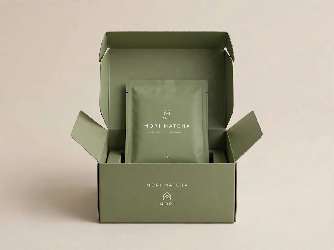
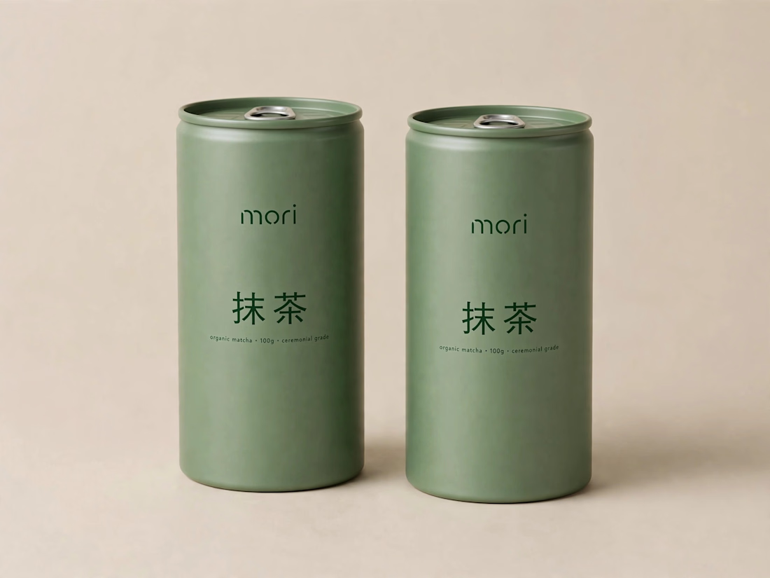
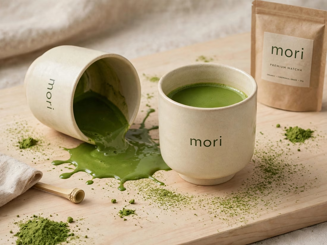
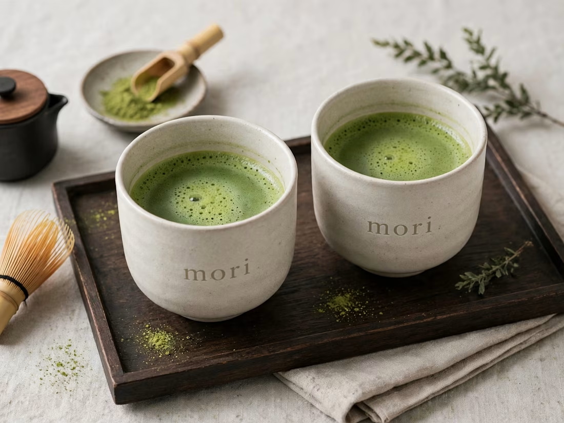
more visuals from my latest project — mori matcha 🍵
explored minimal Japanese packaging with earthy greens and calm typography.
focusing on premium ceramic cups and clean can design.
#branddesign #packagingdesign #visualidentity #brandstrategy #matcha #minimaldesign #japanesedesign #figma #mockup #branding



Brand Expressions -- Olivir



Thats so crazy!!!!!! Seeing this I feel we humans are still far better than AI