The network for creativity
Join 1.25M professional creatives like you
Connect with clients, get discovered, and run your business 100% commission-free
Creatives on Contra have earned over $150M and we are just getting started
Back to feedPost
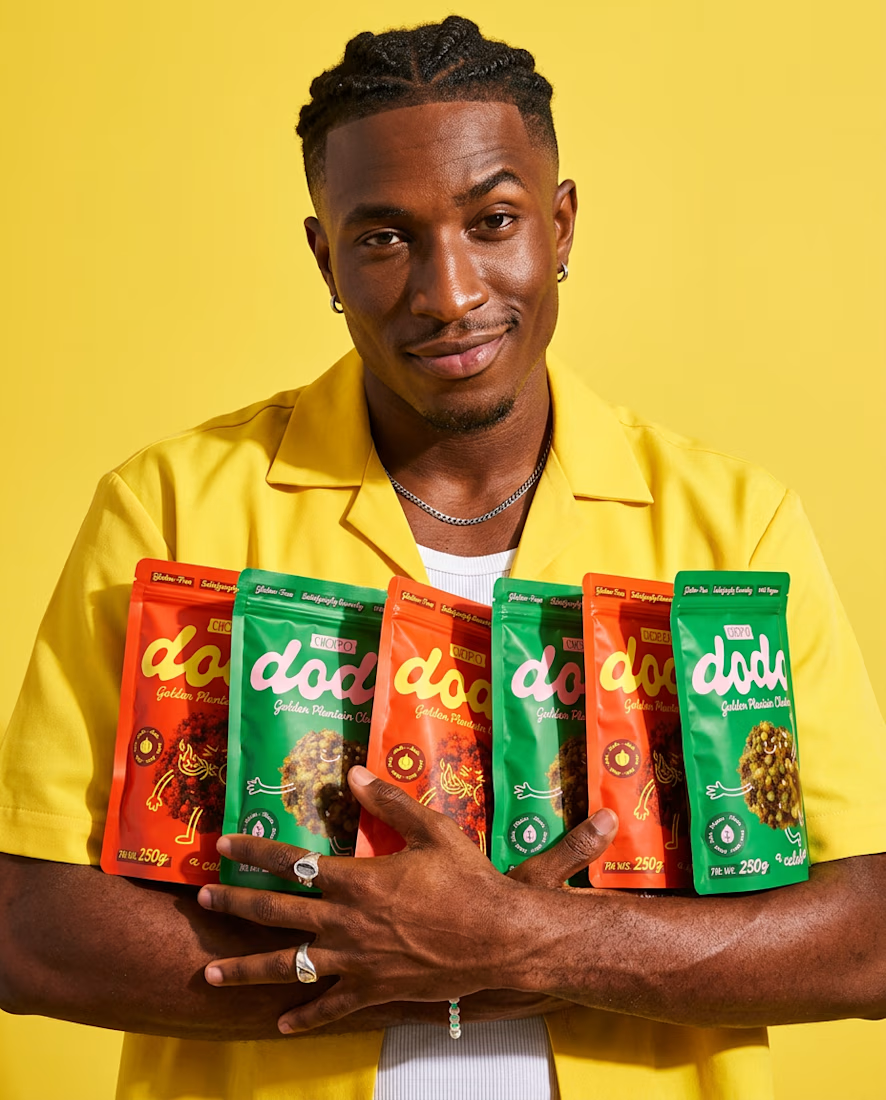
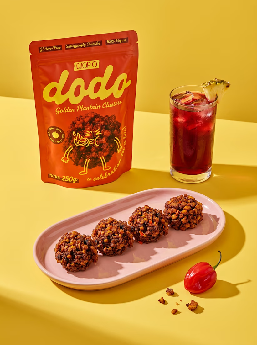
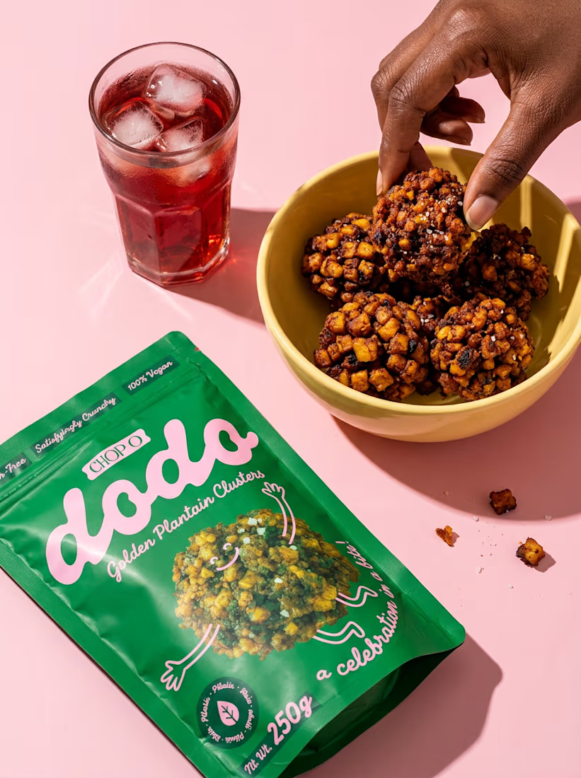
A packaging project I worked on earlier this year for Chop O, a plantain cluster snack brand targeting Nigerian and European markets.
The idea was to create something bold, playful, and full of personality, with vibrant colors and a packaging system that stands out on the shelves.
Always excited to work on fun food and beverage brands. Let's connect! 🚀



Outstanding use of colors and also the logo is unique!

Thank you sm 🙌

Bold and playful is the right call for a snack aimed at two very different markets. Plantain clusters deserve packaging like this.
Thank you, I truly appreciate your feedback

Amazing Execution
Oh thank you!!


This is a really creative piece! I love how the visual elements come together to create something that feels distinctive rather than predictable. The composition, the overall visual direction, and the way the idea has been executed all contribute to making this stand out. It’s a...
Thank you so much! I put a lot of thought into the art direction, so I really appreciate you noticing those details 🤍

Rita, that pink lettering pops beautifully against the green packaging!
Thank you! That pink and green pairing is one of my favorite details too 💗

I would so buy this just because of how cute the packaging is!
That’s the best compliment a packaging designer could get 🥹 Thank you!

Looks great! I love how you’ve combined illustrations with product photography. The color choices are really nice, and the playful typography works so well with the other elements. The mockups and videos look amazing too. Really nice work!
Thank you so much! I had a lot of fun bringing the illustrations and photography together, so I’m happy you liked the mix 💛
The network for creativity
Join 1.25M professional creatives like you
Connect with clients, get discovered, and run your business 100% commission-free
Creatives on Contra have earned over $150M and we are just getting started
Related posts


Celvana brand identity & packaging for a red light therapy brand launching in the US.
The category is crowded with identical, unbranded panels. Celvana sells precision, so the brand had to look like medical equipment you can trust: clinical, exact and professional.
Brand identity case study
Packaging case study

This is high end branding

Nothing rots in salt.
So I put a skincare brand in a salt flat and let it crystallize. Name, mark, palette, campaign, packaging. One idea, zero moodboards.
HALITE. Case study live soon.
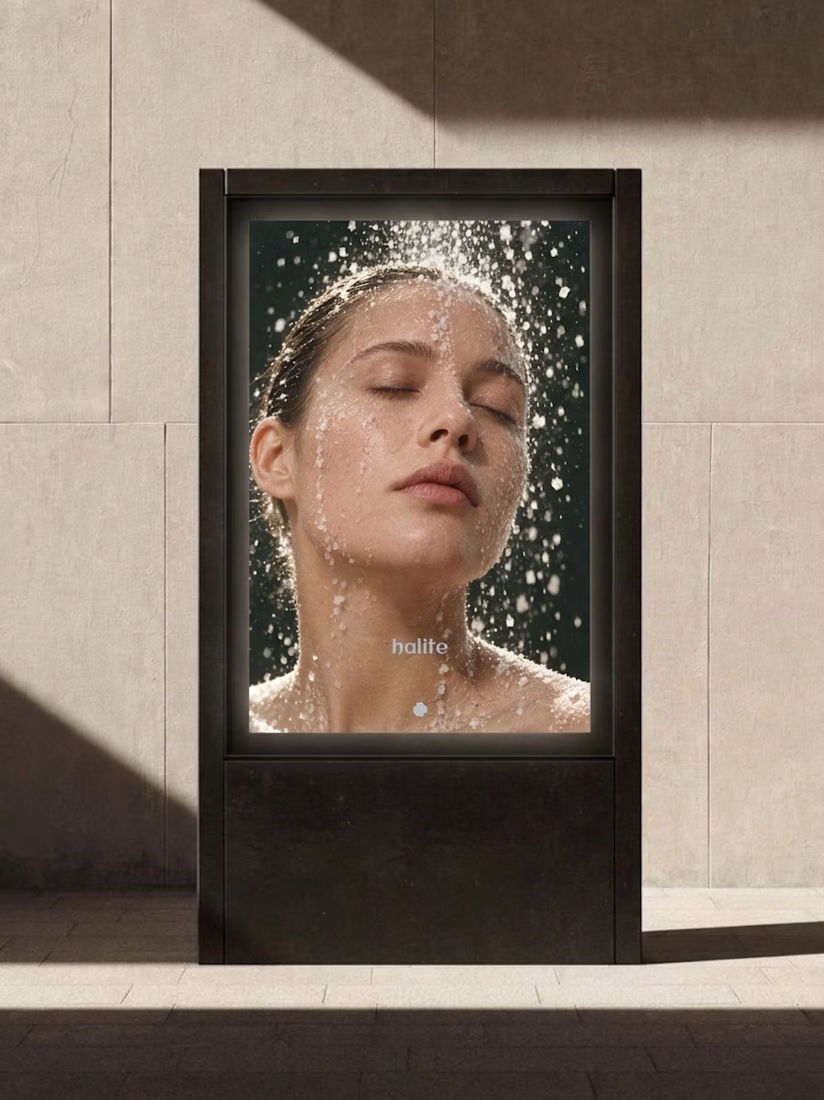
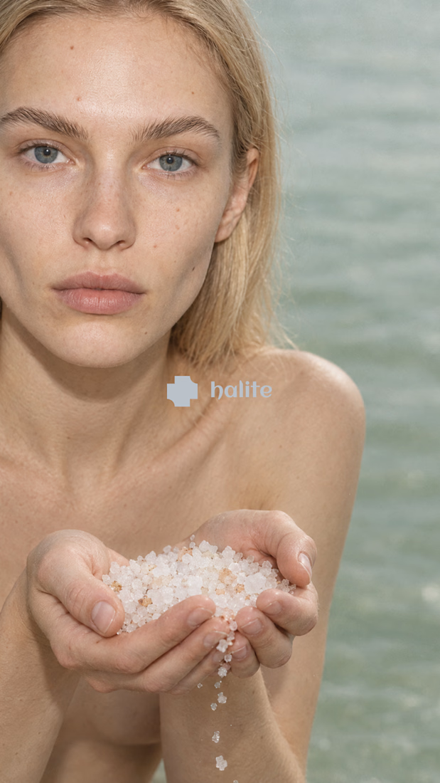
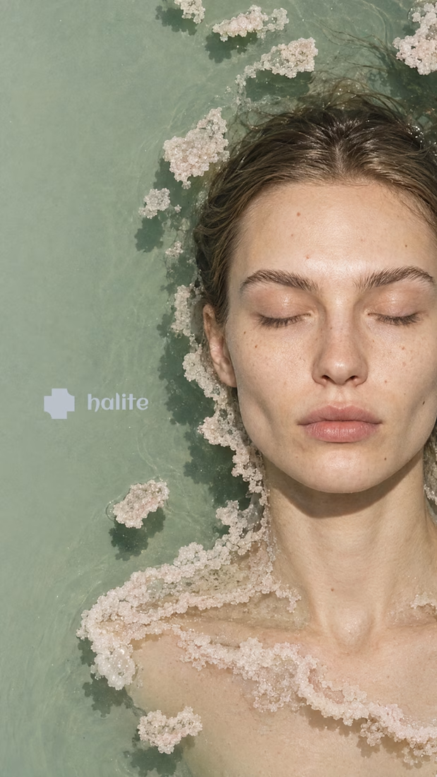
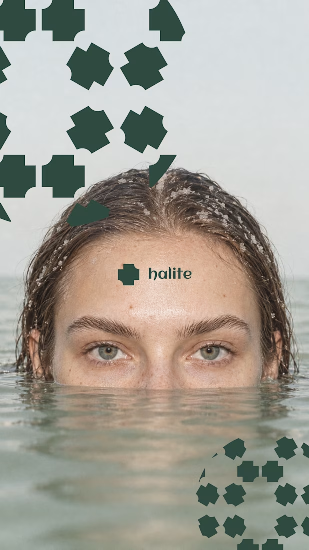

Salt as the core idea is clever. It says preservation, purity and texture in one move, which is exactly what skincare is trying to say. Curious how the crystal motif holds up at small sizes, like a cap or a sachet. Looking forward to the full case.

🍨 Meet MORA — artisanal gelato with a softer side.
Bold typography, creamy tones, and playful flavor-inspired packaging designed to make every scoop feel special.
Explore the full project on my Contra profile and let me know your thoughts!
#BrandIdentity #PackagingDesign #FoodBranding #GraphicDesign #BrandDesign


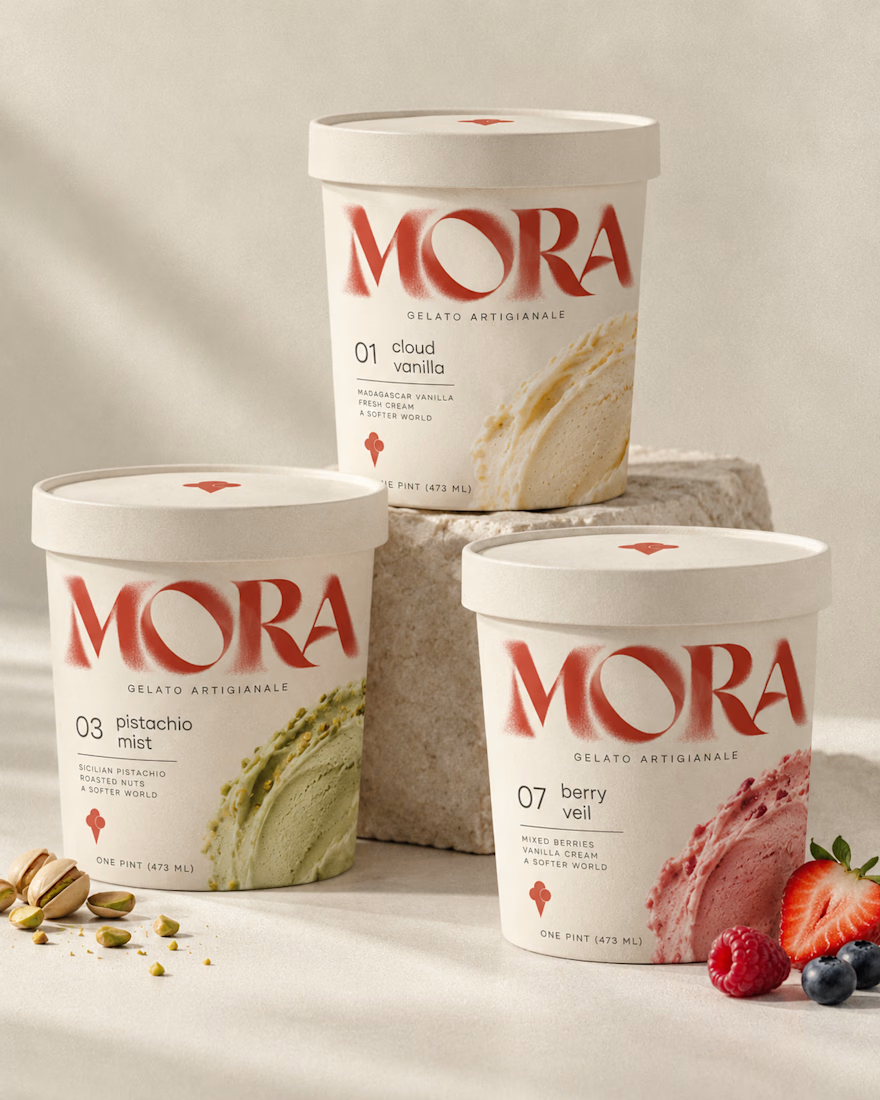
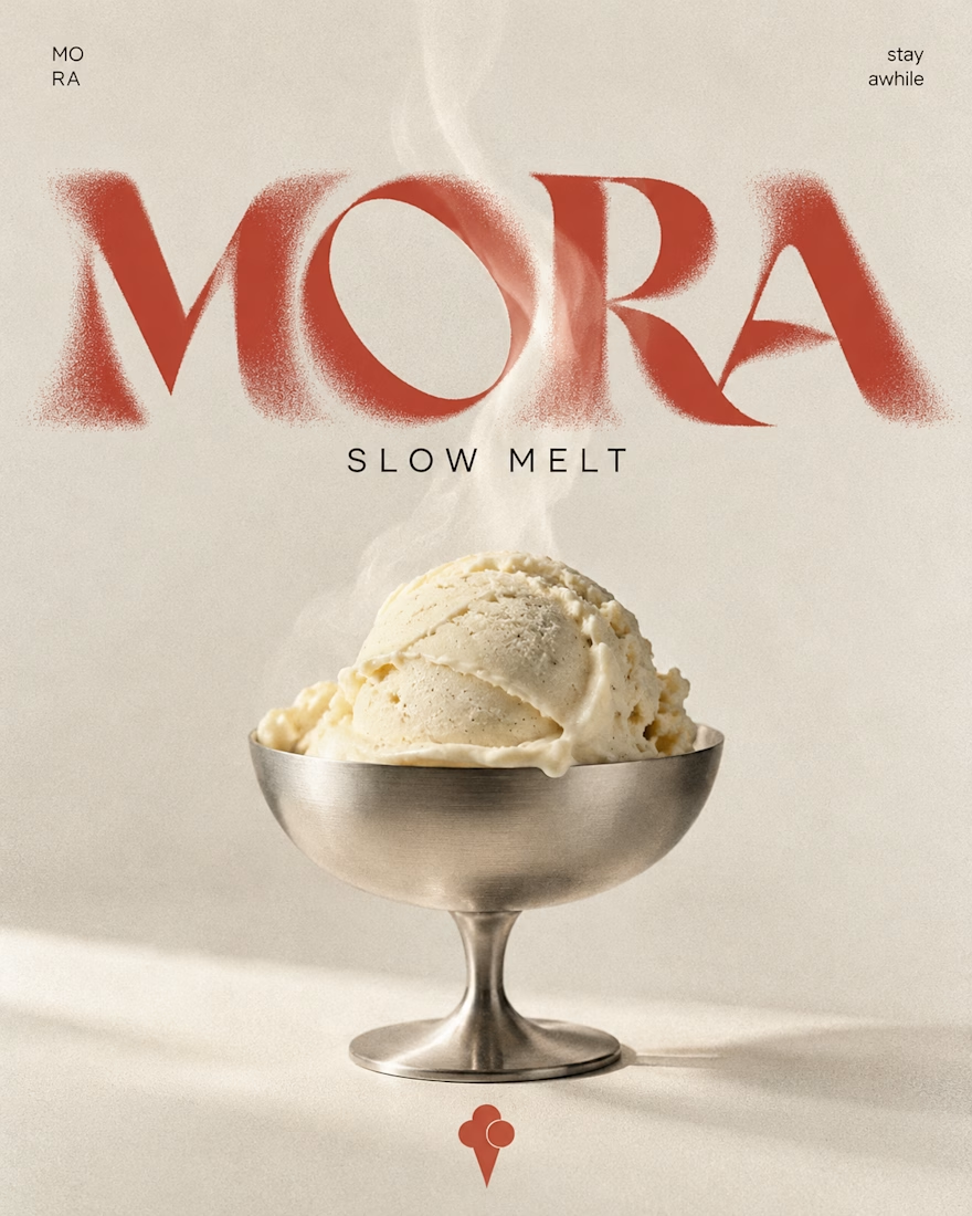
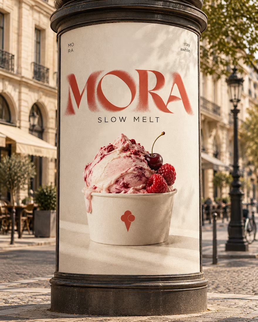

Love this MORA identity! 🍦 The bold typography against the creamy tones is such a perfect balance - feels artisanal yet playful. The flavor-inspired packaging with the watercolor smears for cloud vanilla / berry veil is a really nice touch, makes each scoop feel special as you...