The network for creativity
Join 1.25M professional creatives like you
Connect with clients, get discovered, and run your business 100% commission-free
Creatives on Contra have earned over $150M and we are just getting started
Back to feedPost

What if a tote bag told a story before you even opened it?
I designed a Christmas concept for H&M: a single red line that starts at the handle and flows down the bag like a garland.
Along the way it picks up:
🧦 Stockings hanging at the top
🎁 Gift boxes tumbling down the curve
❄️ A snowflake garland that wraps around the H&M logo
The logo sits at the end of the journey, so the eye travels the whole path before landing on the brand.💫
Which mockup do you like better: the sofa or the clothing rack? 👇
(unofficial). Day 3 completed.
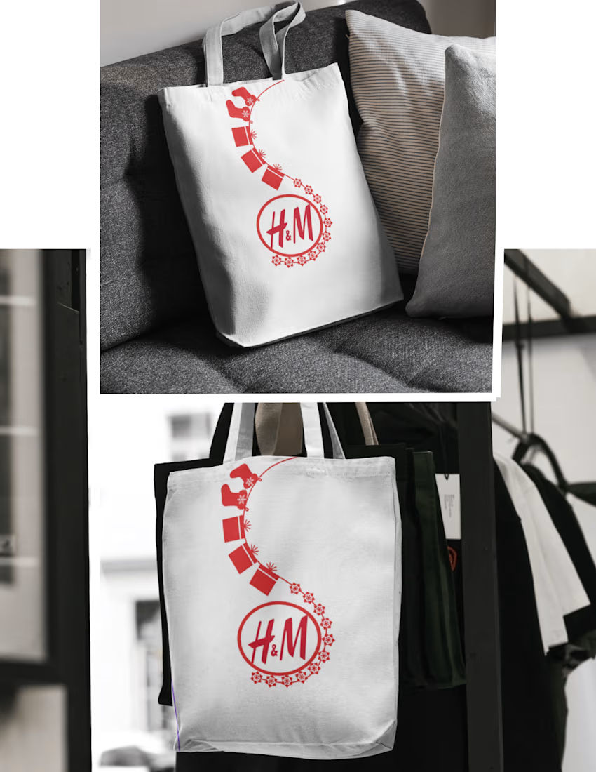

I'd pick the clothing rack one. The line has more room to run there, so the path from handle to logo reads as a full journey, while the sofa crop cuts it short. Curious how the garland behaves once the bag is loaded and the fabric folds.
The network for creativity
Join 1.25M professional creatives like you
Connect with clients, get discovered, and run your business 100% commission-free
Creatives on Contra have earned over $150M and we are just getting started



Related posts

I get asked a lot how I get beauty and skincare clients, so here is what has helped me most:
📚 A portfolio that shows the work you want to get hired for. No real clients yet? Make passion projects for dream brands.
🎯 Apply only when your portfolio matches the job. Clients are very visual, and a product design portfolio won’t win a packaging project.
🔍 Research a lot. Follow the brands, learn how they talk and who they speak to.
💬 Apply to jobs that resonate with your skills and share related projects to potential clients.
🧴 Buy the products and analyze the packaging. Typography, finish, weight, how the label sits. You’ll notice things you can talk about in your pitch ✨
What would you add?

a portfolio that shows the work you want to get hired for is the best advice here. passion projects for dream brands really work

Maison Zéval™ — Luxury Champagne Product Mockup & Advertising Design
Product Mockups | Luxury Beverage Advertising | Editorial Art Direction
Project Overview
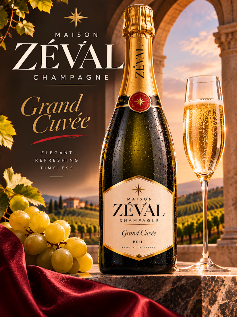
Maison Zéval™ is a self-initiated luxury champagne product mockup and advertising concept created to explore the relationship between premium packaging, photorealistic product visualization, and sophisticated editorial design.
The fictional champagne house is positioned around timeless elegance, craftsmanship, and refined celebration.
The objective was to develop a visually compelling product advertisement that communicates luxury through carefully controlled typography, atmospheric lighting, realistic material textures, and a strong central product presentation.
Rather than relying on excessive promotional graphics, the composition uses a restrained visual hierarchy that allows the champagne bottle, brand identity, and surrounding environment to establish the product's premium character.
Creative Concept & Visual Storytelling
The creative direction is inspired by the romance of European wine estates, classical architecture, and the understated sophistication associated with luxury champagne.
The scene is set on a stone terrace overlooking a sunlit vineyard, framed by an elegant architectural arch.
Rolling vineyards, distant villas, and warm golden light establish a sense of heritage, refinement, and destination-inspired luxury.
At the center of the composition stands a dark-green champagne bottle with gold foil detailing, a carefully designed cream label, and realistic condensation.
A tall champagne flute filled with golden sparkling wine complements the bottle, introducing movement through the fine bubbles rising inside the glass.
Fresh grapes, textured stone, and flowing burgundy fabric provide subtle supporting details that reinforce the product's character without distracting from the hero presentation.
The result is a cinematic still life that combines aspirational atmosphere with commercial product clarity.
Product Mockup & Packaging Presentation
The champagne bottle is the central visual element.
Its upright positioning creates a sense of stability, confidence, and premium presentation while allowing the label and packaging details to remain clearly visible.
The dark-green glass contrasts with the gold foil neck and warm cream label, establishing a sophisticated material palette.
A circular red-and-gold seal introduces a recognizable decorative accent, while the star-inspired emblem provides continuity between the bottle packaging and the surrounding brand presentation.
The label features the Maison Zéval name, Grand Cuvée designation, and Brut classification, communicating the intended product identity with a restrained luxury aesthetic.
Realistic reflections, condensation droplets, subtle glass transparency, and carefully controlled highlights create depth and enhance the tactile quality of the mockup.
Typography & Advertising Layout
Typography plays an important role beyond the bottle label itself.
The left side of the advertisement features an oversized ZÉVAL wordmark, using elegant high-contrast serif lettering to establish an immediate focal point.
The smaller MAISON and CHAMPAGNE typography introduces hierarchy through generous letter spacing and refined proportions.
The phrase Grand Cuvée appears in expressive gold italic lettering, creating contrast with the more structured main wordmark.
Below it, three carefully spaced descriptors reinforce the intended brand positioning:
ELEGANT • REFRESHING • TIMELESS
The typography is deliberately minimal, allowing the product photography and surrounding environment to remain visually dominant.
This approach demonstrates how restrained editorial lettering can create strong advertising impact without overcrowding the composition.
Color Palette & Art Direction
The visual palette is built around warm champagne gold, deep forest green, burgundy, cream, and natural stone tones.
Champagne Gold: Communicates celebration, refinement, and premium quality.
Deep Green: Establishes a traditional beverage-packaging foundation while contrasting with the warm lighting.
Burgundy: Adds richness and visual depth through the fabric and packaging accents.
Soft Cream: Supports the elegant typography and label design.
Warm Stone: Grounds the composition in a classical architectural setting.
The palette is reinforced through natural sunset lighting, carefully controlled reflections, and realistic environmental textures.
Lighting & Material Realism
Lighting is essential to the product's presentation.
Warm directional sunlight illuminates the champagne flute and creates rich golden reflections across the bottle's glass surface.
Condensation droplets introduce freshness and tactile realism, while subtle shadows emphasize the bottle's shape and the texture of the stone platform.
The champagne flute is rendered with visible bubbles, transparent glass, and detailed highlights to communicate the beverage's sparkling character.
The surrounding vineyard remains softly atmospheric, creating depth while keeping the hero product in sharp focus.
Composition & Visual Hierarchy
The advertisement is organized around three primary elements.
The Brand Statement
The large Maison Zéval typography establishes recognition and communicates the product category.
The Hero Product
The upright champagne bottle occupies the central portion of the composition, with its packaging details clearly visible.
The Supporting Atmosphere
The champagne flute, grapes, flowing fabric, classical architecture, and vineyard landscape establish the product's intended lifestyle positioning.
These elements create a cohesive visual story while maintaining the simplicity required of effective premium product advertising.
Potential Brand Applications
The concept demonstrates an art direction that could be adapted for several luxury beverage marketing formats, including:
Premium product advertising campaigns
Beverage brand presentations
Digital storefront hero imagery
Social media product promotions
Editorial beverage features
Packaging and product launch presentations
The design is intended to communicate the value of high-quality product visualization through a combination of packaging detail, lighting, composition, and brand storytelling.
Final Design Outcome
The completed Maison Zéval concept demonstrates an approach to Product Mockups that balances realistic product presentation with sophisticated editorial advertising.
Its strongest characteristics are the clear central product focus, elegant typography, detailed glass rendering, atmospheric lighting, and cohesive luxury art direction.
Developed as a self-initiated portfolio concept, the project showcases the ability to create visually compelling product presentations for premium beverage and lifestyle brands.
Maison Zéval™ — Elegant. Refreshing. Timeless.



Looking beautiful 😍


Very nice 👍🏻