The network for creativity
Join 1.25M professional creatives like you
Connect with clients, get discovered, and run your business 100% commission-free
Creatives on Contra have earned over $150M and we are just getting started
Back to feedPost

剪映元原 — CapCut in the Edo Period
What if CapCut existed 400 years ago in Japan?
This project reimagines CapCut as a woodblock print studio in Edo-period Japan, a creative house that carved, printed, and distributed visual stories to everyday people.
The concept is rooted in a simple truth: ukiyo-e woodblock prints were the mass media of their time. Accessible to all, wide in reach, and made for everyday people. That's exactly what CapCut is today. A tool that puts creative power in everyone's hands.
Key Visuals:
The hero poster reimagines Mount Fuji in CapCut's brand colors, bold pink against a cyan sky, with the brand mark stamped in the upper left as a publisher's colophon. A bijin-ga (portrait of a beautiful woman) shows her wearing a kimono whose fabric pattern is the CapCut mon tiled into seigaiha waves, the brand woven literally into the culture.
Brand System:
The visual identity is built entirely from Edo-period design language: a mon-style emblem derived from the CapCut logo, seigaiha wave patterns tiling the CapCut mark as a repeating komon textile motif, a rakkan signature and red shuin seal, washi paper, wave blue, deep indigo, and ink black, with a nod to CapCut's signature cyan-to-pink gradient.
The tools change. The mission doesn't.
Built with CapCut Design Studio.


waw this is really cool🙌 💯
The network for creativity
Join 1.25M professional creatives like you
Connect with clients, get discovered, and run your business 100% commission-free
Creatives on Contra have earned over $150M and we are just getting started











Related posts

A cinematic AI-assisted real estate property showcase created to demonstrate how luxury properties can be presented through engaging video content.
This vertical video features cinematic exterior shots, detailed interior showcases, lifestyle amenities, and a professional call to action.
Services demonstrated:
AI Real Estate Video Creation
Cinematic Property Showcases
Social Media Reels
AI-Assisted Video Editing
Property Marketing Content
Created as a self-initiated portfolio project to showcase my creative capabilities in AI-powered real estate marketing.


That's really stunning Cinematic view is stunning Felicisimo🔥🔥

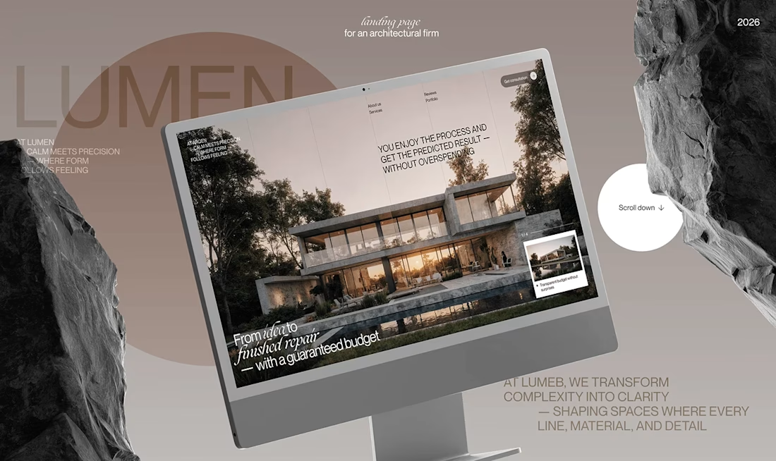
Lumen — UX/UI Design for a Premium Architecture Studio
Sometimes, the smallest details are what give a design its personality.
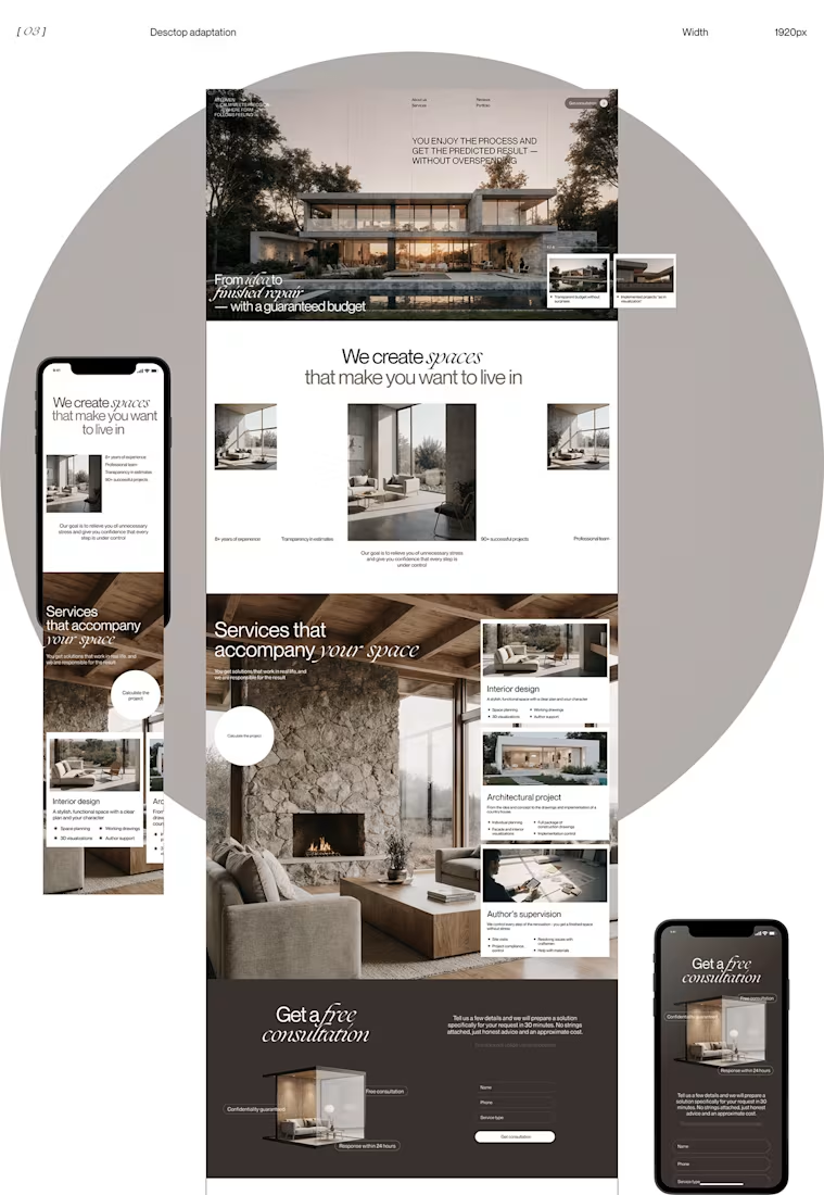
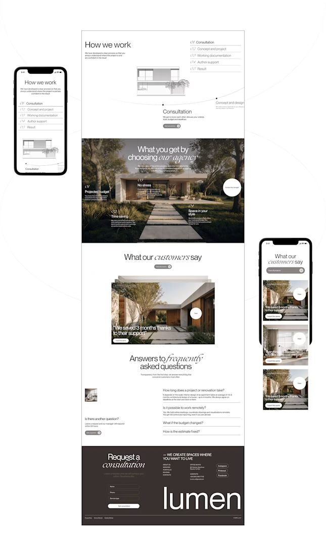
For Lumen, I found myself exploring how typography, architectural photography, colour, and layout could work together to tell a story before someone even starts reading.
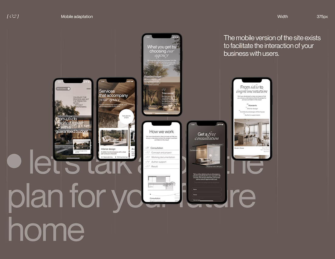
I played with oversized text, warm brown tones, editorial layouts, and a mobile experience that carries the same visual character as the desktop design.
I especially enjoyed putting the mobile screens together. Seeing the different sections come to life on a smaller screen made the whole concept feel more complete.
It's always interesting to see how different creative decisions can change the way people experience a brand.
What's one design detail that can make you appreciate a website even before you've explored everything?
#WebDesign #CreativeDesign #UIUXDesign #Architecture


i love this soooo wellllll, i just said welll with 4 l's thats how good this is

Curcuma zanthorrhiza and the Search for Authenticity
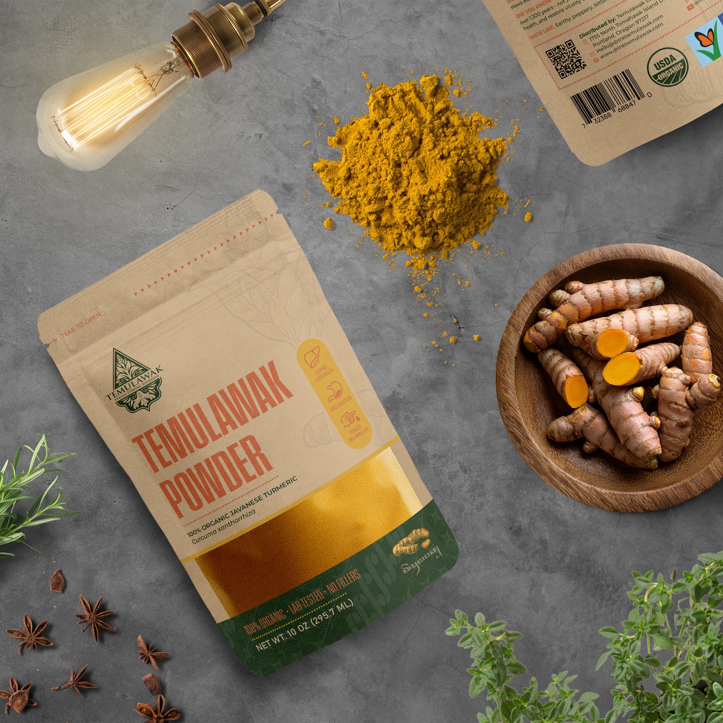
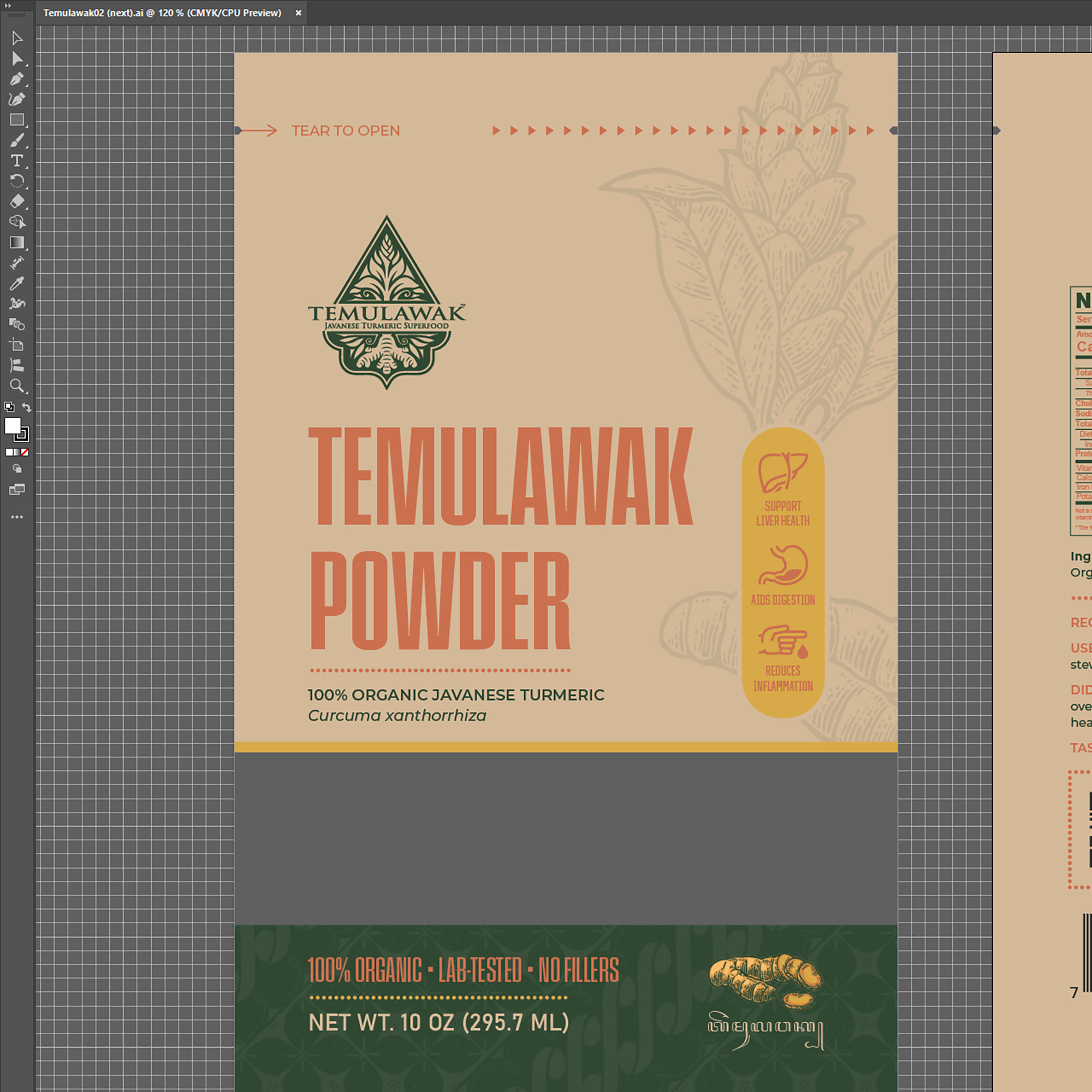
Temulawak’s elegant packaging concept marks my first time that botanical science and cultural heritage come together in its creation. The initial approach was simple: observing the morphological characteristics of Curcuma zanthorrhiza and applying binomial nomenclature—where the Latin name is italicized with the genus capitalized and the rest in lowercase. In the publishing world, a similar writing convention is known as sentence case, but for scientific names, both words remain italicized.
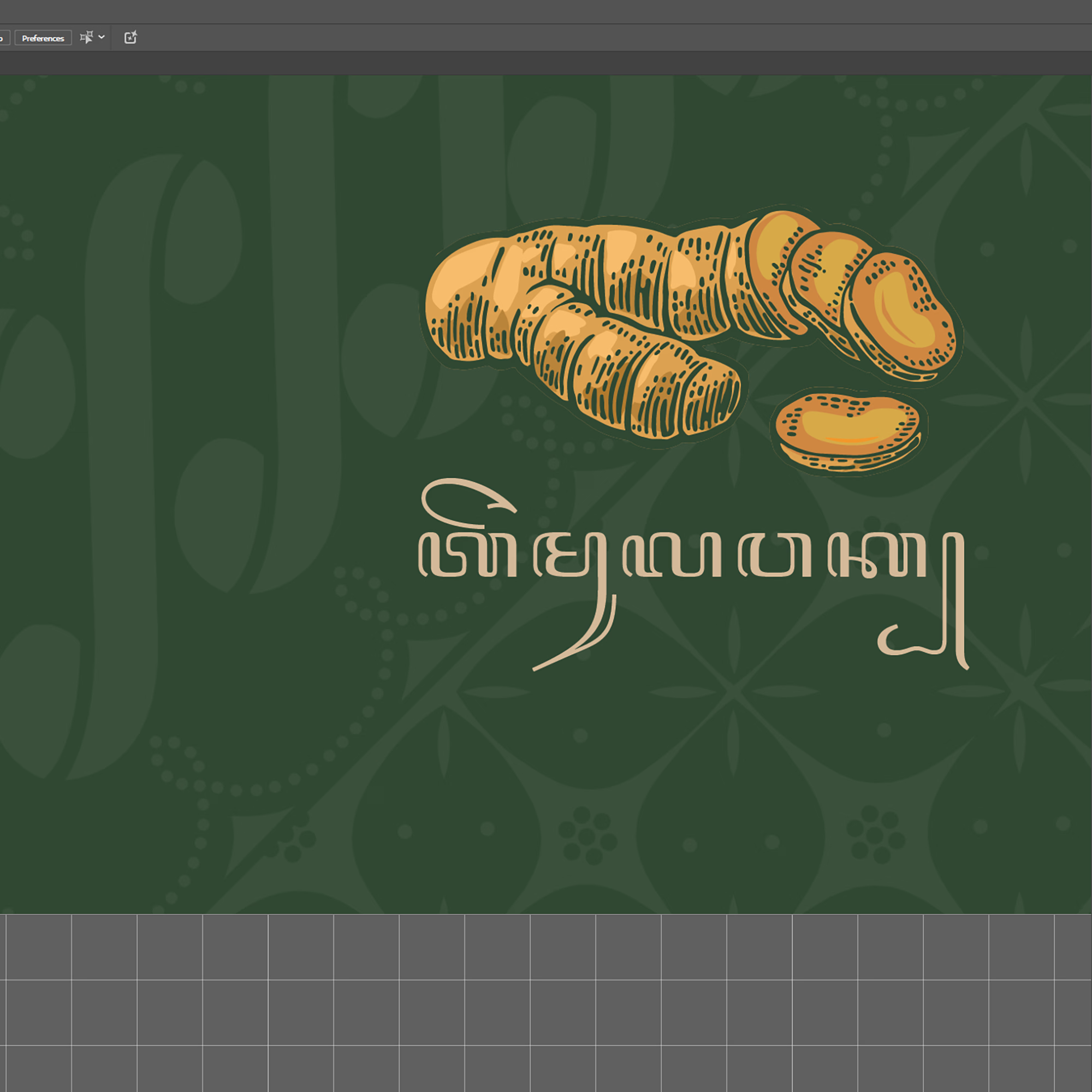
The second approach led me to revisit prior knowledge of Javanese script only to realize my initial understanding was flawed. Not to translate the entire draft from English, but simply to ensure the correct rendering of 'Temulawak.' The first online script translator failed, producing an overly long translation for a five-character base. The second attempt was no better, as it inserted a Latin character for 'e' in 'Temu.' Finally, the third translation tool yielded a more accurate result, rendering the script as ꦠꦼꦩꦸꦭꦮꦏ꧀ for 'Temulawak.'
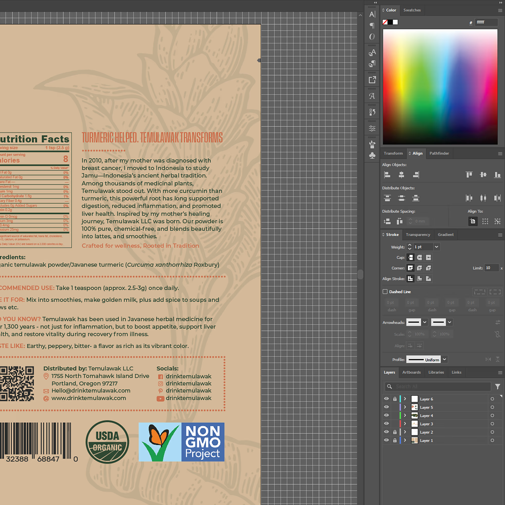
Beyond Javanese script, I sought to incorporate another cultural element into this packaging: Batik. A true heritage of Nusantara, Batik is the perfect fusion of art and cutting-edge technology from its time. While this is neither hand-drawn nor stamped Batik, its motif is seamlessly embedded into the design to emphasize the cultural essence. For the context behind the choice of Javanese script and Batik, you might find a deeper story waiting on the back of the packaging.
One last note: this packaging was developed as a conceptual submission and was not the design ultimately selected for production. Even so, the research behind Curcuma zanthorrhiza, Javanese script, and Batik made it one of the most memorable projects in my portfolio. Certain decorative elements, including botanical illustrations and cultural motifs, were sourced from licensed marketplace assets for concept presentation purposes.




setting the latin name in proper italics on the pack is a really nice nod