
剪映元原 — CapCut in the Edo Period
What if CapCut existed 400 years ago in Japan?
This project reimagines CapCut as a woodblock print studio in Edo-period Japan, a creative house that carved, printed, and distributed visual stories to everyday people.
The concept is rooted in a simple truth: ukiyo-e woodblock prints were the mass media of their time. Accessible to all, wide in reach, and made for everyday people. That's exactly what CapCut is today. A tool that puts creative power in everyone's hands.
Key Visuals:
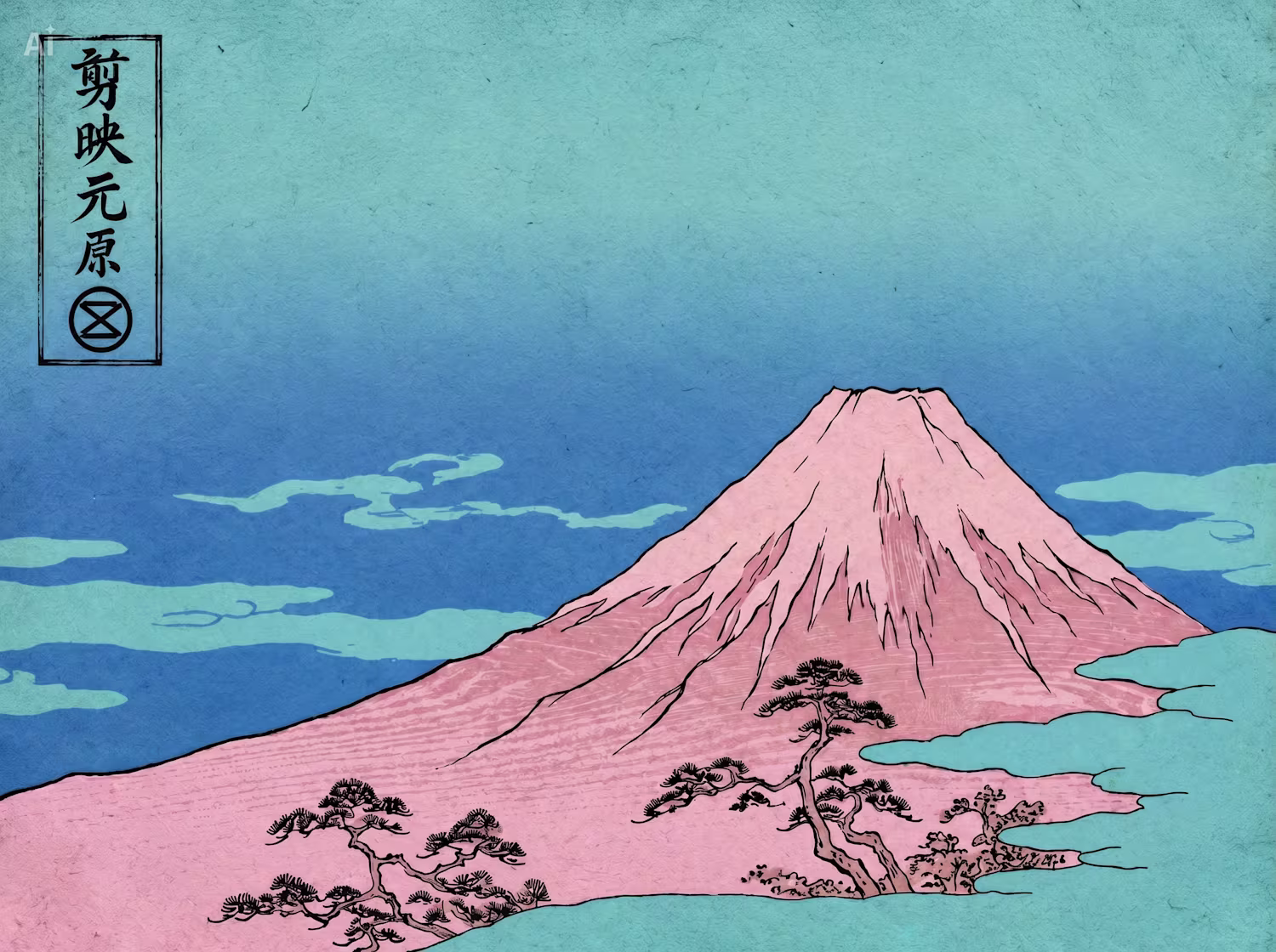
The hero poster reimagines Mount Fuji in CapCut's brand colors, bold pink against a cyan sky, with the brand mark stamped in the upper left as a publisher's colophon. A bijin-ga (portrait of a beautiful woman) shows her wearing a kimono whose fabric pattern is the CapCut mon tiled into seigaiha waves, the brand woven literally into the culture.
Brand System:
The visual identity is built entirely from Edo-period design language: a mon-style emblem derived from the CapCut logo, seigaiha wave patterns tiling the CapCut mark as a repeating komon textile motif, a rakkan signature and red shuin seal, washi paper, wave blue, deep indigo, and ink black, with a nod to CapCut's signature cyan-to-pink gradient.
The tools change. The mission doesn't.
Built with CapCut Design Studio.
2
3
307