The network for creativity
Join 1.25M professional creatives like you
Connect with clients, get discovered, and run your business 100% commission-free
Creatives on Contra have earned over $150M and we are just getting started
Back to feedPost

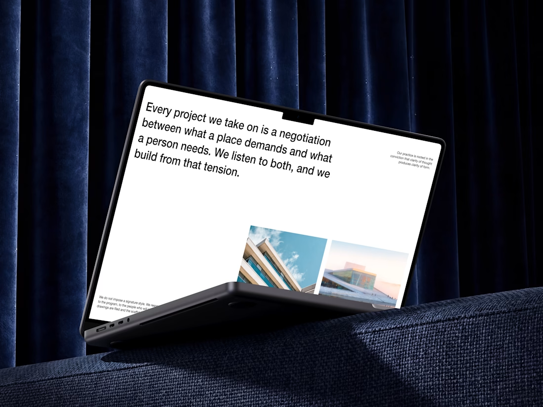
Good architecture leaves nothing to explain. Every decision is load-bearing, every detail earns its place.
That's the logic followed here. Oversized type that sets the tone before a single image loads. A layout that doesn't decorate the work, it is the work. Space used with intention, not filled out of habit.
Nothing extra, nothing missing.
What do you think?



Looks really great, love it!
The network for creativity
Join 1.25M professional creatives like you
Connect with clients, get discovered, and run your business 100% commission-free
Creatives on Contra have earned over $150M and we are just getting started
Related posts


Really nice one, Max!
I felt something was off with my own website.
Too plain. Not how I envisioned the brand.
So I added more creative touches and built a real story into it. Now everything makes sense.
It finally feels like Outredge 🚀
https://outredge.com/


That big bold wordmark with the corner brackets gives it so much more character. "A marketing site as good as your product" is a strong line too, says exactly what you do.

Brand Expressions -- Merdes




love this


