The network for creativity
Join 1.25M professional creatives like you
Connect with clients, get discovered, and run your business 100% commission-free
Creatives on Contra have earned over $150M and we are just getting started
Back to feedPost
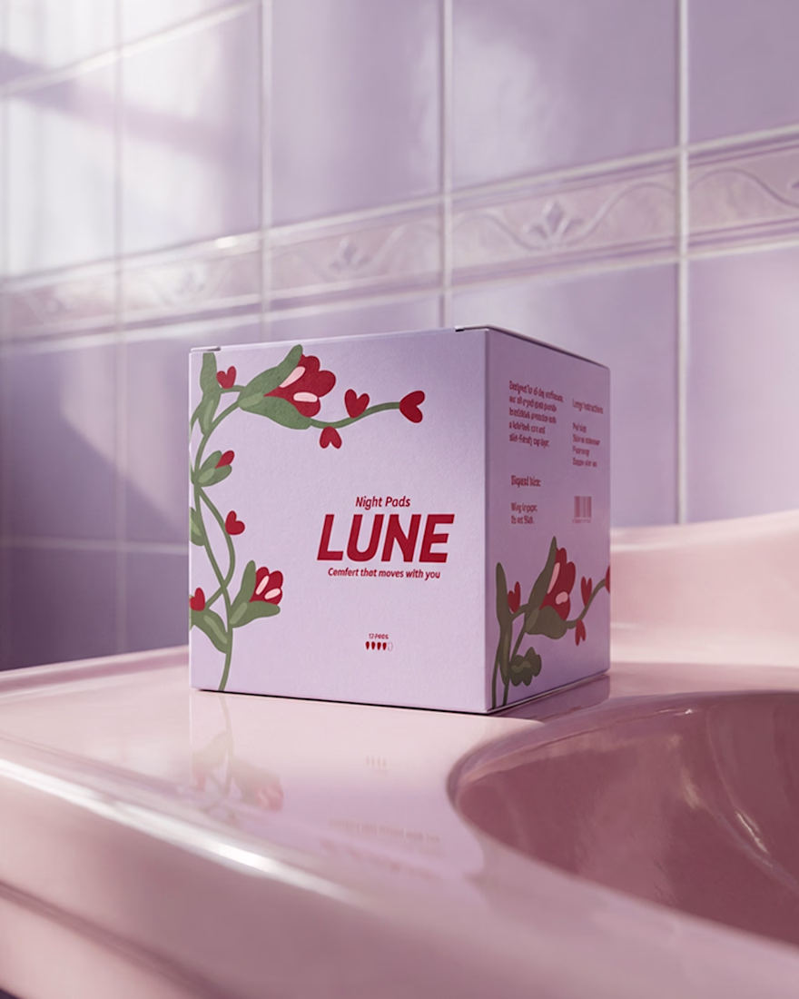
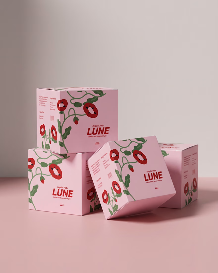
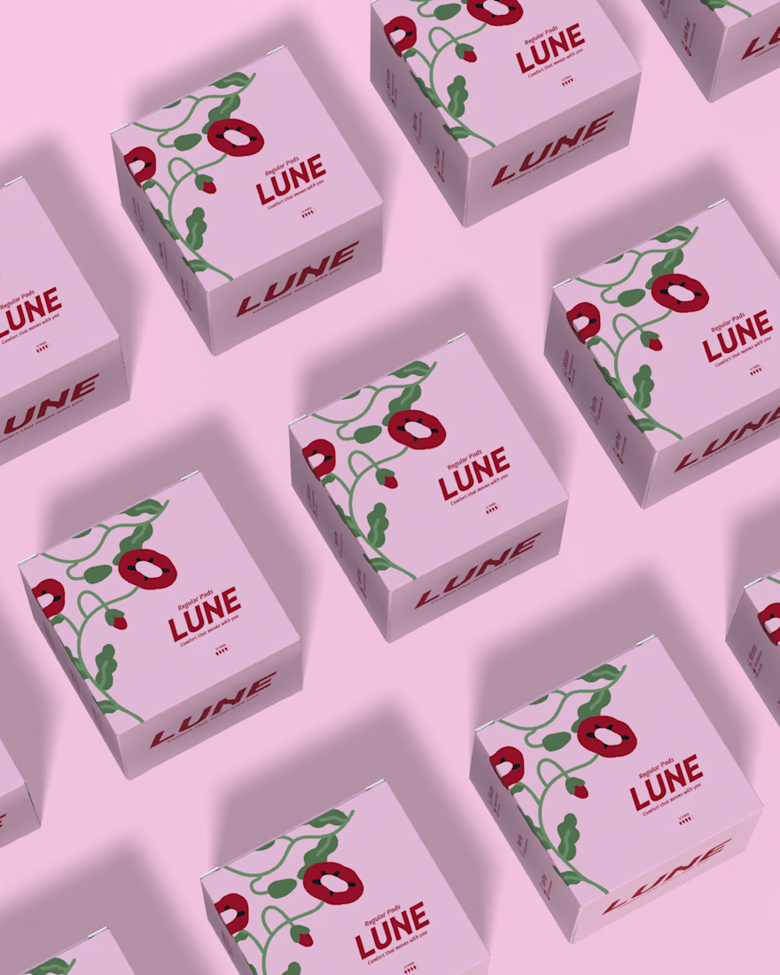
Meet LUNE Sustainable Period Care for Modern Life 🌙
No shame. No hiding. No clinical blue packaging pretending periods don’t exist.
LUNE honours the cycle with products designed to feel empowering, considered, and beautifully modern pieces you wouldn’t hide, but proudly leave on your shelf.
The Challenge:
Create a brand identity that feels calm, confident, and quietly powerful.
Logo & Packaging-Part -1
A soft blush base builds warmth and comfort, while bold red typography adds strength and shelf presence. Flowing florals symbolize rhythm and natural movement, balanced by a structured wordmark that brings trust and stability.
Because period care deserves to feel natural, strong, and worthy of thoughtful design.Check here
The network for creativity
Join 1.25M professional creatives like you
Connect with clients, get discovered, and run your business 100% commission-free
Creatives on Contra have earned over $150M and we are just getting started
Related posts
So good! Love the logo pacement on the last illustration, beautiful!
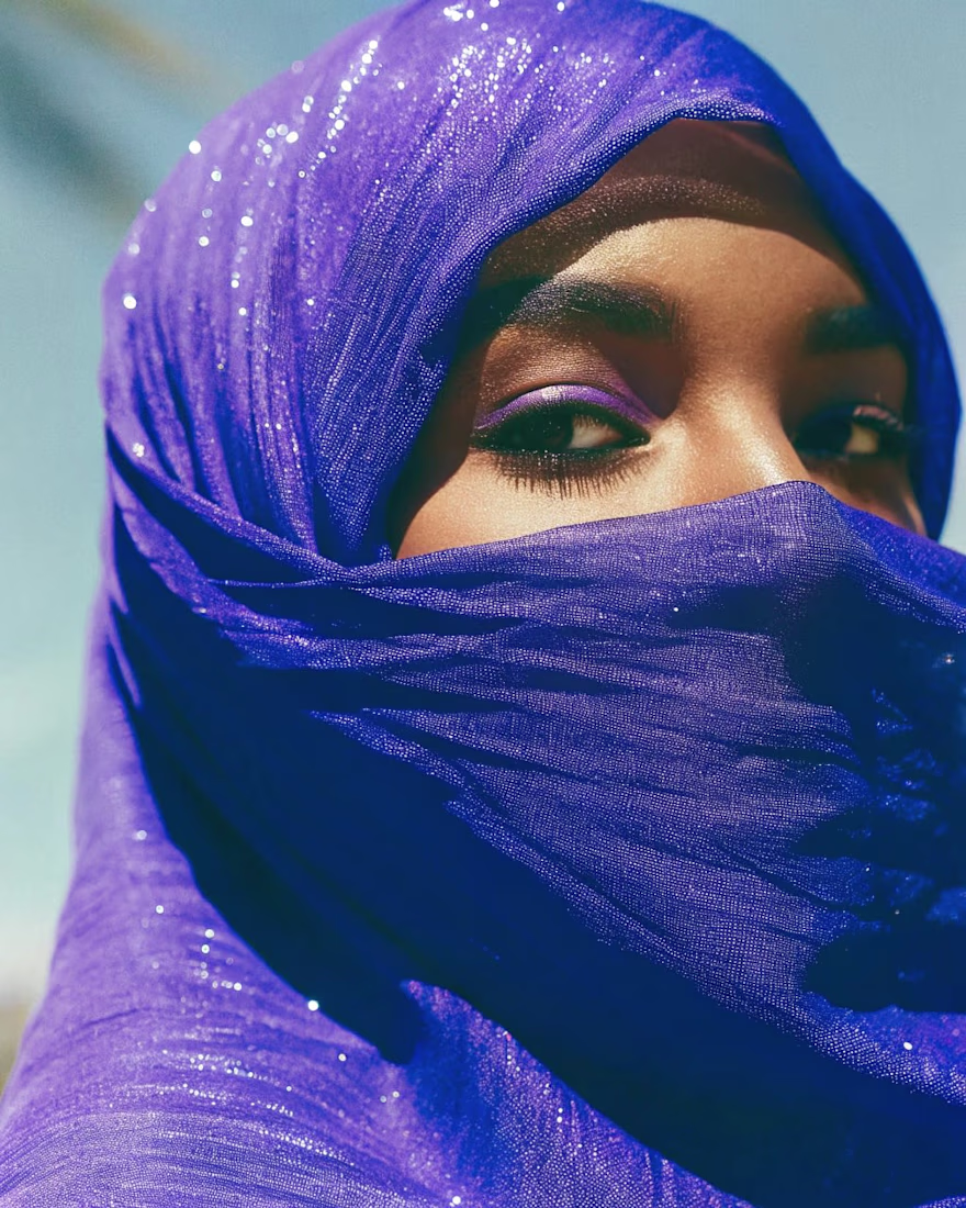
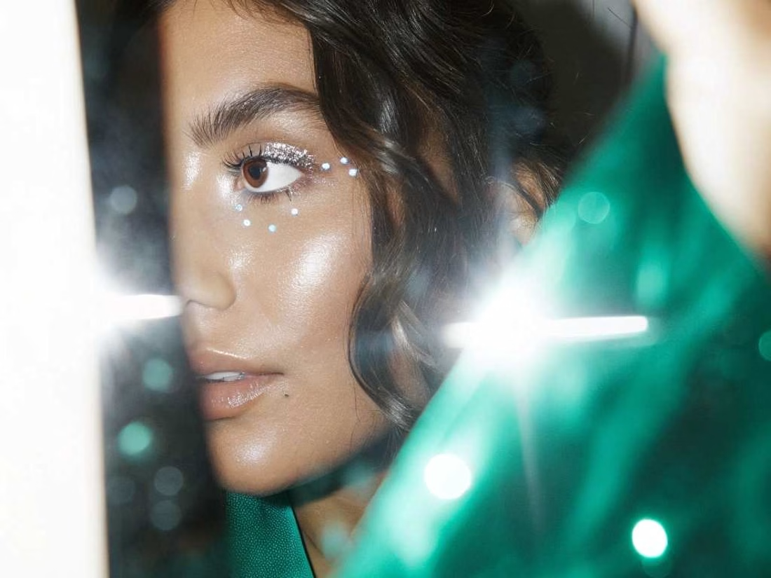
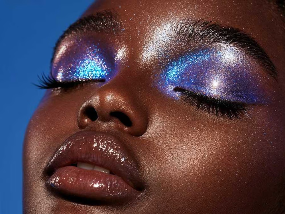
A self-initiated AI beauty editorial exploring color, texture and light as the new makeup. Three portraits move from veiled cobalt to dewy daylight to high-glitter close-up, each leaning into hyperreal skin and pigment that traditional photography rarely captures in one shoot. Built using a stack of, Weavy Ai and Higgsfield with Lummi for refinement, then color-graded for an editorial print feel. Created as a personal study for beauty brands and magazines exploring AI-generated campaign imagery.
So good!
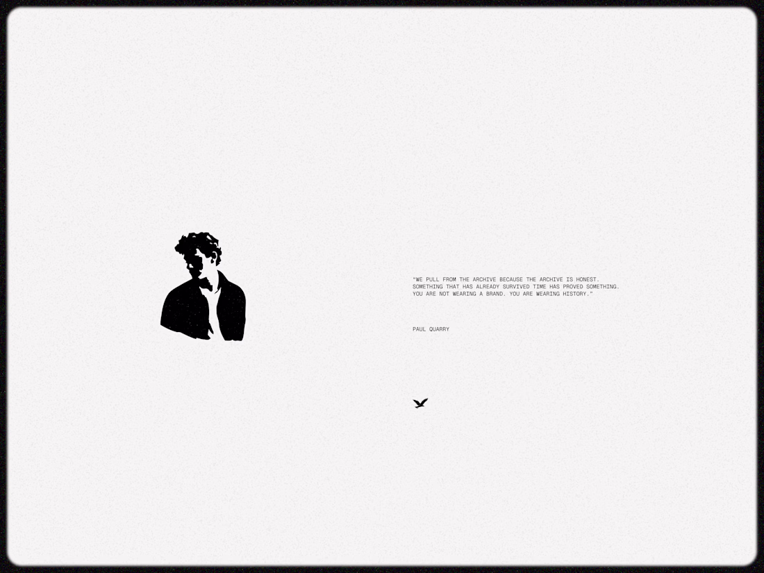
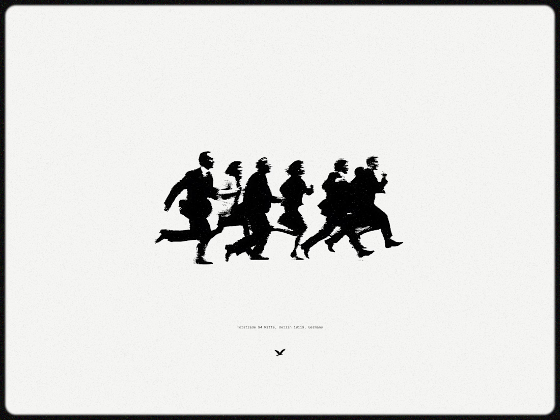
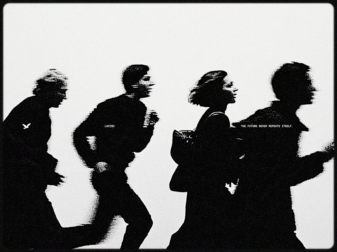
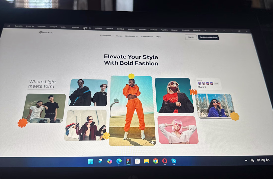
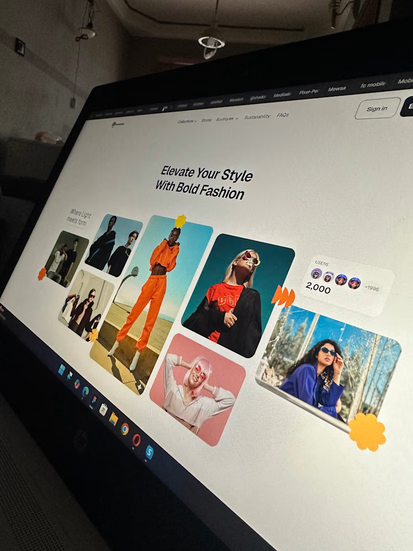
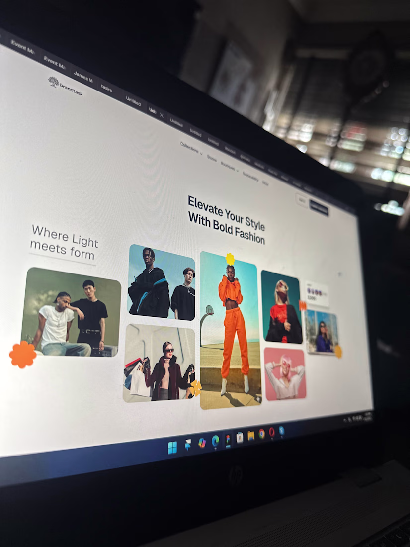
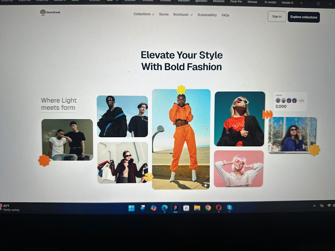
If your landing page isn’t converting, it’s just decoration.
Designed this fashion brand landing page to be bold, intentional, and built to sell, not just sit pretty. Strong hierarchy, clean layout, and visuals that actually pull users in.
Because good design isn’t vibes… it’s results.
Available for projects & collaborations, let’s build something that performs.
landingpagedesignuiuxdesignwebsitedesignGraphic DesignUI DesignUX DesignAdobe IllustratorAdobe PhotoshopFigma
Really like how clean and engaging this feels. If someone wanted to reach this level, what would you say makes the biggest difference in your process?
Trending
Runway
AI video generation is exploding. What are you dreaming up in Runway?
Contra University
Learn from expert creatives how to earn more using next-gen AI tools.
creativeaiflow
Creative AI workflows are evolving. What tools do you use, and what are their strengths and weaknesses?
portfolioreview
The best portfolios tell a story, not just show a grid. Share yours for feedback.
freelancerlife
Freelancer life is wins, pivots, and everything in between. What’s yours right now?