The network for creativity
Join 1.25M professional creatives like you
Connect with clients, get discovered, and run your business 100% commission-free
Creatives on Contra have earned over $150M and we are just getting started
Back to feedPost
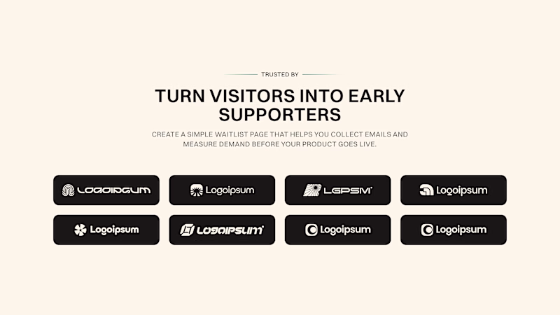
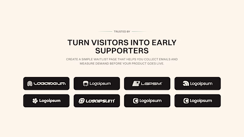
Taste Test
First or Second version?
Look at the gap between headline text and label "Trusted by"
On first - there are 16px gap between, on second - 24px gap.
Gap between headline and body is 12px on both versions.
4 votes
Ends in 1d
Honestly, I probably understand better than most how much a detail like this can affect the overall feel of a design, and I know how hard it can be to decide which option is actually more appealing.
I think this post is underrated, but it definitely earned my attention.
Thanks for Understanding, Nikita!
Second version for me.
The larger gap makes the "Trusted by" label feel like supporting evidence rather than part of the headline itself.
Small spacing changes like this often have a bigger impact than people expect because they affect how quickly the eye understands the structure...
Ty, Bhaskar! It's for template, so I will leave logos like that :)
Will go for the first version
Cool! Got it!
The network for creativity
Join 1.25M professional creatives like you
Connect with clients, get discovered, and run your business 100% commission-free
Creatives on Contra have earned over $150M and we are just getting started
Related posts
3d Sounds cool, but this normal scroll looks premium and decent to me. good work on both 🙌
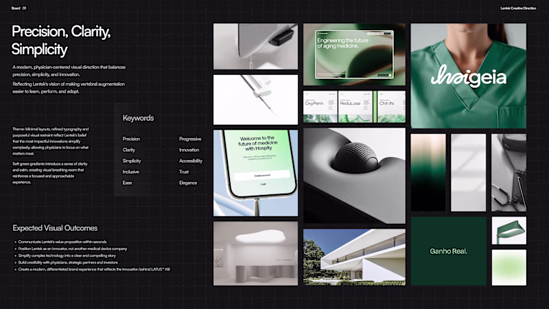
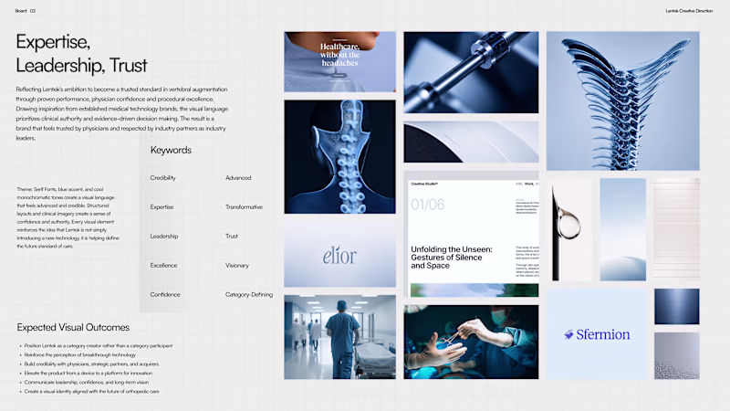
Shared two moodboards for brand direction with client. Which one would you choose?
6 votes
Ends in 1d
Testing how much a color palette can change the perception of the exact same scene.
Same layout. Same composition. Same UI.
Just different art direction.
Which version works better for you?
🟣 Purple (AI / tech)
🟠 Orange (enterprise / business)
Drop your choice in the comments
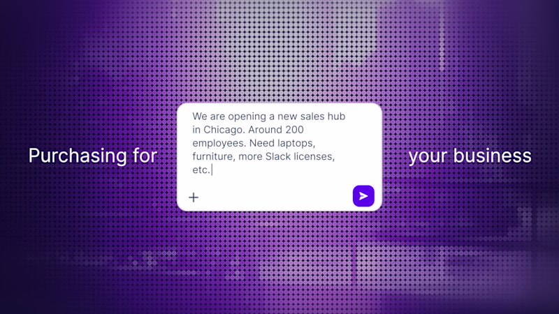
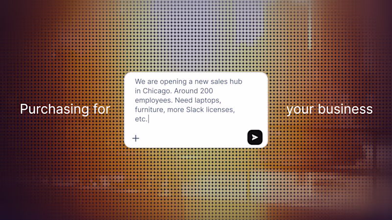
16 votes
Ends in 1d
Orange looks great!
Challenges
View allTrending
Claude
Claude has entered the design space. How are you using Claude Design?
Contra University
Learn from expert creatives how to earn more using next-gen AI tools.
MagicPath
The canvas is infinite, and exploration is becoming the workflow. How are you using MagicPath?
creativeaiflow
Creative AI workflows are evolving. What tools do you use, and what are their strengths and weaknesses?
freelancerlife
Freelancer life is wins, pivots, and everything in between. What’s yours right now?