The network for creativity
Join 1.25M professional creatives like you
Connect with clients, get discovered, and run your business 100% commission-free
Creatives on Contra have earned over $150M and we are just getting started
Back to feedPost

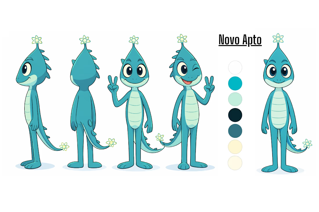
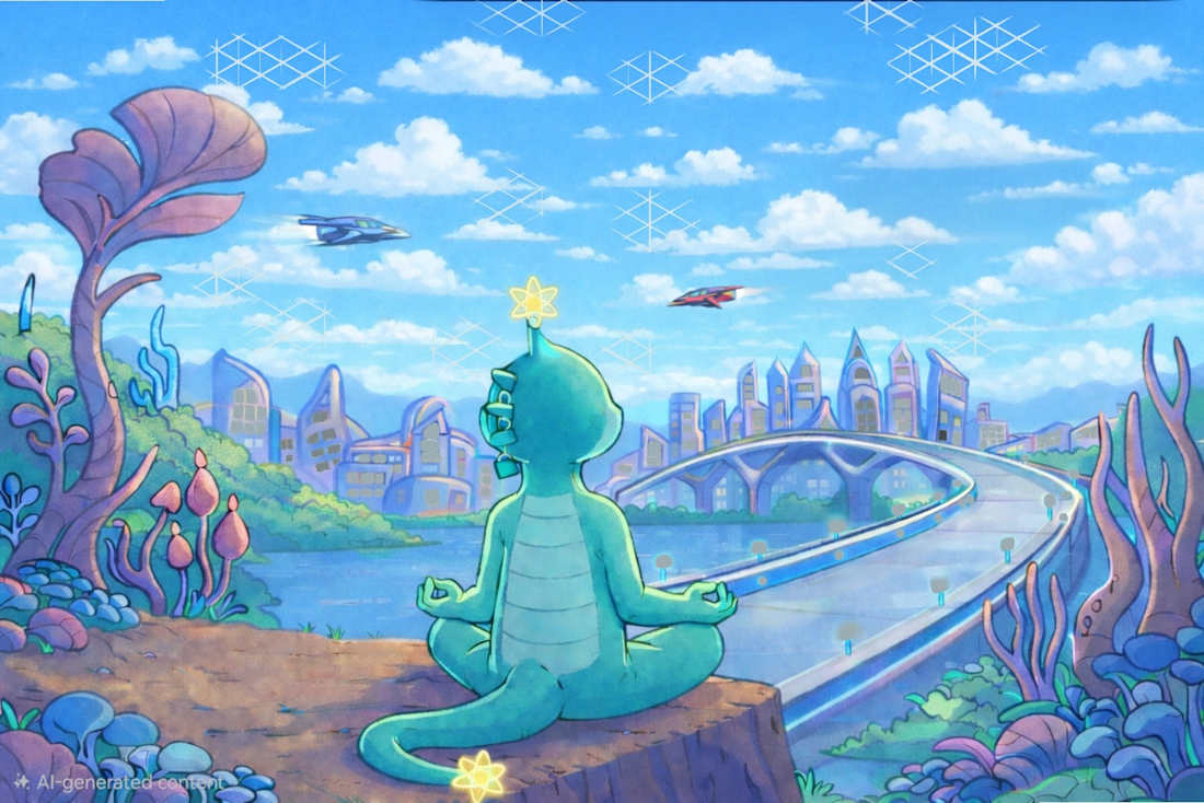
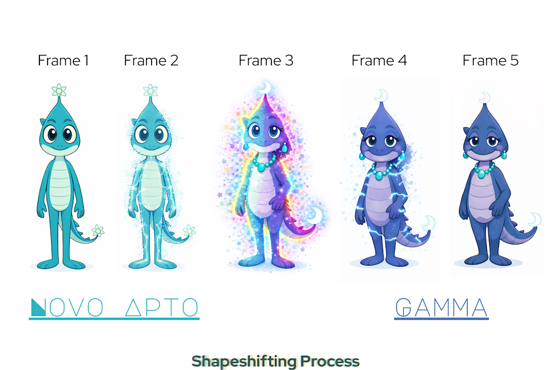
Novo Apto - Charecter Design - Concept Art / Children's Quantum Mechanics Cartoon Idea



The network for creativity
Join 1.25M professional creatives like you
Connect with clients, get discovered, and run your business 100% commission-free
Creatives on Contra have earned over $150M and we are just getting started
Challenges
View all


Related posts

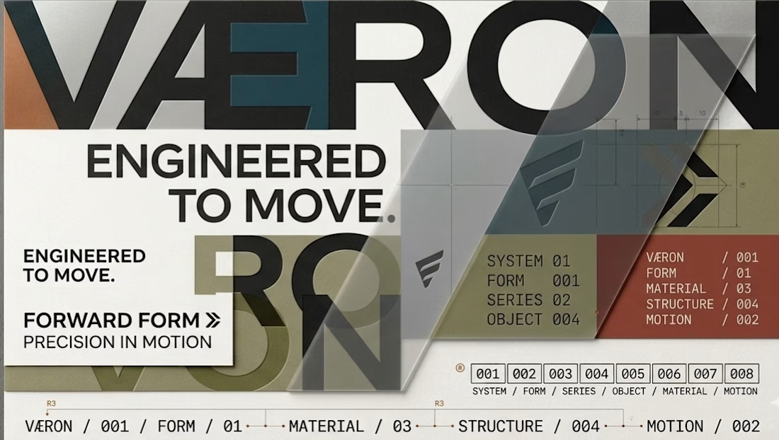
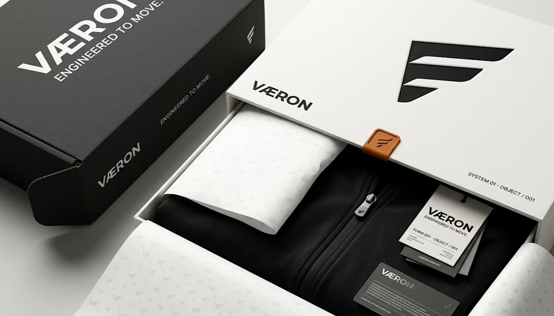
VÆRON
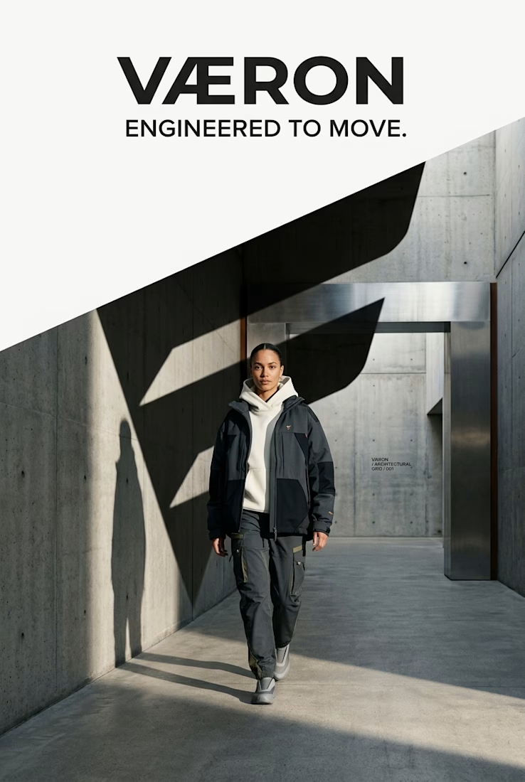
A complete visual identity exploration built around one central idea: FORWARD FORM — a design language where fashion, architecture, engineering and movement converge.
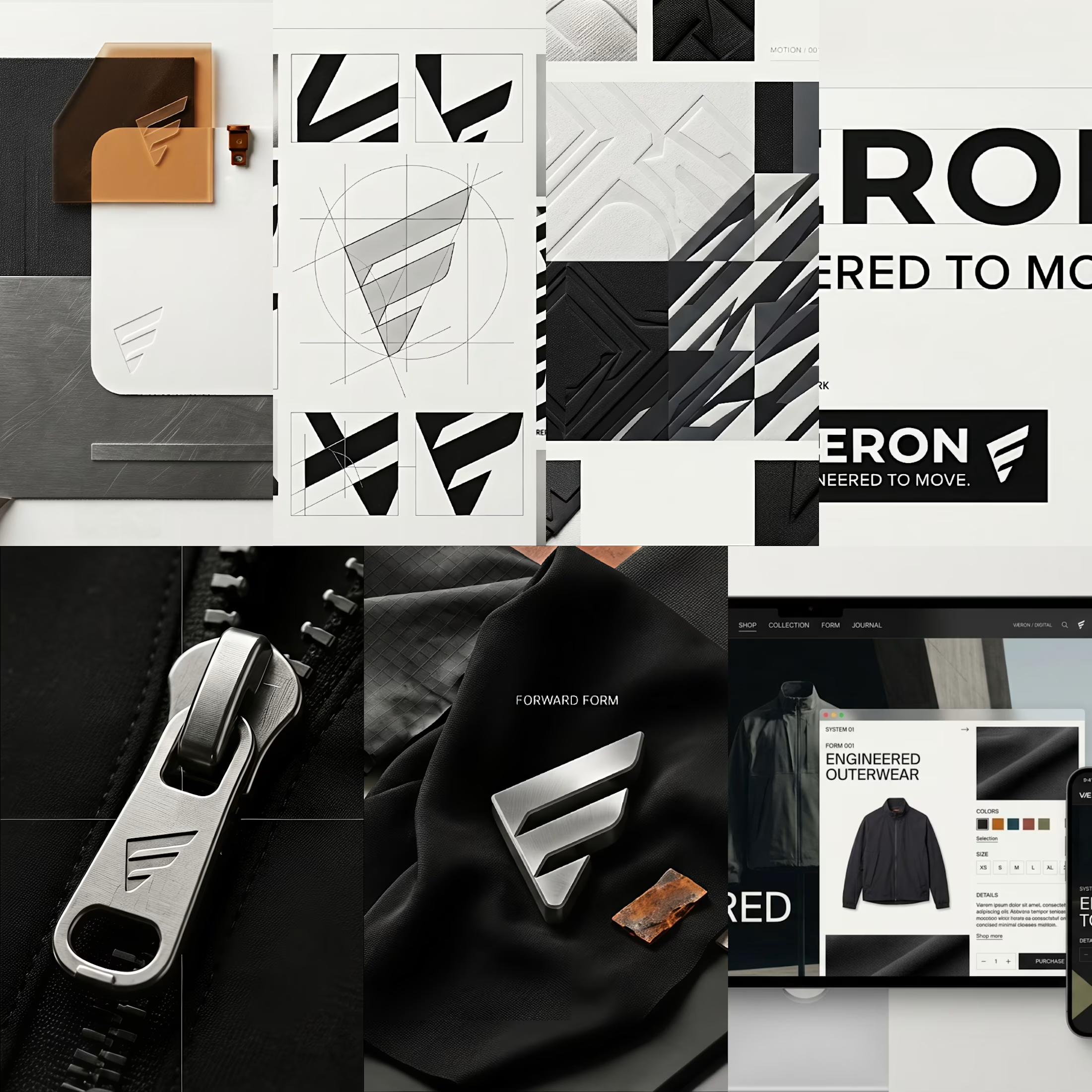
Rather than designing a logo in isolation, I developed VÆRON as a connected brand system, where every decision has a purpose.
From the Æ construction and typography to the geometric language, material direction, color architecture, garment design, hardware, packaging, digital experience and campaign world — every layer was developed to function as part of one recognizable visual universe.
The creative direction balances contemporary streetwear with quiet luxury, using engineered silhouettes, tactile materials, architectural forms and controlled color to create a distinctive identity with both character and restraint.
The goal was simple: build a brand that remains recognizable even when the logo is removed.
Concept → Identity → Graphic System → Material → Garment → Packaging → Digital → Campaign
This project represents my approach to brand identity, creative direction, AI-assisted visual development, image editing, fashion visualisation, art direction and detail-driven design.
VÆRON
ENGINEERED TO MOVE.
Want to see the thinking behind the visuals?
Explore the full case study in my portfolio — from the initial concept and identity system to the final brand world.
Open to creative collaborations, freelance projects and brand identity opportunities.



Creative


I’ve been razzmatazzing and flibbertigibbeting with Claude Code and somehow ended up with a new yels.dev.
It finally feels like me: simple on the surface, slightly complicated underneath, and very much alive.
You can see who I am, what I do, the work behind Herodot, RaptorLabs, CyberLink Security and Solmint, plus a selection of projects I’ve built across AI, cybersecurity, Web3, product systems, education, archives, and experimental digital spaces.
Built to be explored


The simple-on-the-surface, layered-underneath idea comes through so clearly in the presentation. I especially like how the project archive turns the site into something to explore rather than just a résumé of links.

How do you turn movement into a visual identity without literally showing movement?
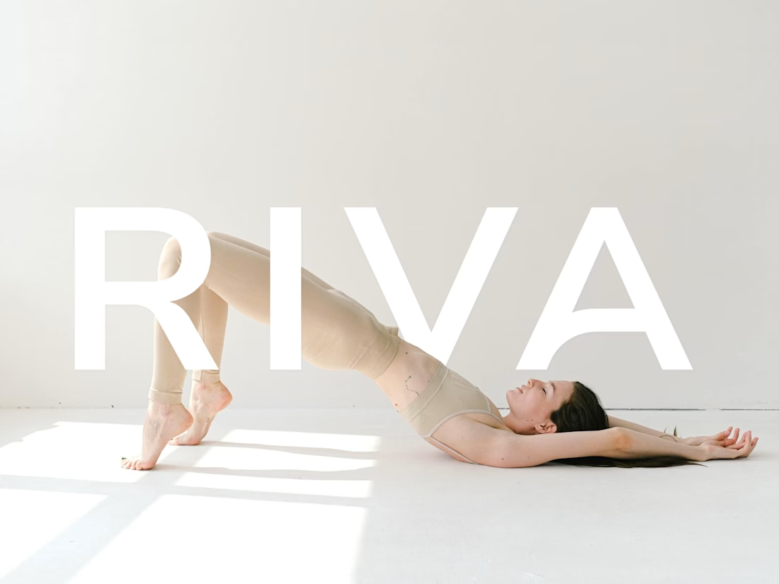
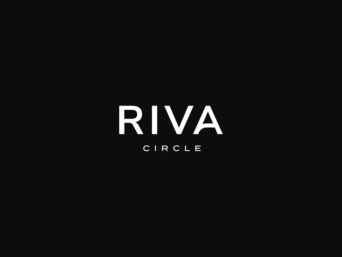
That was one of the questions behind the branding for Riva Circle, a Pilates studio based in St. Gallen, Switzerland.
Riva Circle came to us as a completely new brand. The task was to build the brand from the ground up and create a visual language that could define how Riva Circle would be perceived from the very beginning.
The goal was to create something modern and dynamic, but without being loud or overly expressive. We wanted the brand to feel refined and contemporary, while still capturing something essential to Pilates: movement, control, balance, and the connection with the body.
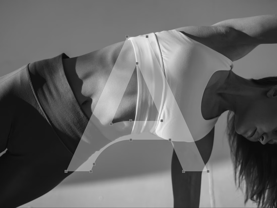
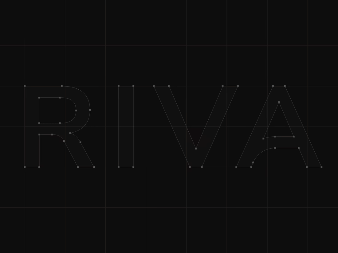
That became the starting point for the wordmark. We explored how we could translate the expression of the body and the movement of Pilates into typography. Rather than illustrating movement directly, we looked for a way to make it part of the letterforms themselves.
This led us to a custom typographic treatment where a simple continuous line becomes part of the letters. Most importantly, that line appears within the letter A, creating a subtle but distinctive gesture. From that detail, we developed the visual language of the brand. The result is intentionally simple, clean typography, a restrained visual system, and a recognizable symbol built from the same idea of movement.
For me, that balance was really important. The brand needed to have enough character to be recognizable, but not so much visual noise that it would compete with the experience Riva Circle is offering.
And I think the brand has proven that direction quite well. Just one year after launching, Riva Circle has grown, established a recognizable presence, and, most importantly, built a strong community around the studio.
So, this project was ultimately about taking something as expressive as movement and finding a very simple visual expression for it. One that can stay relevant as the brand continues to grow.


Creative work :)