The network for creativity
Join 1.25M professional creatives like you
Connect with clients, get discovered, and run your business 100% commission-free
Creatives on Contra have earned over $150M and we are just getting started
Back to feedPost
Another concept from our archives that we're still really happy with.
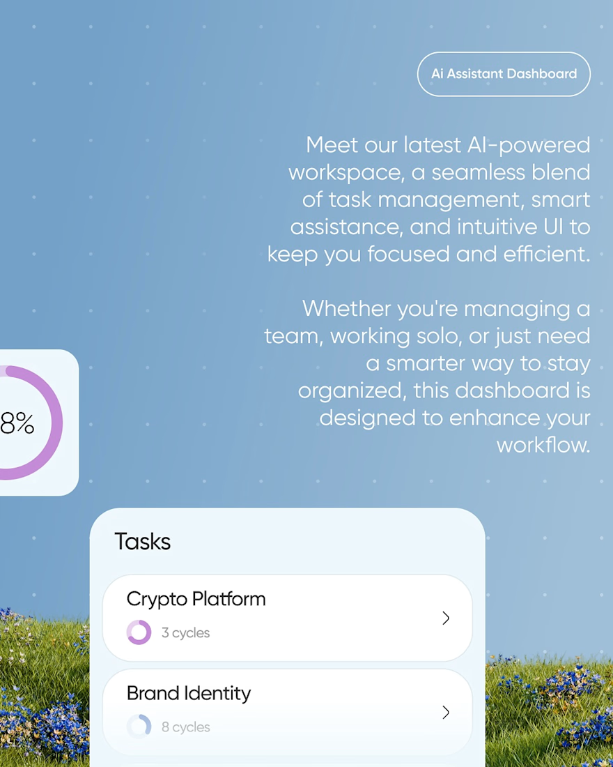
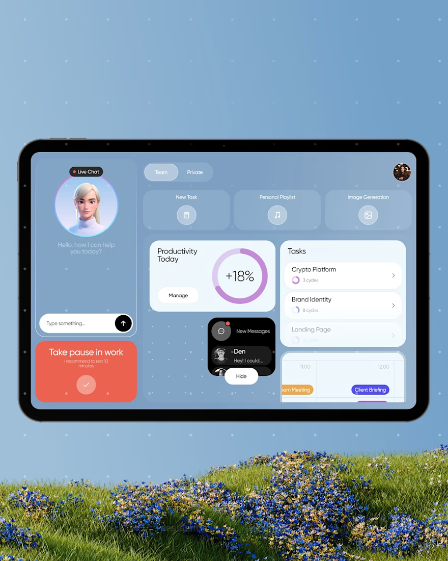
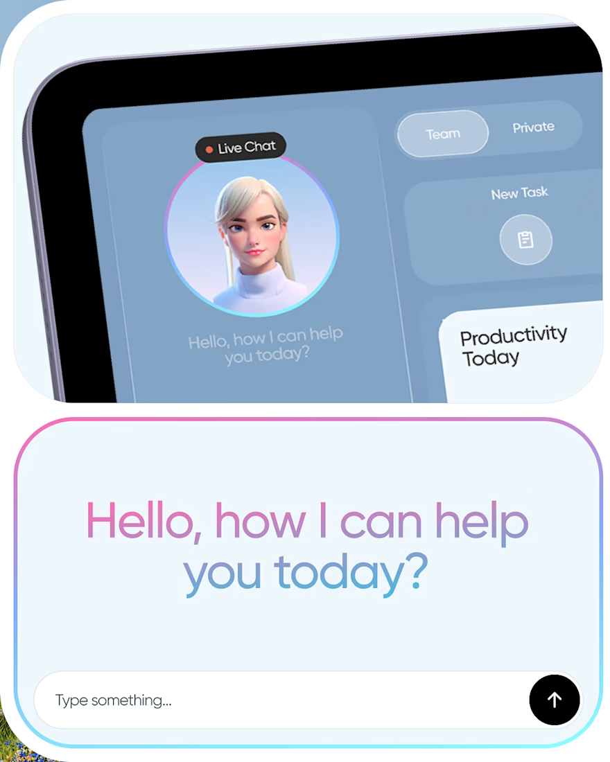
We explored what an AI productivity workspace could look like when the assistant is built directly into the workflow. Tasks, messages, scheduling, and AI assistance all come together in one place without making the interface feel too heavy.
The visual direction uses a soft blue palette, rounded UI elements, subtle gradients, and 3D character work to create a more approachable feel.
From the main dashboard to the assistant interaction and tablet layouts, we focused on keeping the experience connected, simple, and easy to navigate.



What almost made the interface feel too heavy before you landed on this version? The soft blue and rounded shapes do a lot of work to keep an AI assistant from feeling clinical.

Mostly finding the balance between structure and softness. We kept simplifying until it felt approachable.

Really strong product direction. As a UI/UX designer, I especially like how the dashboard brings tasks, messages, scheduling, and AI assistance together without making the interface feel overwhelming. The navigation and overall hierarchy feel very intentional. 👏
The network for creativity
Join 1.25M professional creatives like you
Connect with clients, get discovered, and run your business 100% commission-free
Creatives on Contra have earned over $150M and we are just getting started





Related posts


Definitely the new one. Seems more fluid and easier to interact with

How minimal can a fintech website get before it starts losing personality?
Version 01 of a recent Verlo Finance exploration.
Focused on strong type, clarity and keeping everything else out of the way.
Would you keep it this minimal?


Built this Framer site from scratch.
The interesting part wasn't the design.
It was building this team section with a flipping interaction and full-card expansion on hover.
Here's the final result.

Really good section with amazing transitions.
Great job Rokas!🙌