The network for creativity
Join 1.25M professional creatives like you
Connect with clients, get discovered, and run your business 100% commission-free
Creatives on Contra have earned over $150M and we are just getting started
Back to feedPost
A new day, a new Daily UI challenge.
This time, the challenge was to design a music player interface for the Apple Watch. I took inspiration from my favorite artist, Natalia Lafourcade, and combined some basic animation techniques in After Effects with a UI designed in Figma.
It was a really fun challenge that I completed some time ago. Looking back at it now, I can't help but wonder if I could recreate the spinning vinyl effect using Figma Motion...
I guess there's only one way to find out... 🎵✨


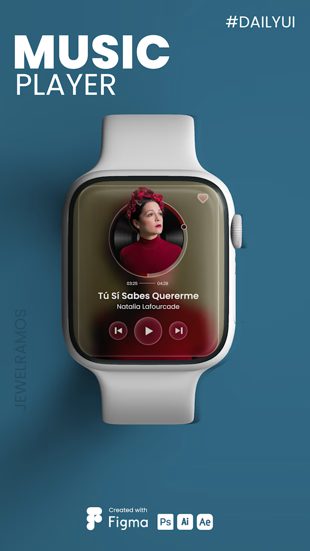
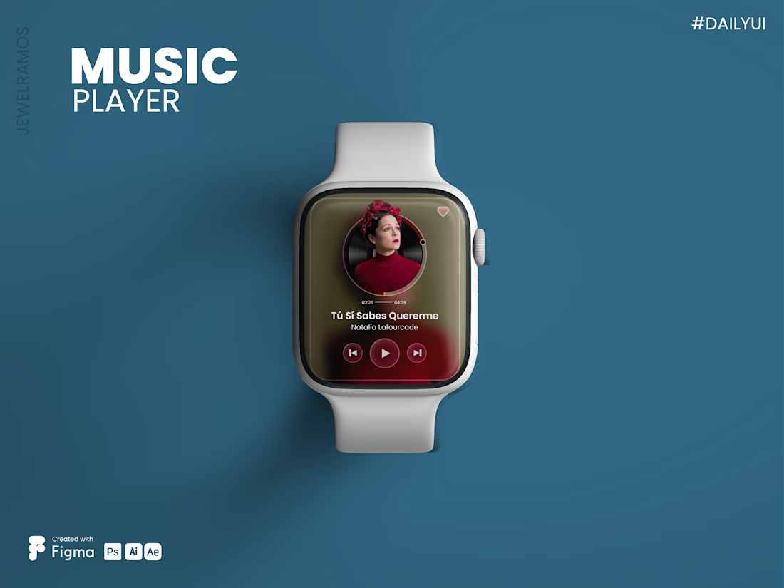


The color choice, mockups the presentation, and overall is flowing. Animation speeds are just on point too, good work!

Thank you! 😊
The network for creativity
Join 1.25M professional creatives like you
Connect with clients, get discovered, and run your business 100% commission-free
Creatives on Contra have earned over $150M and we are just getting started








Related posts


Recent product update video for a client

Really curious about your process here. Did you start with a storyboard or go straight into motion?

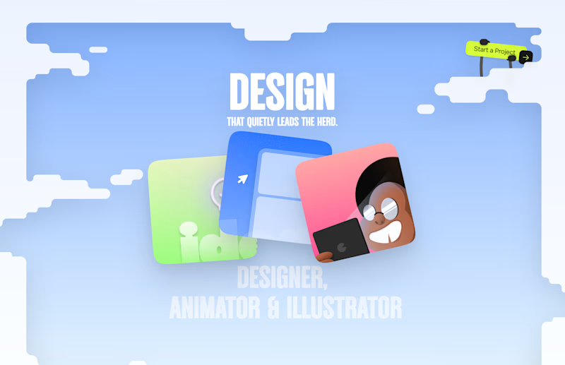
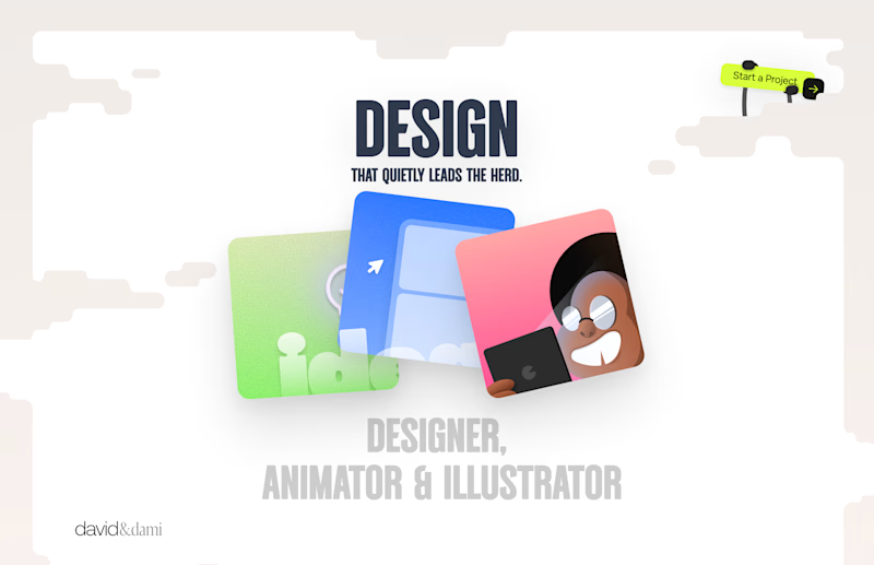
Should I go for left or right? Focusing on updating and finishing up my portfolio... and then I came across this crossroads. Another alternative is to make them switchable themes through a toggle, but I still need to decide which should be the default.
27 voted
75%
9 voted
25%
36 votes
Closed

Left is better because the text is readable, the overall blue background is not flashing to the eyes as compared to the right one.
For the top right button " Start a project ", you can add some animation so that it stands out and encourage users to click on it.


The app looks amazing, but do you think the number font might be a bit hard for people to read quickly when checking their money?